GeoHealth Mapping GIS Training
for Monitoring and Evaluation or
Strategic Information Officers and Data Analysts for HIV

5.2. Case Studies
5.2.1 Generalized Epidemic
5.2.1.1 Background
South Africa has the largest HIV epidemic in the world. HIV prevalence is high in the general population, although it varies significantly by province. A 2012 population-based survey found a range of HIV prevalences throughout the country, from a high of 16.9 percent in KwaZulu-Natal (KZN) to a low of 5 percent in Western Cape. 1 While these data provide important insight into country-wide variation between provinces, there is also a need to examine variability within provinces.
5.2.1.2 Question of interest
Given the high HIV prevalence, the KZN Provincial AIDS Council (PAC) sought to examine spatial variations in HIV burden within KZN using HIV testing data reported from PMTCT facilities in the province.
Specifically, the PAC wanted to know
- How does HIV positivity vary by health facility in KZN? 2
- How does the number of people living with HIV (PLHIV) vary by district in KZN?
- Where are the ART coverage gaps in KZN? 3
5.2.1.3 Data required to answer the question
In order to map spatial variations of HIV burden between facilities, geocodes, or latitude and longitude, data were used for all PMTCT (prevention of mother-to-child transmission of HIV) health facilities in KZN. Routinely collected, facility-level HIV testing data from women who attend PMTCT clinics was then linked to the geocoded data. Finally, to map the HIV and antiretroviral therapy (ART) spatial variation by district, the PMTCT HIV testing data and the routinely collected ART data were aggregated by district and linked to the boundary files of the KZN districts.
5.2.1.4 Selection of method
When mapping variations in data values, users will find that this is best done using graduated colors—light to dark—whereby light colors symbolize low values and dark colors symbolize high values. Graduated colors can be used for both point data and polygon (area) data. In this case, graduated colors were used to map point data to show variations in HIV positivity by facility. Following this, choropleth maps were used to map variations in the number of PLHIV by district and ART coverage gaps in districts.
5.2.1.5 Results
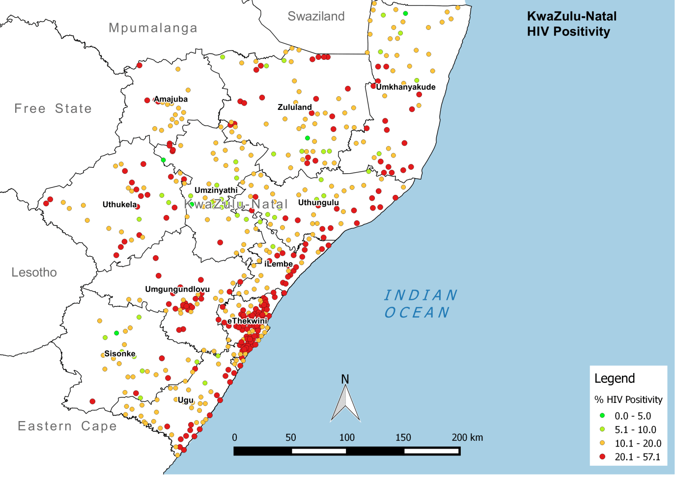
HIV testing data was used to estimate HIV burden (as described by HIV positivity) at each PMTCT facility. Results were displayed on a map of the province, with each point indicating the location of a facility and its relative HIV positivity. Even in this early step of the analysis, it was clear to decisionmakers that facility-level HIV positivity varied throughout the province. Facilities with higher HIV positivity clustered along the southeast border—specifically around cities and ports—and extended toward Eastern Cape province.
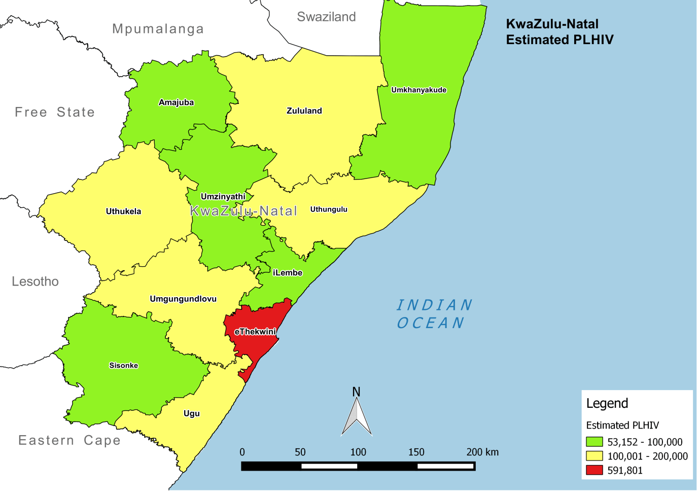
Facility-level data was then aggregated up to the district level, using an adjustment factor to account for population density. This calculation provided an estimate of the number of PLHIV in each district. As with HIV positivity, the map showed considerable variation in the estimated number of PLHIV throughout KZN. While the estimated number of PLHIV is high throughout the province, this exercise suggests a greater number of PLHIV live in eThekiwini than in other districts.
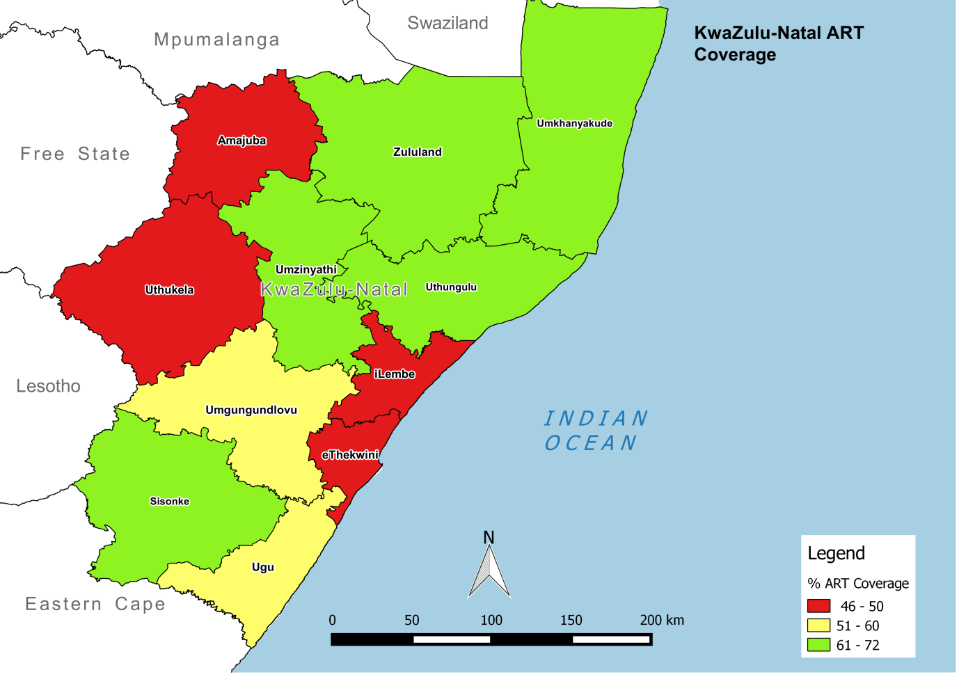
Finally, the KZN PAC mapped ART coverage—the percentage of HIV-positive people in a given district that are on treatment—and compared this to the map for estimated number of PLHIV. Viewing these two maps together allowed program planners to consider where to prioritize ART scale-up. For example, coverage appears to be lower in eThekwini, even though the district has the highest number of PLHIV.
5.2.1.6 Summary and next steps
Using facility-level data, the KZN PAC was able to examine spatial variations in HIV positivity, estimated number of PLHIV, and ART coverage using routinely collected facility-level HIV testing data. Visualizing these data at various administrative levels provided provincial-level decisionmakers with a more nuanced understanding of program coverage and priorities for scale-up.
By mapping these data, users were better able to recognize important patterns that might have been less readily apparent with data displayed in a graph or chart. The KZN PAC may want to continue mapping these indicators over time, which could support routine monitoring and management. For example, the analyses above would allow KZN to track progress made toward achieving an important global target: the first two UNAIDS 90-90-90 targets (i.e., 90% of all people living with HIV will know their status by 2016, and 90% of all PLHIV will receive ART).
In summary, mapping routinely collected data reported from PMTCT clinics allowed decisionmakers in KZN to easily visualize patterns in HIV burden and coverage. By comparing these maps, the district gained insight on the best allocation of available resources to achieve the greatest impact.
5.2.2 Concentrated Epidemic
5.2.2.1 Background
Bangladesh is considered a low-HIV prevalence country, with HIV in the general population estimated at less than 0.1 percent.1 HIV is concentrated in key population groups, including female and male sex workers (FSWs and MSWs) and transgender populations, with HIV prevalence for these groups just below 1 percent. People who inject drugs (PWID) have a higher HIV prevalence, at slightly above 1 percent.
5.2.2.2 Question of interest
Given the importance of key populations in Bangladesh's HIV epidemic, the team at the National AIDS/STD Programme (NASP) wanted to understand the spatial distribution of drop-in clinics (DICs) offering services to key populations. Due to the program's relationship with implementing partners serving FSWs and PWID within Dhaka City, the team focused its analysis on these populations. Currently, DICs offer condom distribution and health education to FSWs, and provide needles/syringes, condoms, and health education to PWID. NASP aimed to identify any service gaps for both populations to improve coverage for their HIV program.
Specifically, they wanted to know
- Where are key populations (FSWs and PWID) located in Dhaka City?
- What DICs provide HIV services to FSWs in Dhaka City?
- What DICs provide HIV services to PWID in Dhaka City?
- Where are FSW and PWID populations clustered or concentrated in Dhaka City?
5.2.2.3 Data required to answer the question
Mapping the exact location of key populations violates confidentiality and exposes individuals to great risk. Instead, NASP used the number of FSWs and PWID accessing services at DICs as a proxy for identifying their location. In Dhaka City, such information can be obtained from DICs—specifically, through the implementing partners that oversee these DICs. The available dataset provides the total number of PWID and FSWs reached from October to December 2014.
In addition to obtaining geocodes or latitude and longitude for all DICs, NASP also needed information on the lower-level administrative boundaries served by each clinic. In Bangladesh, these boundaries are referred to as Thanas, or subdivisions of Dhaka City.
5.2.2.4 Selection of method
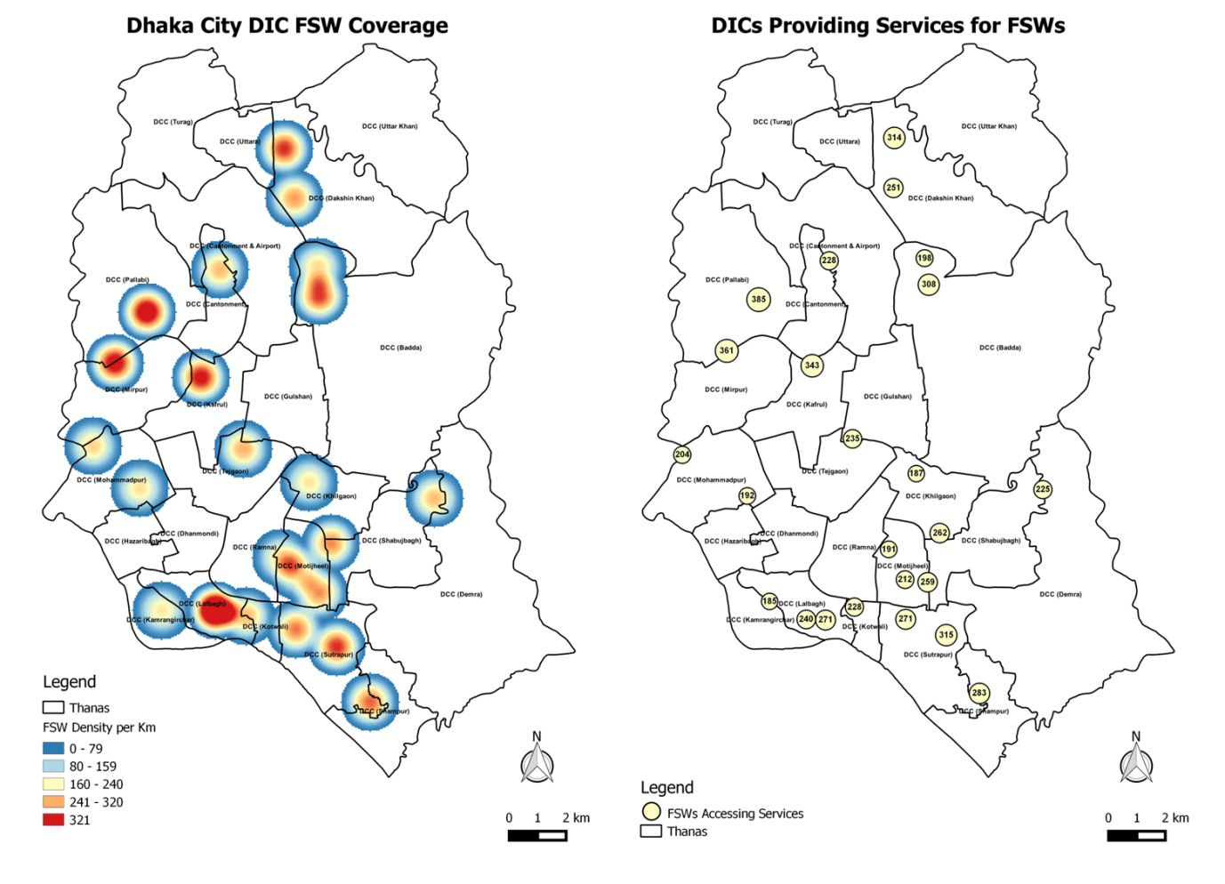
Density mapping using point features can be carried out using the features themselves or related data values. In this case, data were available for both 1) locations of DICs and 2) the number of FSWs and PWID accessing services at those locations. Since NASP was interested in knowing where clusters of key populations were located in the city, the team decided to carry out density mapping using data values (i.e., the number of FSWs and PWID accessing services). Specifically, kernel density was used to create maps showing numbers of key populations accessing services per square km.
NASP used proportional symbols to map DICs in order to show the relative magnitude (i.e., total numbers) of key populations accessing services at a given DIC. The team also created separate maps for DICs offering services to FSWs and PWID in order to provide the most useful data for population-specific services.
5.2.2.5 Results
The team created two maps for each population: 1) a map of DIC locations with absolute numbers for population served, and 2) a density map of numbers of FSWs and PWID accessing services per square km. The maps were displayed side-by-side to better understand the number of people served by DICs versus the number in need of services in a given Thana.
The exercise showed that DICs offering services to FSWs were distributed mostly in the south and southwest parts of the city, as opposed to the north and east. Further, it showed that density of FSWs (i.e., numbers of FSWs accessing services per square km) varied geographically within Dhaka, with high densities in the southern parts of the city relative to other parts. High densities were also evident in the northern and western parts of the city, where there were fewer DICs—a possible indication of the need to increase DICs in those areas.
While the results suggested that FSW services were distributed throughout the city, they also showed that PWID accessed services in only a few Thanas in the southern parts of the city. This may indicate that there are few (or no) PWID in the northern parts of the city, or that there is a service gap.
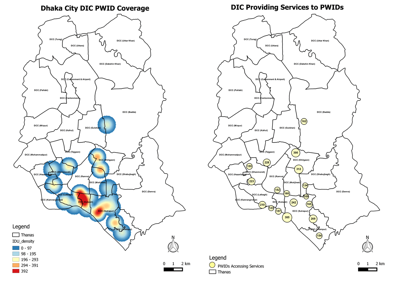
When compared side-by-side, the maps showed considerable variation in facilities offering services to FSWs and PWID, an important factor to consider in program planning. For example, DICs serving only one of these populations will require different resources and programming than those serving both.
5.2.2.6 Summary and next steps
NASP wanted to understand the spatial distribution of DICs offering services to FSWs and PWID within Dhaka City to identify service gaps and improve coverage for their HIV programs. Using available data for the total number of FSWs and PWID reached from October to December 2014, they generated maps using kernel point density to identify where FSWs and PWID access services within Dhaka City.
Comparing these maps side-by-side allowed NASP to see
- Where FSWs and PWID access services independently throughout Dhaka City
- Where DICs serve both populations
By examining these data on a map, NASP can consider how to best allocate existing resources to ensure adequate supply of commodities and staff at DICs, particularly in the southwest corner of Dhaka City where there are large concentrations of these populations. The exercise also raised new questions requiring additional exploration, including why so few PWID access services in northern parts of the city. In the future, NASP may want to collect data on the number of key populations in each Thana not able to access services, or the number accessing services in different Thanas. By mapping these data, NASP could compare results with the distribution of DICs to identify Thanas most in need of services.