GeoHealth Mapping GIS Training
for Monitoring and Evaluation or
Strategic Information Officers and Data Analysts for HIV

2.3. Orientation to QGIS Features and Functionality
This module is for users who are new to QGIS. Users will have a chance to explore QGIS, become familiar with its interface, and learn how to use its different features and functions. For this exercise, users will work with infant mortality data in Africa within the software.
2.3.1 Objectives
- Visualize infant mortality rates by country in Africa.
- Understand types of vector data.
- Learn how to navigate, including zooming and panning.
- Learn how to make data selections.
- Learn about map attributes (table data).
- Learn how to find features.
- Learn how to query data using expressions.
- Learn how select and create subsets of data.
You will need the files for Section_2_3 to complete this module.
2.3.2 Start QGIS and open an existing QGIS project
- Launch QGIS by clicking on the QGIS desktop shortcut on your desktop:

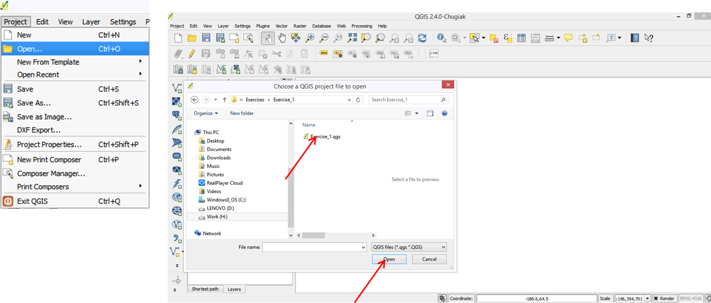
- On the main menu of QGIS, click on Project and then on Open.
- In the dialog box that opens, browse to your exercise folder (QGIS_Training\Section_2_3\), select Exercise_1.qgs, and then click Open.
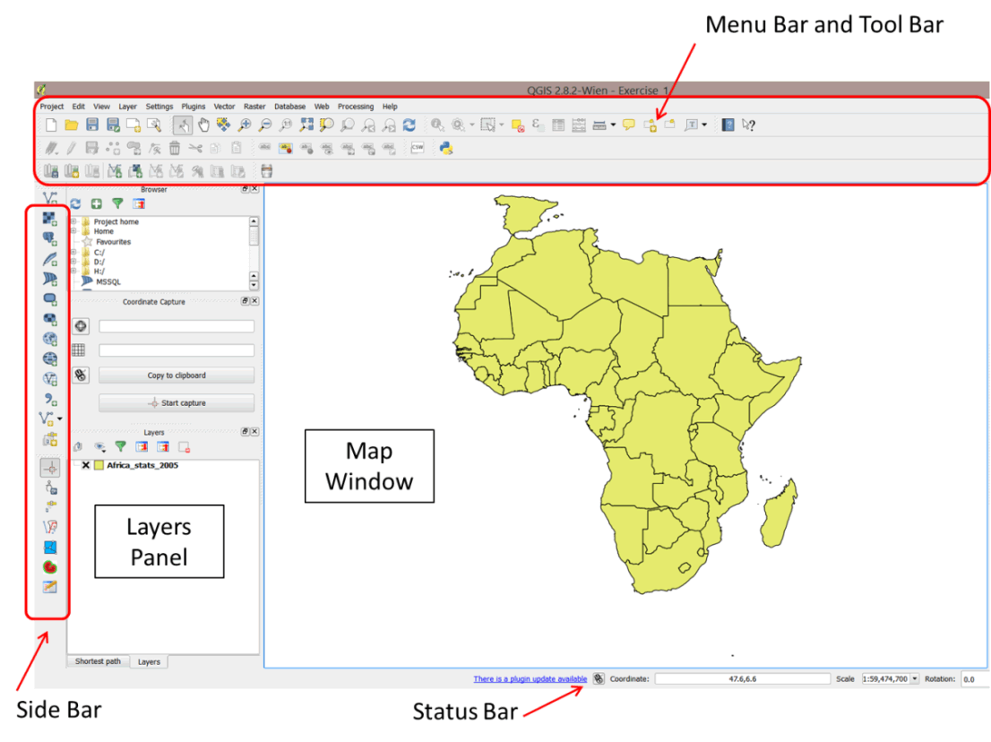
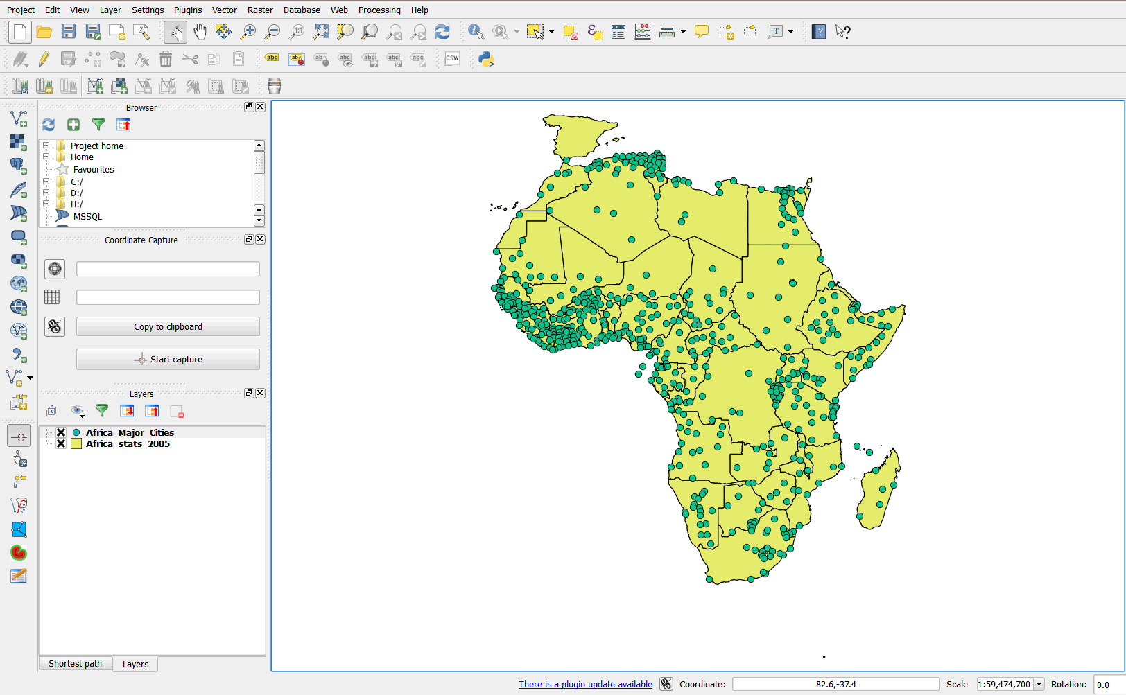
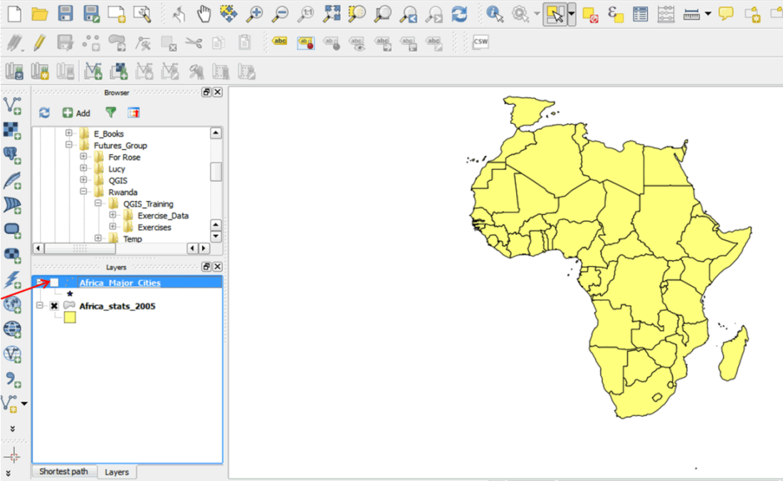
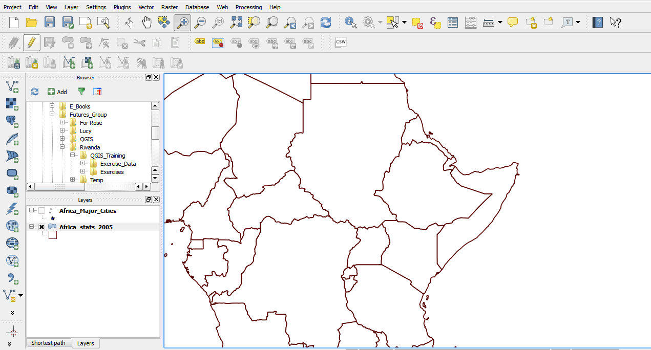
- A project document opens displaying countries in Africa. This file has basic statistics on African countries for the year 2005.
- The QGIS user interface is divided into 6 main areas: the Menu Bar, Tool Bar, Layers Panel, Map Window, Side Bar, and Status Bar.
2.3.3 Add a layer
- On the Menu Bar, click on Layer > Add Vector Layer.
- In the dialog box that opens, click the Browse button and navigate to Exercise_Data\Exercise_1 folder.
- On the left of the file name box, change the file type and select Esri Shapefiles (*.shp, *.SHP).
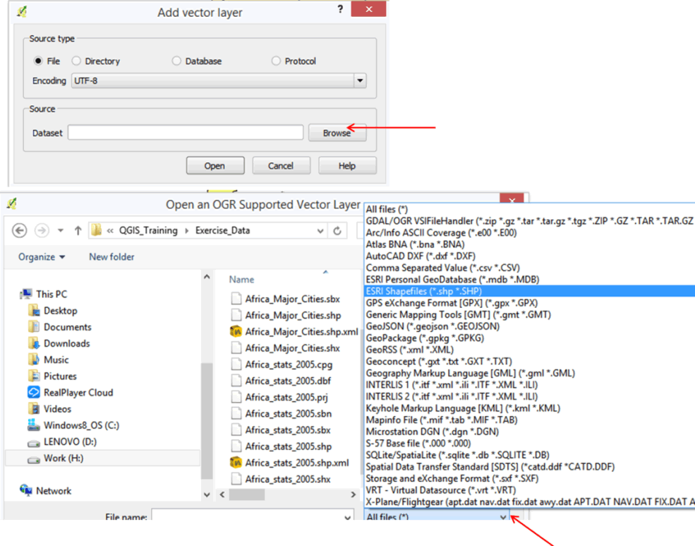
- Select Africa_Major_Cities.shp and click the Open button.
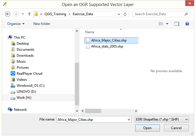
- Click Open in the next dialog box.
- A layer is now added to your project. You now have two vector-type layers listed in the layer panel: point vector (Africa_Major_Cities) and polygon vector (Africa_Stats_2005).
2.3.4 Change the color and symbol properties of your layers
When presenting data on a map, you must style it in a form that is visually informative. In QGIS, you can change the colors and symbols of your layers for better visualization.
2.3.5 Change symbol color and size
- Double-click on the Africa_Major_Cities layer in the layer panel to open the Layer Properties dialog box. The Layer Properties dialog box contains information on your layer and allows you to carry out different functions on the layer. For now, we are interested in changing the style of our layer.
- Click on Style on the left panel. Different symbols will appear.
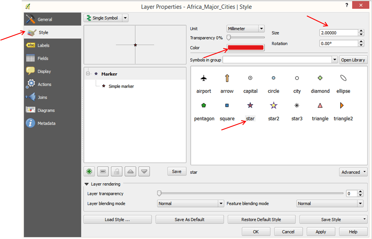
- Select a symbol. In the size box, change the size from 4.0000 to 2.0000.
- Click on Color to change the color. This opens the color selector dialog box. Choose a color and click OK.
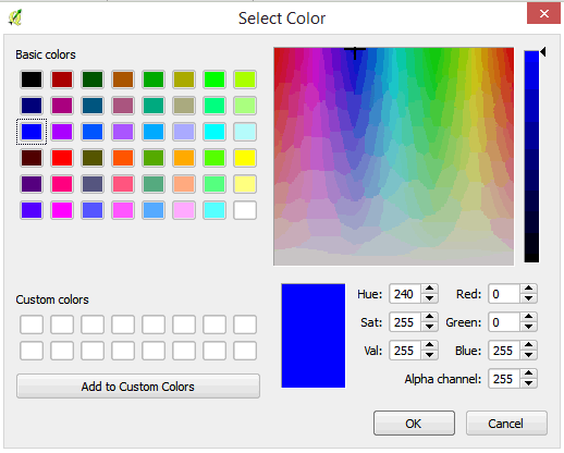
- Click OK in the next dialog box. Your cities are now displayed in a different symbol and color.
2.3.6 Turn layers on and off
- For now, we do not need the Cities layer so we will turn it off.
- On the layers panel, click on the small box to the left of the Africa_Major_Cities layer. This will turn off the layer. The cities are no longer displayed on your map.
2.3.7 Change country layer fill color and border outline color and width
- Double-click on Africa_Stats_2005 to open the Layer Properties dialog box.
- Click on Style > Simple Fill.
- Click on Colors Fill, select the white color, and click OK.
- Click on Border to change the color of the border outline.
- Select a red or brown color and click OK.
- Change the border width to 0.46000 by clicking on the up arrow next to the border width box. Click OK.
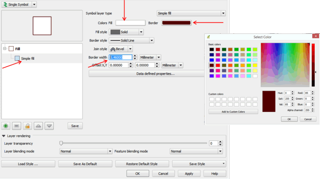
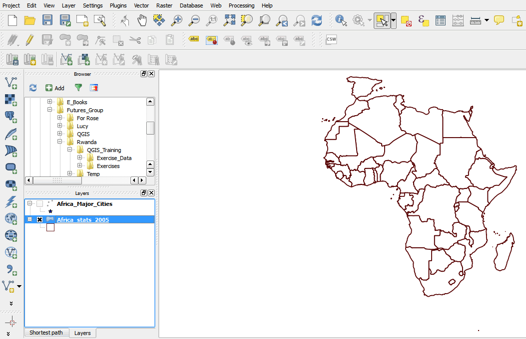
- Your map is now displayed differently.
2.3.8 Zooming to and panning features
Sometimes you may want to focus on a particular area of your map, or enlarge a particular area to see more details. In QGIS, you can zoom in and out on a map and use the pan tool to move your map around.
- On the tool bar, click the Zoom In button.
- Press and hold the mouse button on a part of your map.
- Drag the mouse pointer to draw a box around an area of your map, then release.
- Your map is now zoomed in to the area.
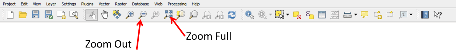
- Click the Zoom Full button
 on the tool bar to zoom to the full extent of your map.
 - You can also use the Zoom Out button.
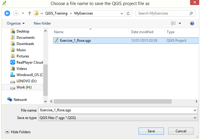
2.3.9 Save your project
- On the menu bar click Project > Save As.
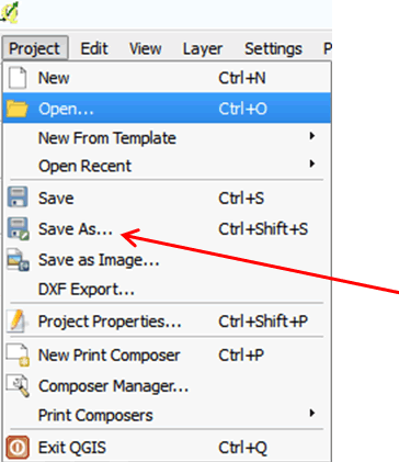
- Browse to the folder MyExercises and save your file under a new name: Exercise_1_your name.
- Click Save.
2.3.10 Identifying features
Map layers have attributes associated with them. To view the attributes of a layer, you can use the Identify tool. Let's use the tool to look at infant mortality rates for different countries in Africa, as well as life expectancy rates and other statistics.
- Click on Africa_Stats_2005 in the layout panel to select.
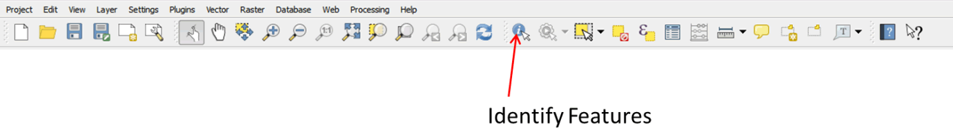
- Click on the Identify Features button on the tool bar:
 .
.
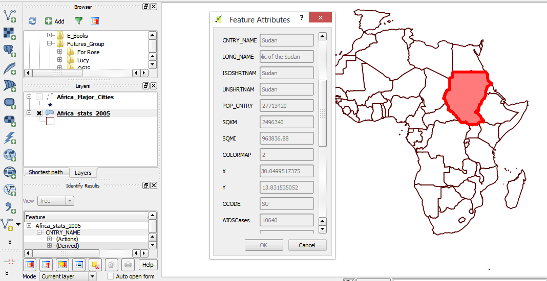
- Click inside Sudan. The country is outlined in red.
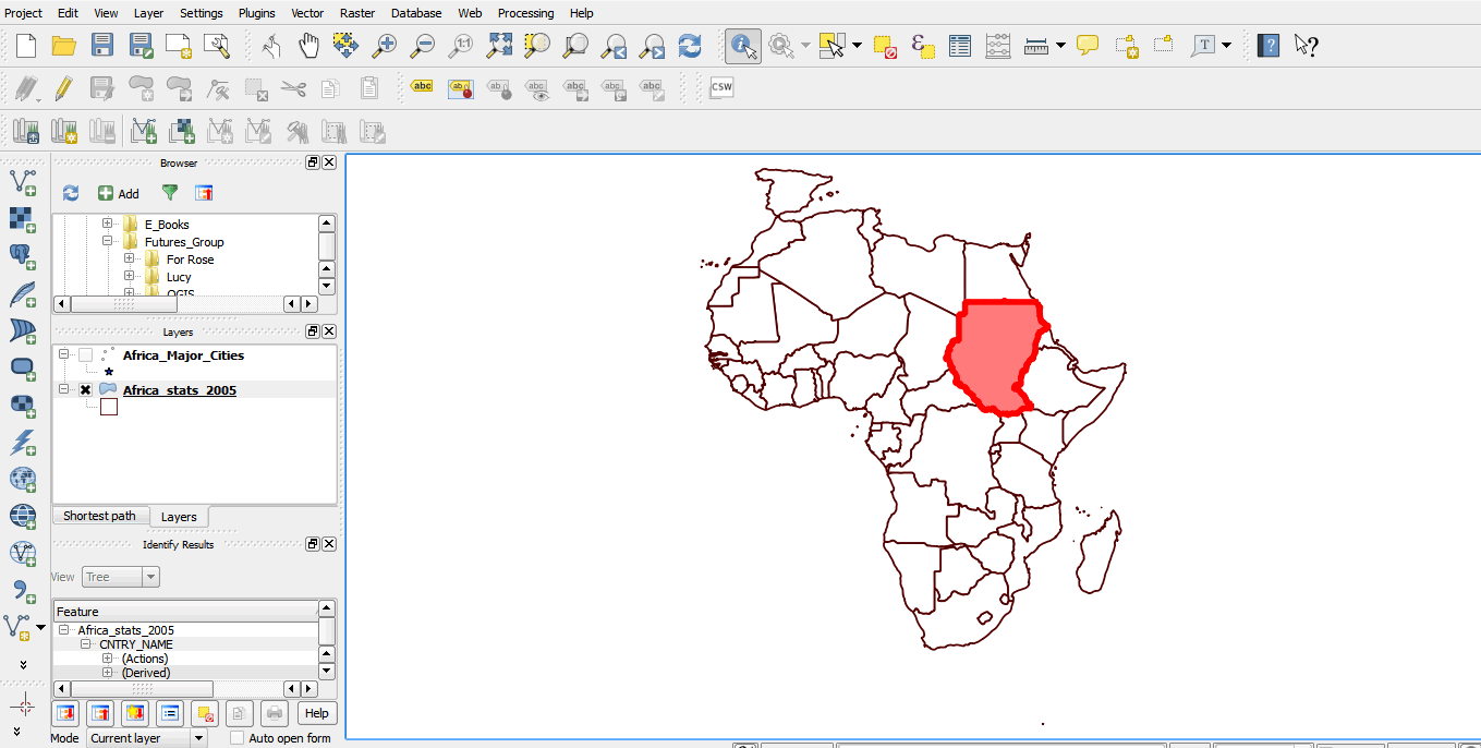
- On the layers panel, a feature panel will appear.
- You can scroll left, or up and down, to view the features of the selected country.
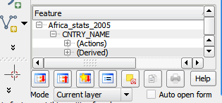
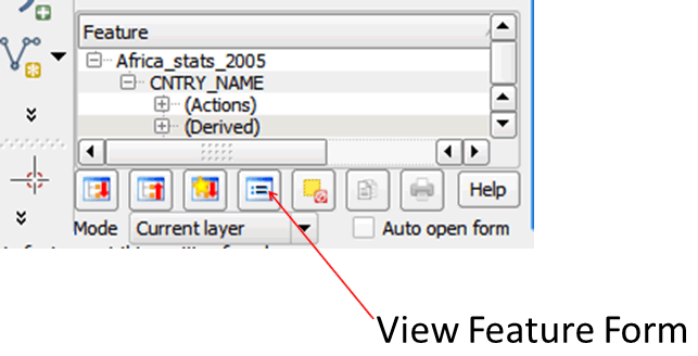
- You can also click on the View Feature Form button at the bottom of the features panel.
- A form showing the layer attributes pops up on your map window.
- Close the form.
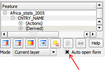
- In order to have the attribute form pop up each time you identify a feature, click on the Auto Open Form button at the bottom of the panel.
- Now click inside another country. The attribute form now opens automatically.
- Scroll up and down on the features attribute form to view the infant mortality rates and life expectancy rates for that country. What other attributes can you see?
- Close the form.
2.3.11 Selecting map features
In the course of your work, you may want to select certain features to carry out functions on a subset of features. You can select single or multiple features in QGIS.
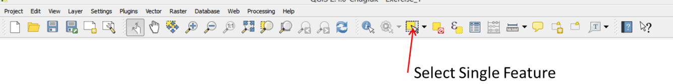
- On your tool bar, click on the Select Single Feature tool:
 .
.
- Click inside any of the countries. The selected country is now highlighted in yellow.
- To make multiple selections, hold down the Ctrl key on your computer and click inside several countries to select them.
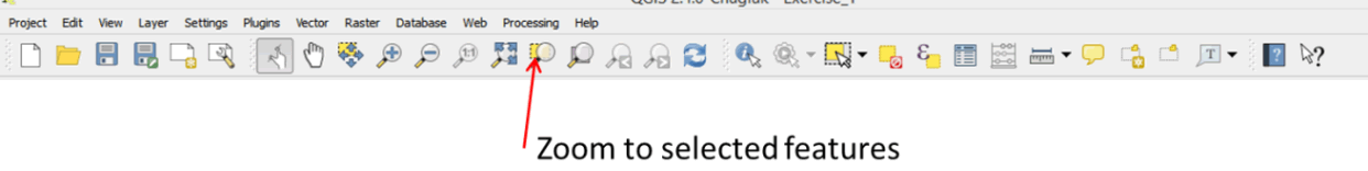
- Click on the Zoom to Selection tool on your tool bar to zoom in on the selected countries.
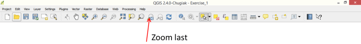
- Now click on the Zoom Last tool on your tool bar to zoom to your previous map extent.
- To clear your selection, click on the Deselect Features from All Layers tool on your tool bar.
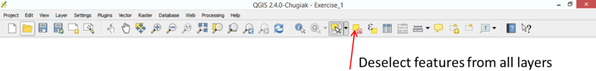
- No features are now selected.
2.3.12 Finding features on your map using a query expression
Sometimes you may know what you are looking for but don't know where it is on the map. You can use a query to find the feature in question.
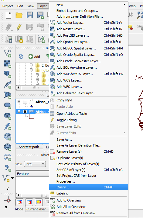
- On your menu bar, click on Layer > Query or Layer > Filter (depending on your software version) to open the Query Builder dialog box.
- The query builder dialog box is comprised of a field list, a values box, operators, and an expression box.
- In the field list, click on CNTRY_NAME to select, and then click the All button on the values box to list all values under that field.
- Double-click on CNTRY_NAME . It will appear in your expression box.
- Click on the = operator.
- In your values box, scroll down and double-click on Rwanda.
- Your query builder should resemble the graphic below:
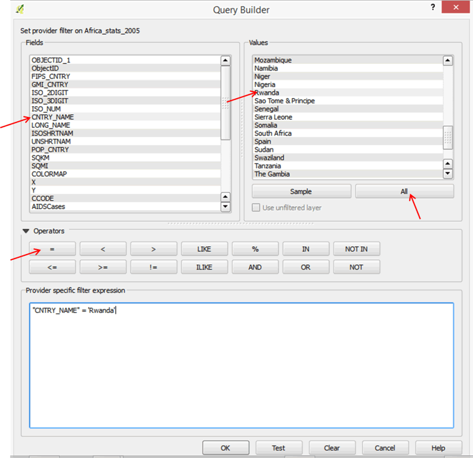
- Click Ok. Only Rwanda will be displayed in your map window.
- Go back to the Query Builder dialog box (Layer > Query or Layer > Filter) and click on the Clear button.
- Now all countries are displayed.
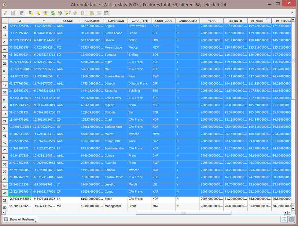
2.3.13 Attribute tables
Map layers include attribute tables containing data associated with each feature in the layer. You can carry out different functions in the attribute table. As with any other tabular data, you can sort, query, make selections, etc. In this exercise, we will use the attribute table to select countries with male and female infant mortality rates higher than 90.
2.3.14 Select data
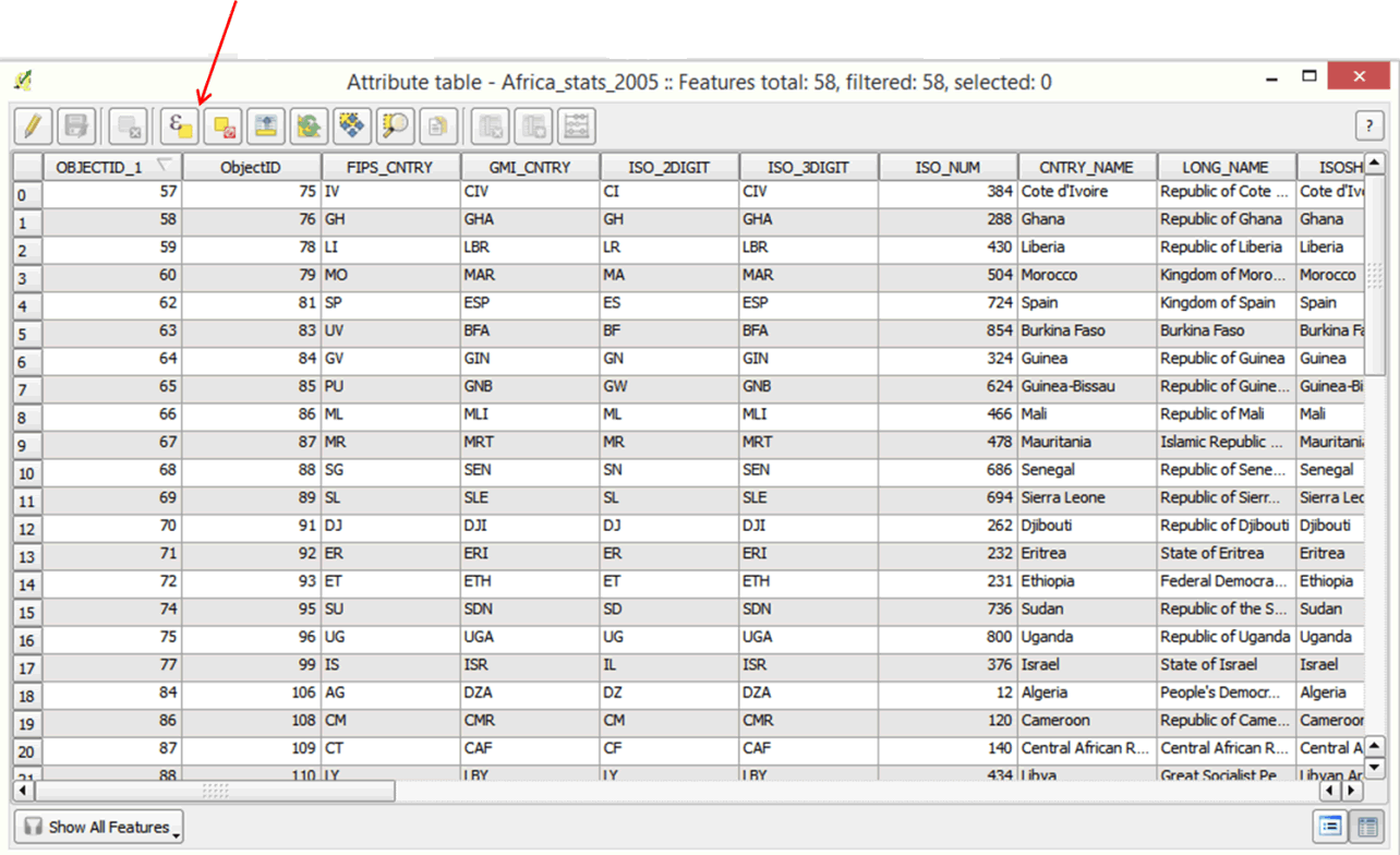
- On your tool bar, click on the Open Attribute Table tool.
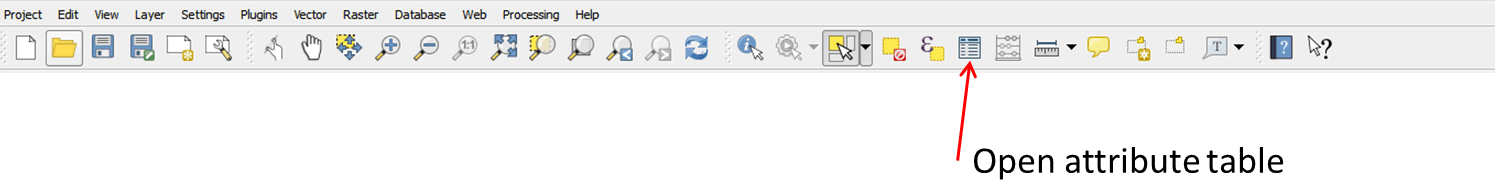
- A table will open. Scroll through the table to familiarize yourself with the attributes.
- Close the table.
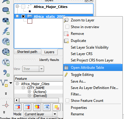
- You can also open the attribute table by right-clicking on the Africa_Stats_2005 layer and selecting Open Attribute Table.
- Open the attribute table again.
- Scroll to the right until you see the field IM_MALE.
- Click inside the name field. The records will be sorted automatically in ascending order.
- Click again to sort the records in descending order.
- We will now select rows where the male infant mortality rate is higher than 90.
- Click on the first row to select it, then hold down the Shift key on your computer and click on the row just above Benin. Several records are selected. The selected records are those where male infant mortality rates are higher than 90.
- Close the attribute form.
- In your map window, several countries are highlighted.
- We will create a subset of our selection.
- Right-click on Africa Stats layer and select Save As.
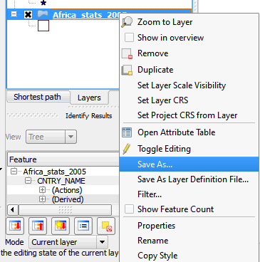
- In the Save Vector Layer as dialog box, check the Save only selected features box, as well as Add saved file to map.
- Click the Browse button and navigate to the MyExercises folder; name the file IM_Male_Rates_Over_90.shp and click Save. Click OK.
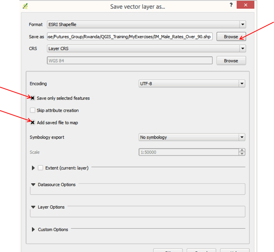
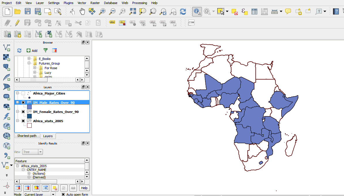
- Your layer is now added to your map.
2.3.15 Select data using a query expression
- We will now select female infant mortality rates using a query expression.
- Right-click on the Africa Stats layer and open the attribute table.
- In the attribute table tool bar, click on the Select attributes using an expression tool.
- In the Function list box, scroll down and click on the plus sign next to Fields and Values.
- Scroll down and click on IM_FEMALE.
- In the field values box, click on all unique to display the values.
- Double-click on IM_FEMALE to load it into the expression box, then type > 90. Your expression box should resemble the graphic below:
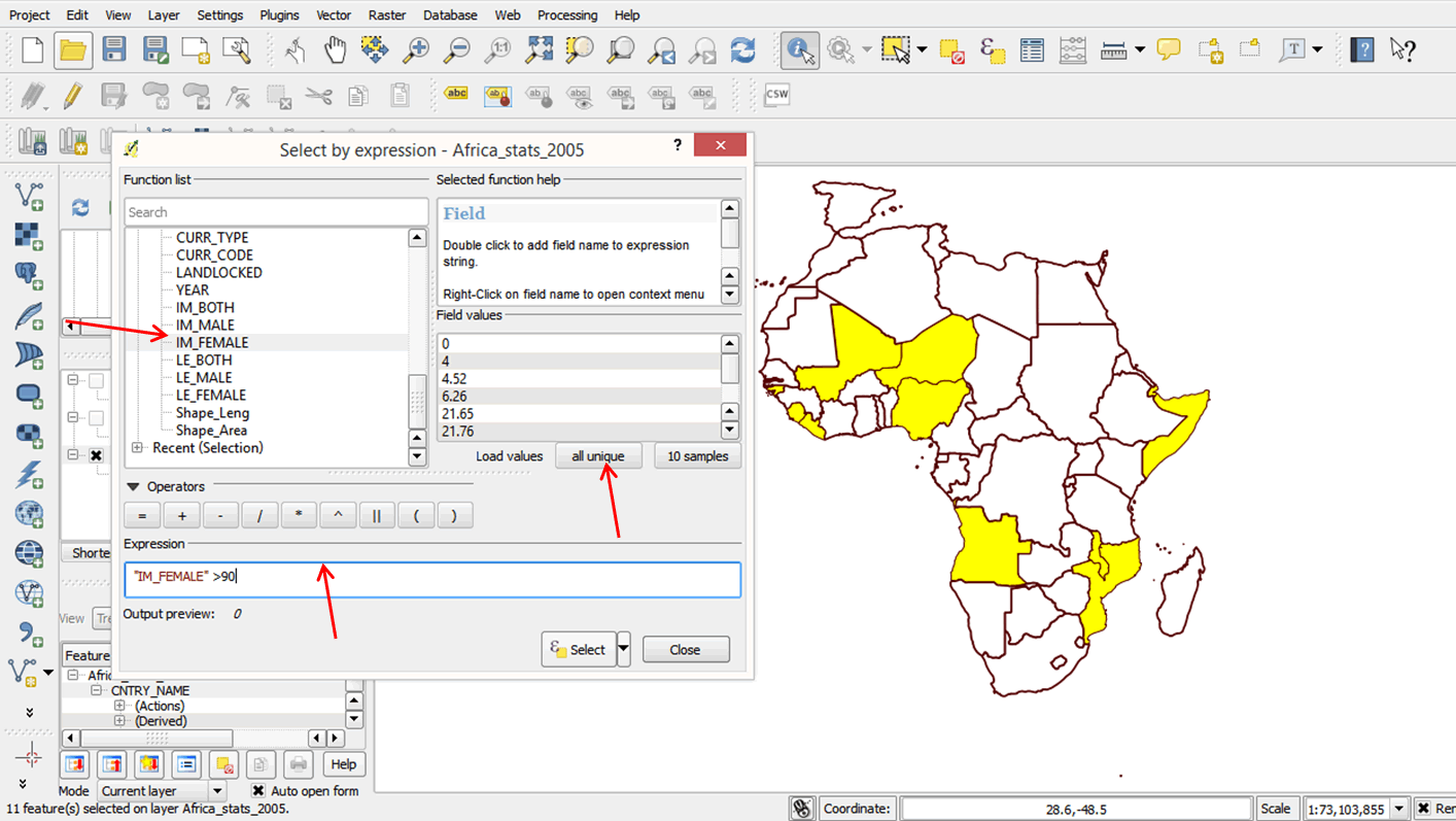
- Click Select, then click Close.
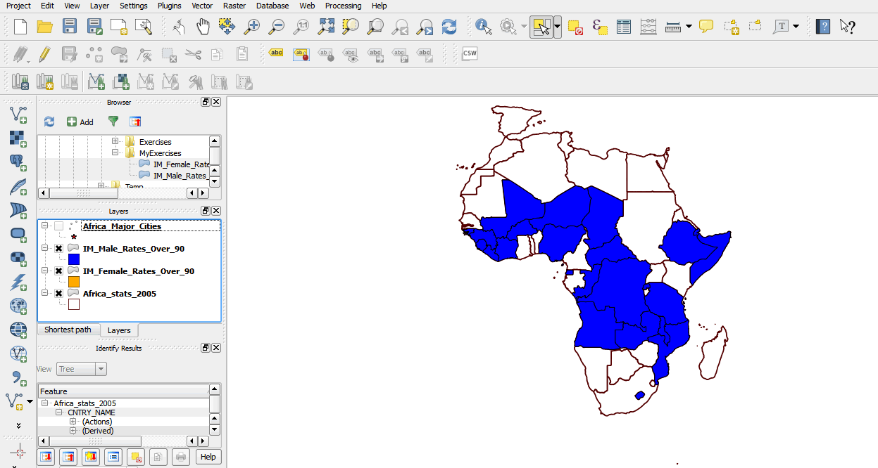
- Countries with female infant mortality rates higher than 90 are selected in your attribute table.
- To see your selection on the map, uncheck the IM_Male_Rates_Over_90 layer. Turn it back on when done.
- Close your attribute table and go to the map window.
- Create a subset of the selected features by following steps 77—79 above. Save the file in the MyExercises folder as IM_Female_Rates_Over_90.shp.
- You now have two new layers on your map.
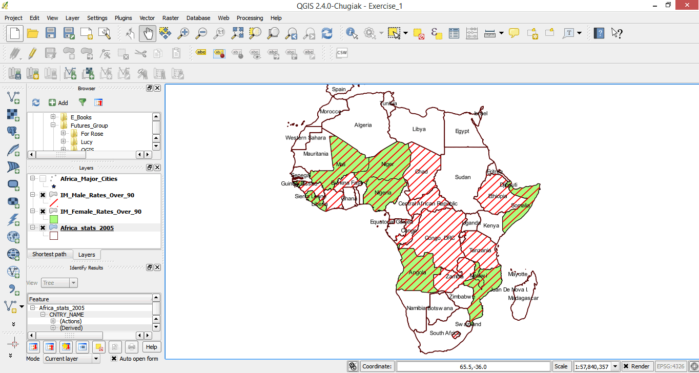
2.3.16 Symbolizing overlapping polygon features
When you look at your map, it is clear that both male and female infant mortality rates are high in some countries. It is not possible to tell which countries these are with the current system of symbols. We will now practice adding symbols to the map so that we can identify those countries where both values are high.
- In the layers panel, drag the IM_Female_Rates layer so that it is below the IM_Male_Rates layer.
- Double-click on the IM_Female_Rates layer to open up the properties dialog box. Change the color to a suitable color. Choose a light color and click OK to return to the map window.
- Right-click on the IM_Male Rates layer to open the properties dialog box.
- We will use a different symbol type so that the layers below are visible.
- Click on Simple Fill. In the Symbol Layer Type box, click the down arrow and select Line pattern fill.
- Change the distance units to 3.
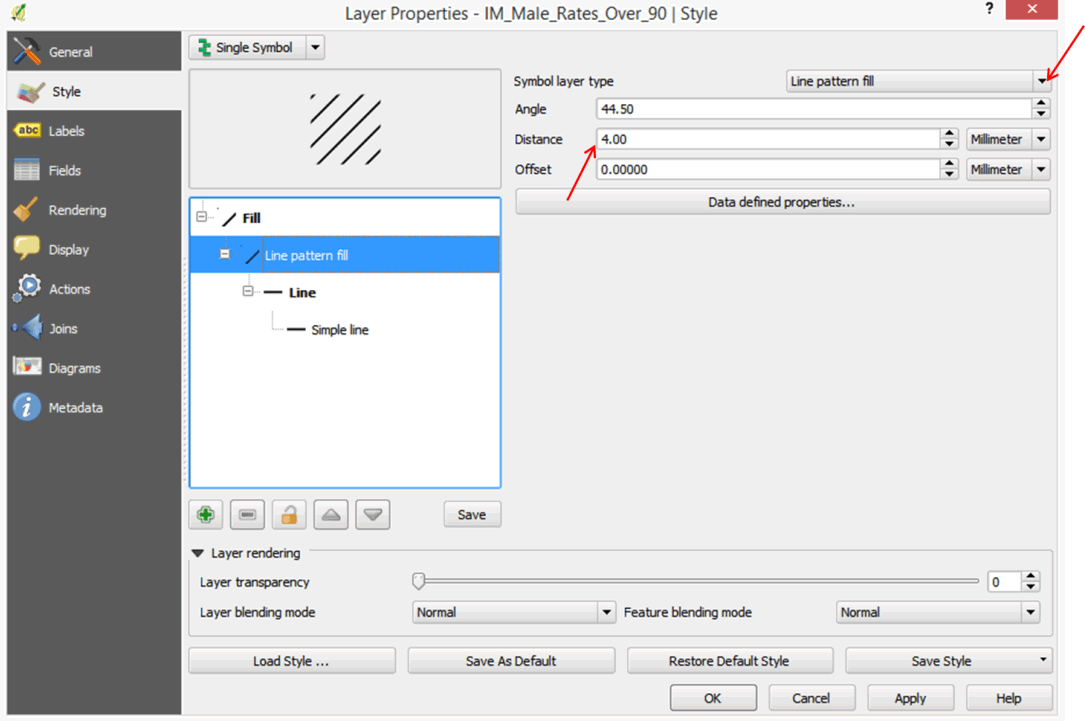
- Click on Simple line, click on Color, change the color to red, and click OK.
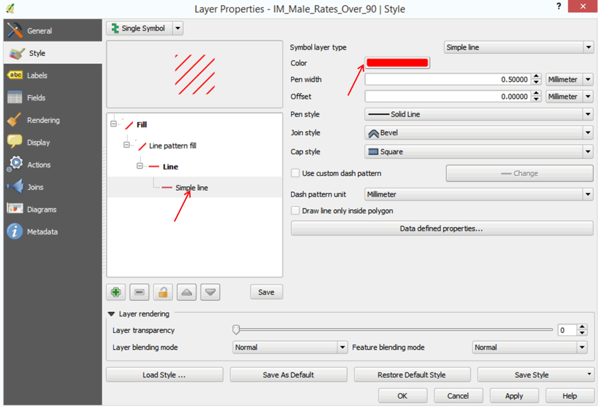
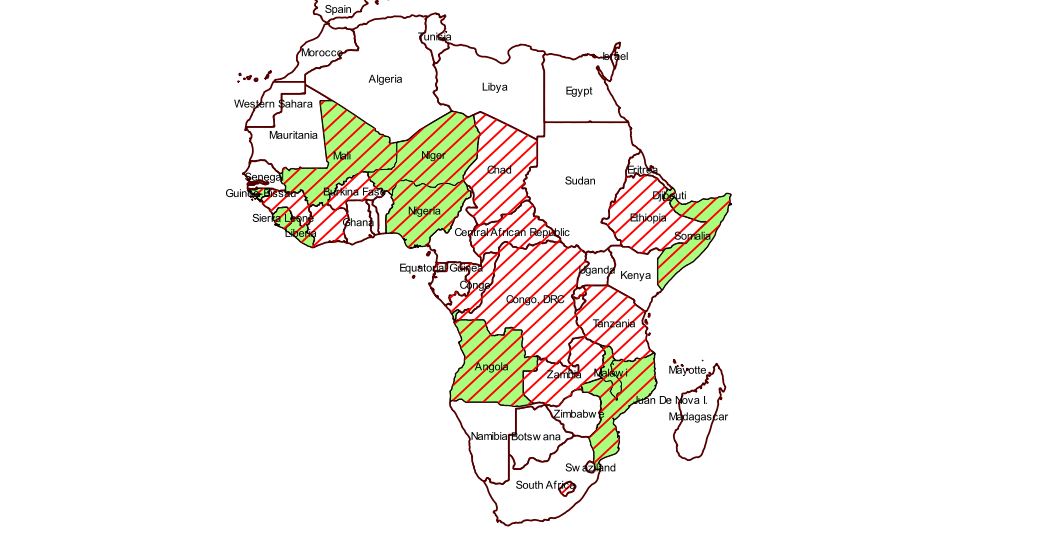
- Can you now tell which countries have high infant mortality rates for both males and females?
2.3.17 Labelling features
- We may not be familiar with all countries in Africa.
- We will label the countries with their names from the attribute table. What field do you think we will use to label the countries?
- Double-click on Africa_stats_2005 layer to open the Layer Properties dialog box.
- Click on Label in the left panel.
- In the dialog box that opens, click the Label this layer with box.
- Click on the down arrow in the list box and select CNTRY_NAME.
- Select a suitable font and size. You can change the font color if you wish.
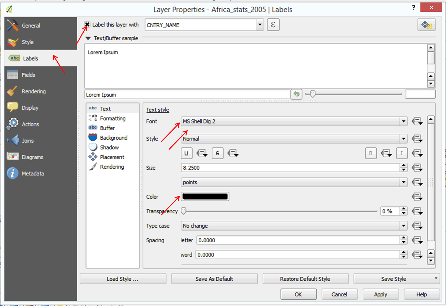
- Click Ok. Your map now has country labels.
- Study your map. What questions would you ask?
2.3.18 Exporting your map as a graphic
You can export your map as a graphic to use in a presentation or report. Please note that we would need to add other elements to our map (e.g., legend, text, etc.). We will learn more about this in a later exercise.
- On the menu bar, click on Project > Save as Image.
- Browse to the MyExercises folder and give the file a name of your choice.
- On the file type, you can change from .png to .jpg, .bmp, etc.
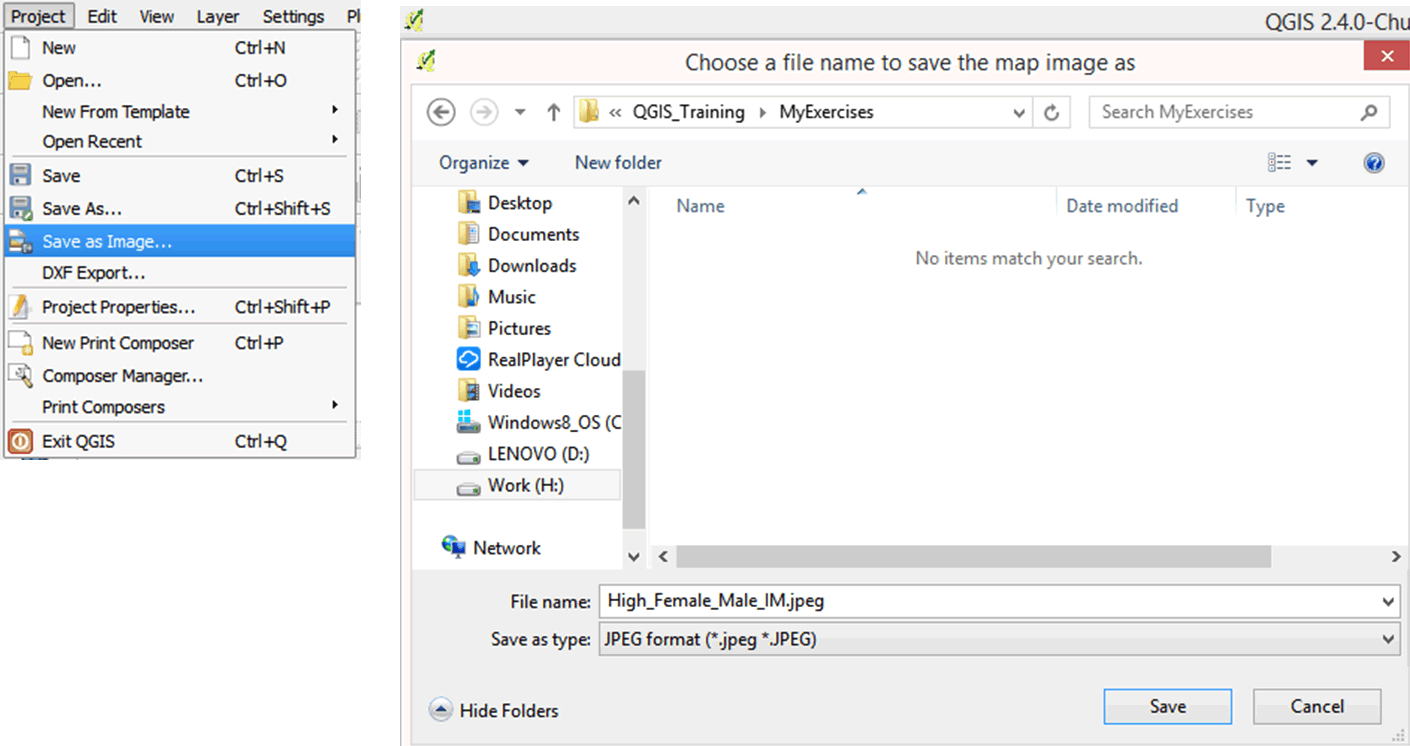
- Click OK.
- Open the file in your folder using a picture viewer.
- Save your project.
2.3.19 Practice exercises
- Select countries with AIDS cases over 10,000 (refer to select data using an expression).
- Save your selected data as a new layer and add it to your map. When done, be sure to deselect all selected maps.
- Add symbols to your new layer so that you have a map showing which countries in Africa have high numbers of AIDS cases.