GeoHealth Mapping GIS Training
for Monitoring and Evaluation or
Strategic Information Officers and Data Analysts for HIV

3.7. Density Mapping
Density maps are used to show the concentration of a variable within a given geographic radius. These maps—sometimes referred to as heat maps—use discrete data points to produce a smoothed, vibrant picture of existing clusters in your data, which appear as radii indicating various levels of magnitude. For example, if a program manager was interested in learning where female sex workers (FSW) access services at drop-in clinics (DICs), s/he could use density mapping to visualize which DICs see the most FSW visits versus those with lower patient volume. Depending on how the program manager chooses to classify the heat map, DICs with higher patient volumes may be surrounded by radii with more intense colors than DICs that are utilized less often.
Density maps can be created using either point or line data. They are represented using the Raster data model, whereby features are represented on a grid of square cells that are all the same size. While there are multiple methods of creating density maps, one of the most commonly used in health programming is kernel point density. In this method, the radii surrounding each point are based on a quadratic formula with the highest value of observations assumed to be at the center (the point location), then tapering to zero at the radius distance. Kernel density calculates a "magnitude per search radius" from a point using a kernel function1 to fit a smoothly tapered surface to each point.
Note that while density maps can show where clusters exist in your data, they do not indicate whether there are statistically significant differences between clusters. Further analyses are required to determine this information. For a more detailed exploration of the principles of geospatial analysis, please visit the following link: http://maps.unomaha.edu/Peterson/gisII/ESRImanuals/Ch3_Principles.pdf.
3.7.1 Objectives
- Create and interpret density maps
You will need the files for Section_3_7 to complete this module.
In this exercise, we will create a kernel density map (using point data) of areas with a high concentration of sex workers in Dhaka municipality. In QGIS, the heat map tool is used for density mapping of point data.
3.7.2 Launch QGIS and open an existing project
- Launch QGIS and open Exercise_3g.qgs in your exercise folder.
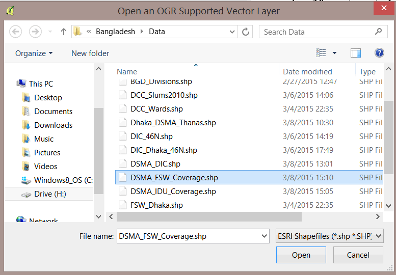
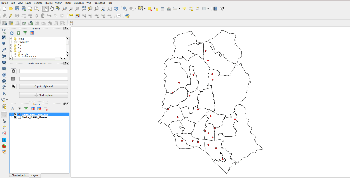
- Click the add vector button on your side bar, browse to the exercise data folder, and open DSMA_FSW_Coverage.shp.
- This layer contains the total number of female sex workers reached at drop-in centers.
3.7.3 Create a density map
- On the main menu, click on Raster > Heatmap > Heatmap to open the tool.
- In the dialog box that opens, ensure that DSMA_FSW_Coverage is the Input point layer.
- For Output raster, browse to the MyExercises folder and save the file as FSW_Heatmap.
- Enter 1500 as the search radius in the Radius field.
- Ensure that the Add generated file to map option is selected.
- Check the Advanced option box.
- Enter 50 for both Cell size X and Cell size Y.
- Select the Use weight from field option and select FSW_Total field from the pull-down menu.
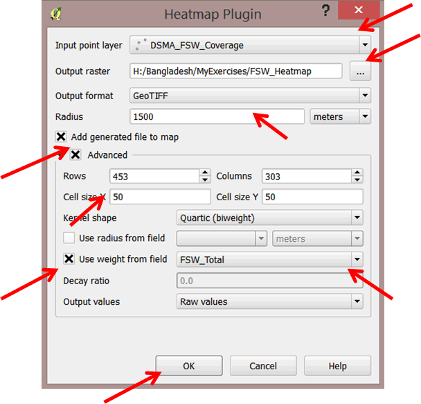
- Click OK to run the tool.
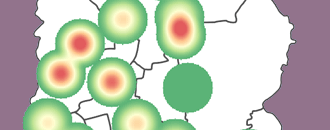
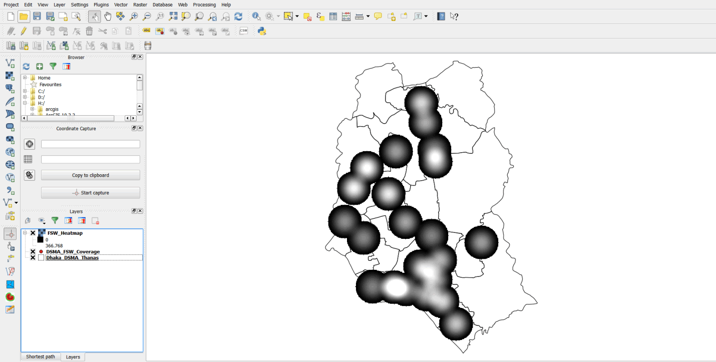
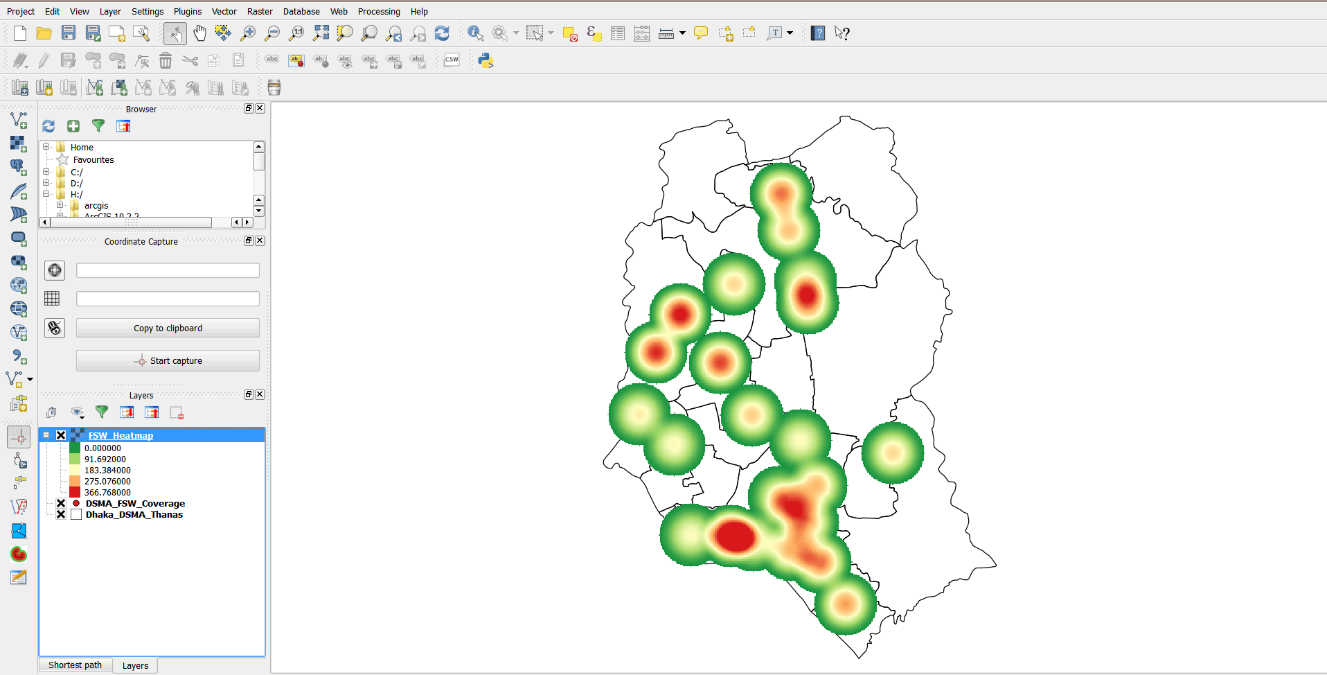
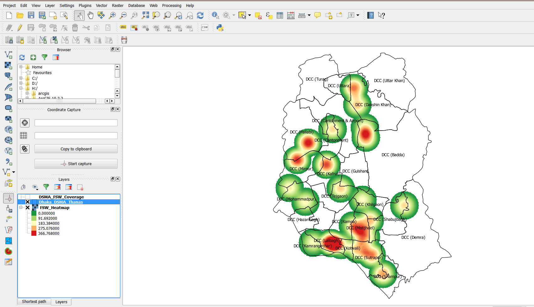
- Your map should resemble the graphic below.
- We will symbolize the density map to identify the "hotspots."
- Double-click on FSW_Heatmap to open the Layer Properties dialog box.
- Click on Style and select Singleband pseudocolor as the Render type.
- Select RdYlGn as the color and click on the Classify button.
- Select the Invert option. This will invert the colors so that areas of high density take the color red and areas of low clustering take the color green.
- Click on the Classify button again, then click Apply.
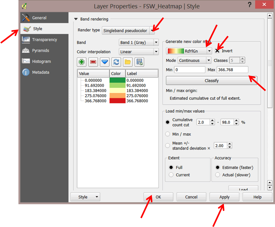
- Click OK to close the dialog box and view your map.
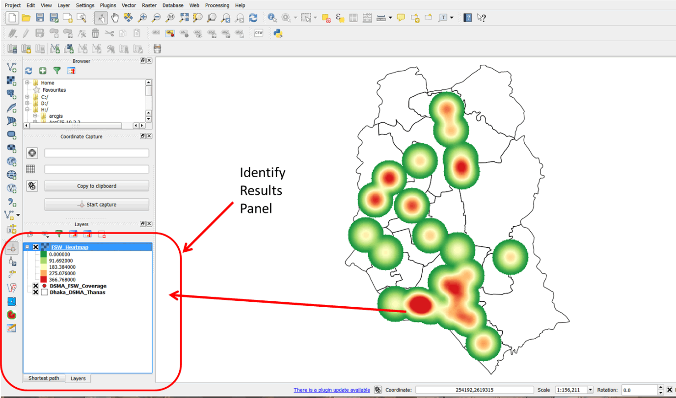
- The heatmap tool generated a raster surface based on the total number of FSWs. You can use the identify tool to see these values on the raster.
- On the main menu, click on the Identify Features buttonl
 .
. - Click inside any part of the raster surface. This opens an Identify Results panel on the left. The value at the point you clicked with the identify tool is displayed.
- Click on other parts of the raster and check the values.
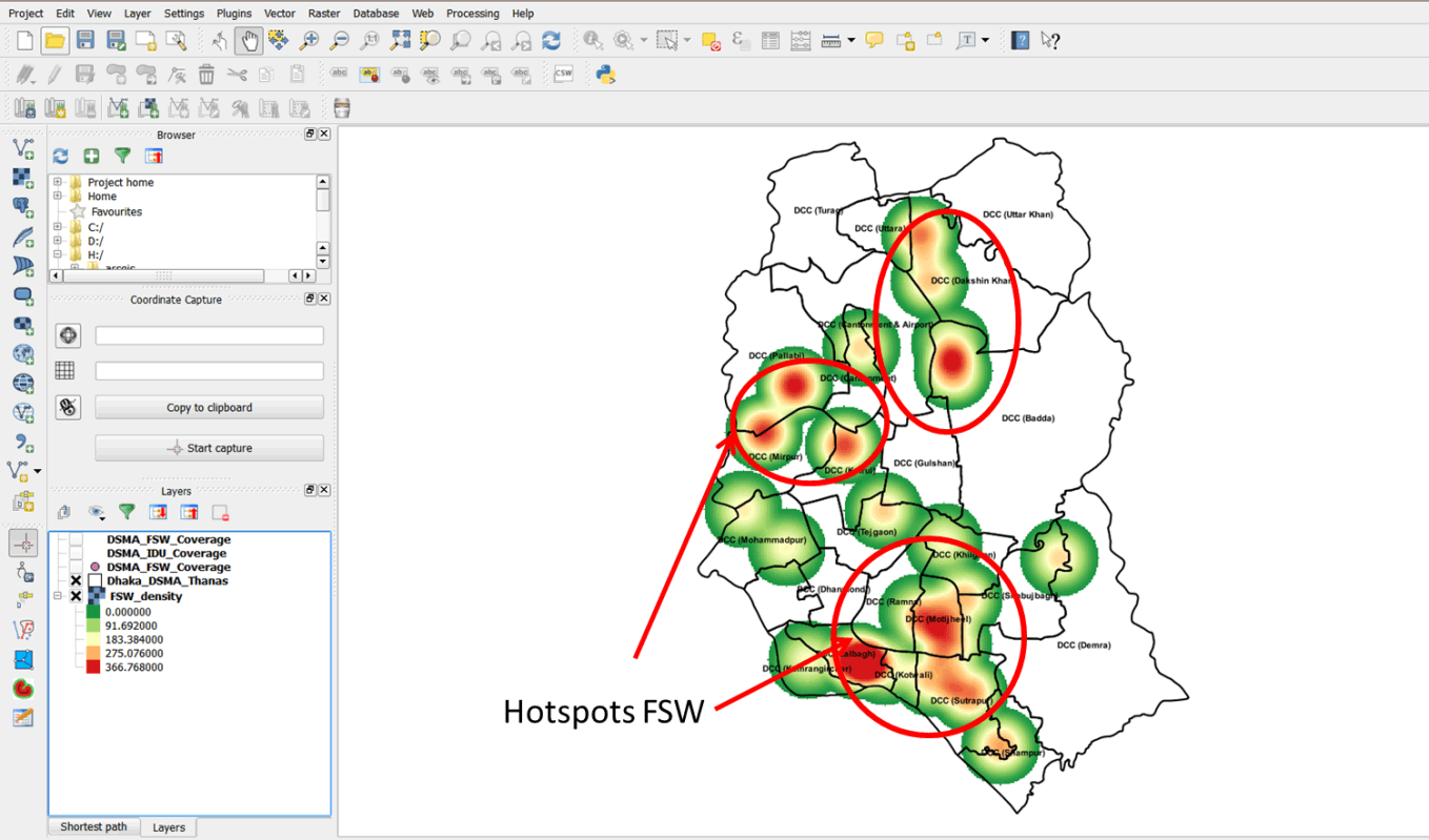
- The raster layer covered up the Thanas. We need to see the Thanas in which "hotspots" occur.
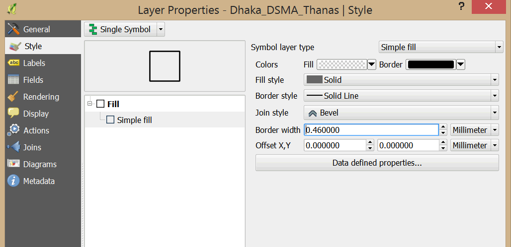
- Double-click Dhaka_DSMA_Thanas to open the Layer Properties dialog box.
- Under Style, change the Fill color to transparent fill. Increase the Border width to 0.46.
- Drag Dhaka_DSMA_Thanas layer above the heat map so that the heat map is visible below the Thanas.
- Potential "hotspots" areas are displayed.
- Next add Thana labels to your map. Double-click on Dhaka_DSMA_Thanas and select Labels on the left.
- Enable the Label this layer option and select UPAZILA as your label field.
- Under Text style, Select Arial for Font and Bold for Style and reduce the Size to 6.25
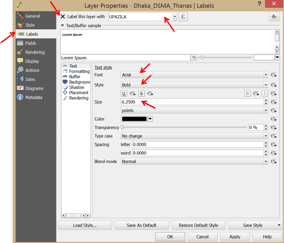 .
. - Click OK to close the dialog box.
- In which Thanas do hotspots occur?
- Save your project as Exercise_4g in the MyExercises folder.
3.7.4 Planning program interventions
- We now know the potential hotspots for FSWs in Dhaka municipality. For planning purposes, we will use proportional symbols to symbolize the total number of FSWs reached at the DICs.
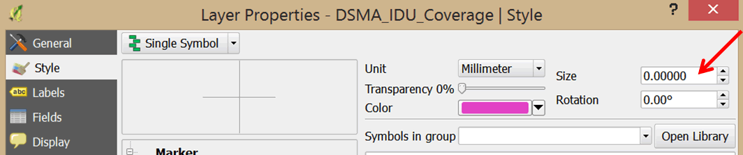
- Double-click on DSMA_FSU_Coverage to open the Layer Properties dialog box.
- Click on Style and set the symbol Size to 0.
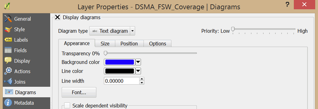
- Click on Diagrams and check the Display diagrams option.
- Click on the Appearance tab and set the Background color to blue.
- Click on Font and select Arial, Bold, size 7.
- Click on the Size tab and deselect Fixed size.
- For Attribute, select FSW_Total, and click Find maximum value. Next, type 8 into the Size box.
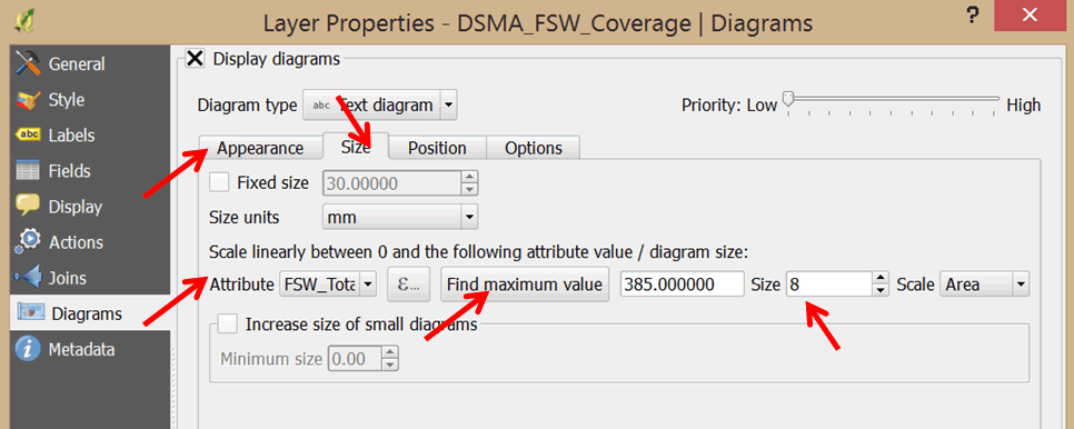
- Under Available attributes, select FSW_Total and click on the green plus sign to add it to the Assigned attributes. This will add labels to your proportional symbols. Change the color to white.

- Click OK to close the dialog box.
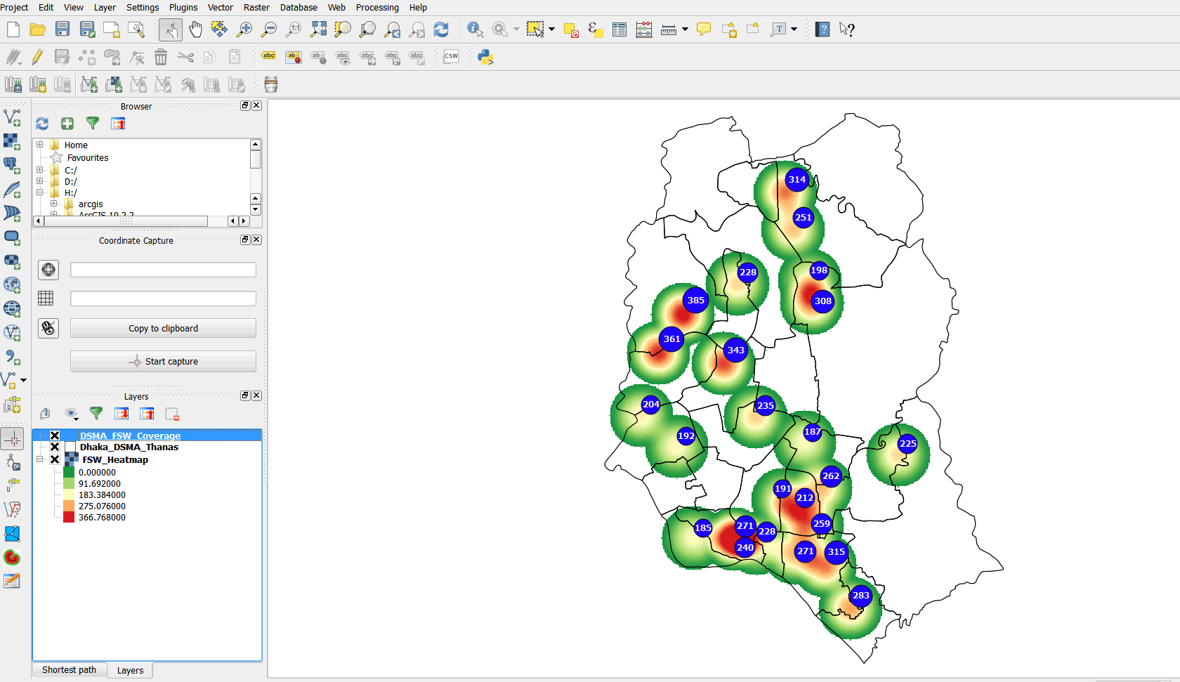
- Study your map. What interventions can you plan for?
- Create a map layout and export your map to .jpg format (Refer to Section 3.1.10).
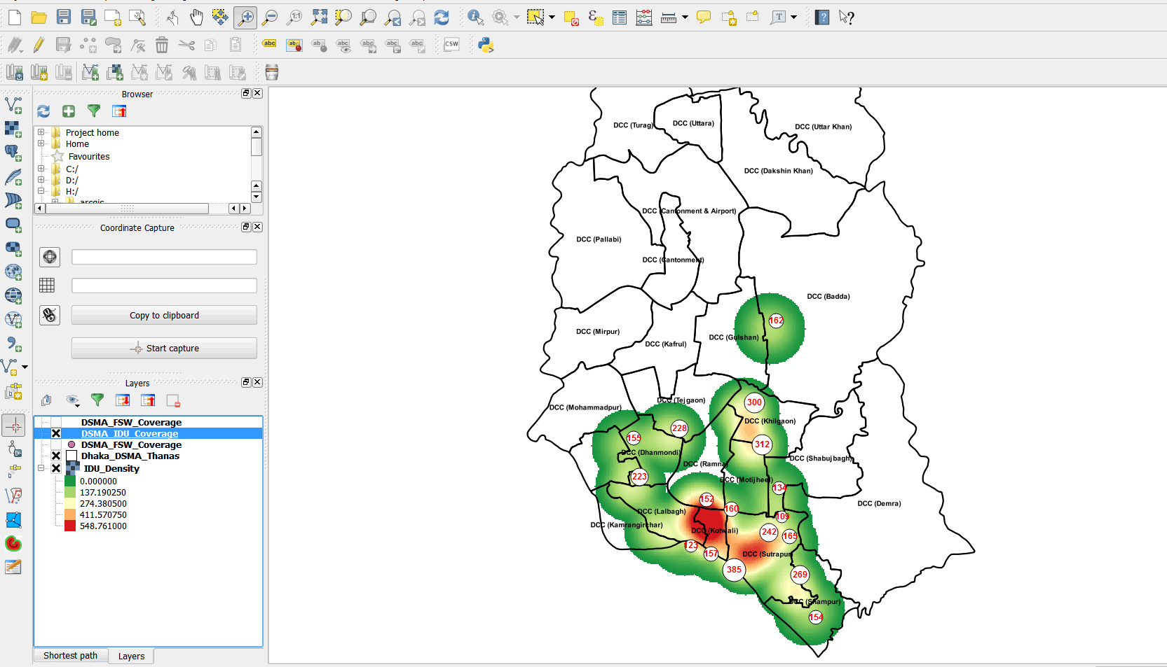
- Repeat the same process with the DSMA_IDU_Coverage layer and create a heat map. Your final map should resemble the graphic below.
- Prepare a PowerPoint presentation of your map and recommended interventions.