GeoHealth Mapping GIS Training
for Monitoring and Evaluation or
Strategic Information Officers and Data Analysts for HIV

3.1. Preparing Spatial and Tabular Data
3.1.1 Background
In order to map data, it must be geographic. Most health data are stored in databases, often in a non-geographic format, so a geographic identifier is needed to make data geographic. Geographic identifiers can include administrative boundaries (such as for districts), towns, street addresses, or latitudinal and longitudinal coordinates.
3.1.2 Objectives
- Learn how to prepare spatial and tabular data
- Learn how to map data from an Excel file
- Learn how to classify quantitative and qualitative data
- Create a professional map layout
You will need the files for Section_3_1 to complete this module.
In this exercise, we will demonstrate how to prepare data to map HIV variation at antenatal clinics (ANC) in Rwanda. Using non-geographic data in Excel format, aggregated by district, we will prepare and map the data using the following steps:
- Process the data in a format that can be used in QGIS
- Import the data into QGIS
- Join (link) the data to sector administrative boundaries of Rwanda
- Map HIV variation using the most and least method
- Choose a classification scheme
- Present results in a professional map layout
3.1.3 Start QGIS and open an existing project
- Launch QGIS; on the main menu, click on Project > Open.
- Navigate to your exercise folder and open Exercise_3a.qgs.
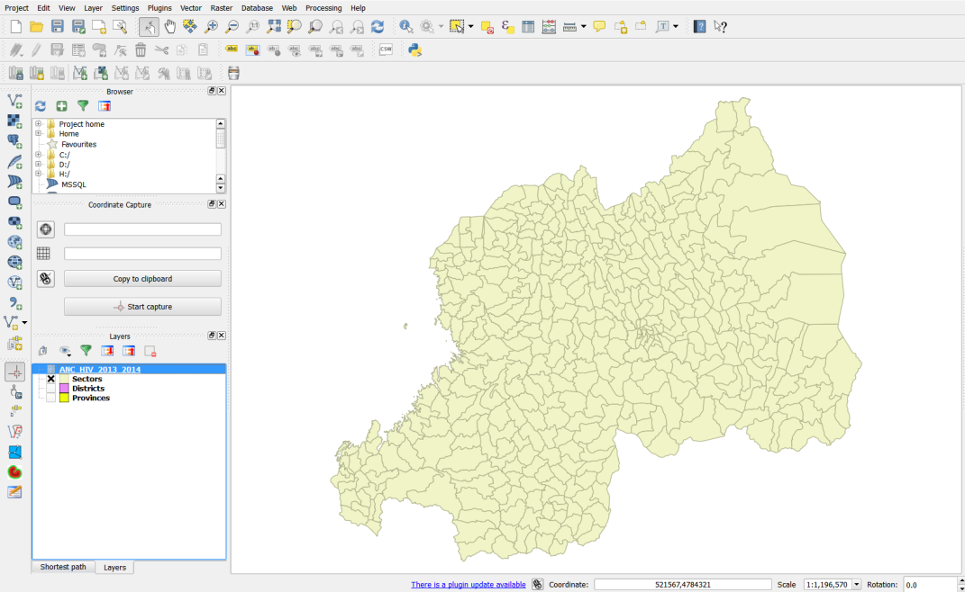
- A map document will open to display sectors of Rwanda. Sectors are the fourth administrative level boundaries.
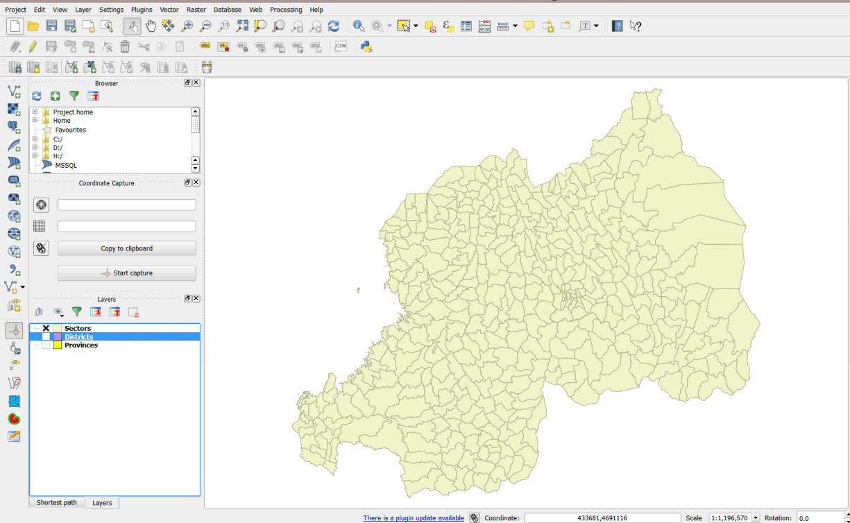
- Right click on the sectors layer and select open attribute table.
- You will notice that the attribute table contains only data on the administrative districts, with no data on HIV positivity. The HIV data is contained in an Excel file, which must be imported into QGIS. In order to do this, we must first convert the Excel file into a comma delimited file (.csv), the format recognized by QGIS.
3.1.4 Convert Excel file to .csv
- In Windows Explorer, browse to your exercise_data folder.
- Open ANC_HIV_2013_2014.xlsx. This is a file on HIV testing at ANC clinics, aggregated by sector.
- Click on File > Save As. Save the new file as District_EC3.csv.
- Change the Save As type from Excel Workbook to CSV by clicking on the down arrow and selecting CSV.
- Navigate to MyExercises\Data and save the file in the folder.
- Click Yes on the next dialog box, which confirms you want to use the CSV format.
- Close the file and exit Excel.
3.1.5 Load CSV file in QGIS
- Click on Layer on the main menu.
- Click on Add Layer > Add Delimited Text Layer.
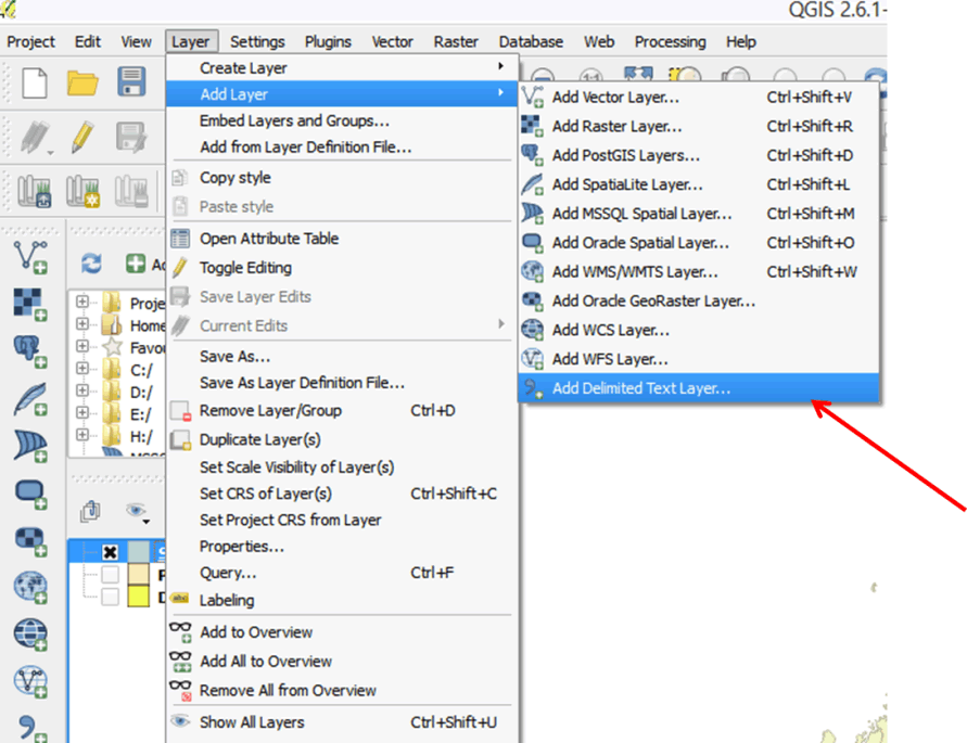
- In the dialog box that opens, browse to MyExercises and select the CSV file you just saved: District_EC3.csv.
- For File format select CSV and for Geometry definition select No geometry (attribute only table).
- Click Ok.
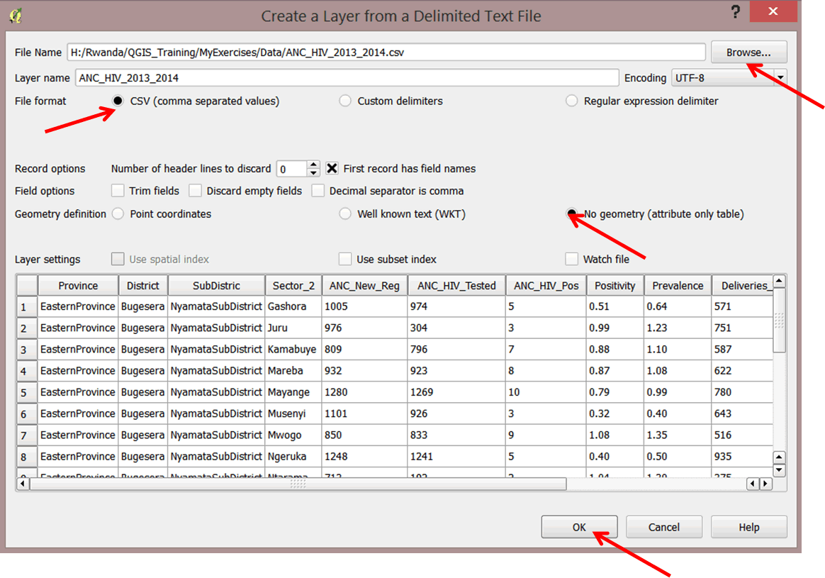
- The CSV file has been added to your layer panel.
- Right-click ANC_HIV_2013 and open the attribute table to familiarize yourself with the data.
- Close the attribute table.
3.1.6 Link non-geographic data with geographic data
In order to map the HIV data, we must link it to the Eastern Cape district boundaries. We will use the advanced table tools in QGIS to join these data; this is often referred to as 'a join'. Once we complete the join, we can save resulting output as a new shapefile.
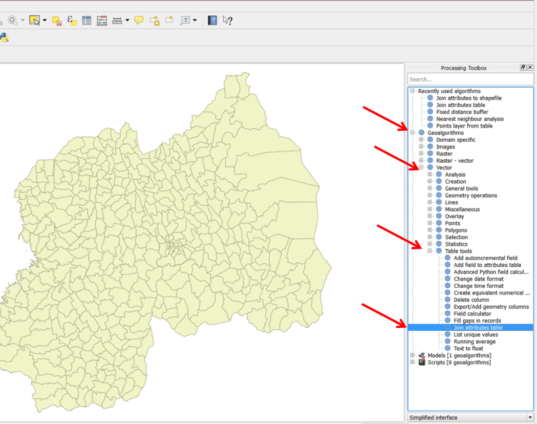
3.1.7 Load QGIS Processing Toolbox
The QGIS Processing Toolbox is used to run various algorithms for different purposes. The table tools can be found in the Processing Toolbox. We will access the tools and run the Join Attribute Tables algorithm.
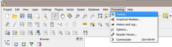
- On the main menu, select Processing > Toolbox.
- The Processing Toolbox automatically snaps to your right panel.
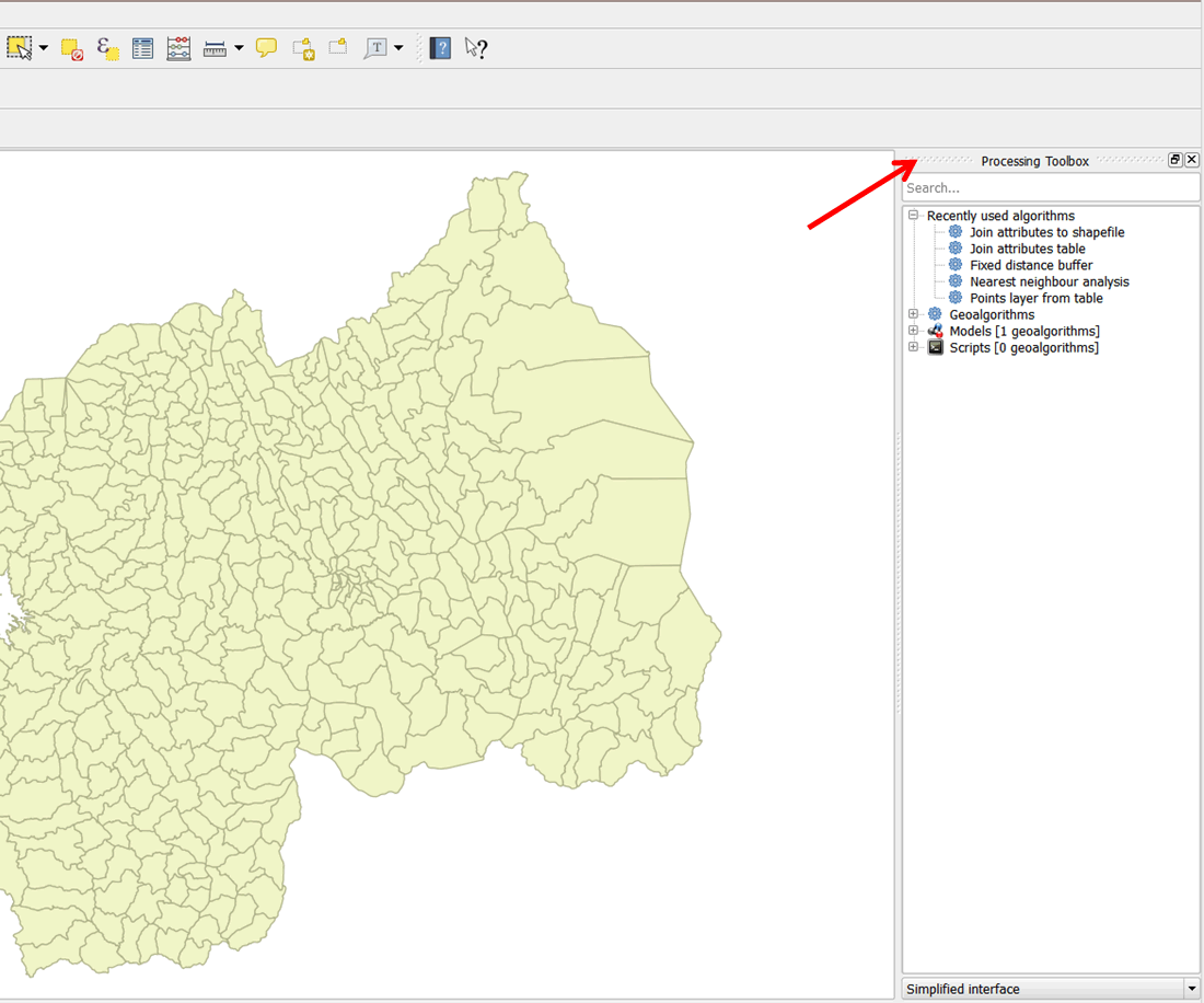
- Expand Geoalgorithms, then expand Vector followed by Table tools.
- From the listed table tools, double-click on the Join Attribute Tables tool to open it (see below).
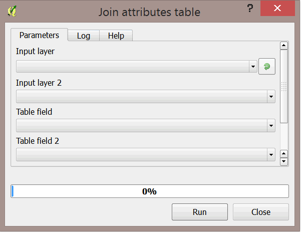
- The Join attribute tables dialog box opens up.
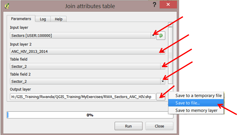
- We will join the attributes ANC_HIV_2013_2014 to the sectors layer and create a new shapefile. The input layer in this case will be the sectors layer (the layer to which you will join attributes). Input layer 2 will be ANC_HIV_2013_2014 (the join table).
- Select Sectors for Input layer and ANC_HIV_2013_2014 as Input layer 2.
- Select Sector_2 as the Table field. This field is from the districts layer.
- Select Sector_2 as Table field 2. This field is from the .csv file.
- For output layer, click on the browse button. In the sub-menu that opens, select Save to file.
- Save the file in MyExercises folder as RWA_Sectors_ANC_HIV.shp.
- Click on Run to run the tool.
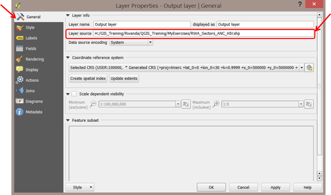
- Your layer has been added to your map document as Joined Layer (Output Layer in previous versions). Please note this is just an "alias" name. The layer is still RWA_Sectors_ANC_HIV.shp.
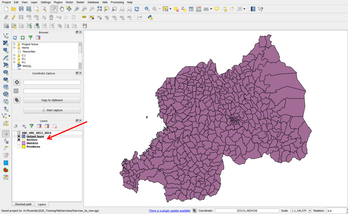
- To cross-check that your layer was saved in the MyExercises folder, double-click on Output layer, click on the General tab, and check on the path in the Layer source. Close the properties dialog box when done.
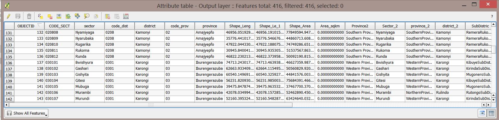
- Open the Output layer attribute table, scroll right, and scroll through the data. The HIV data has been joined to the districts layer.
- Close the attribute table.
- Save your map as Exercise_3a.qgs in the MyExercises folder.
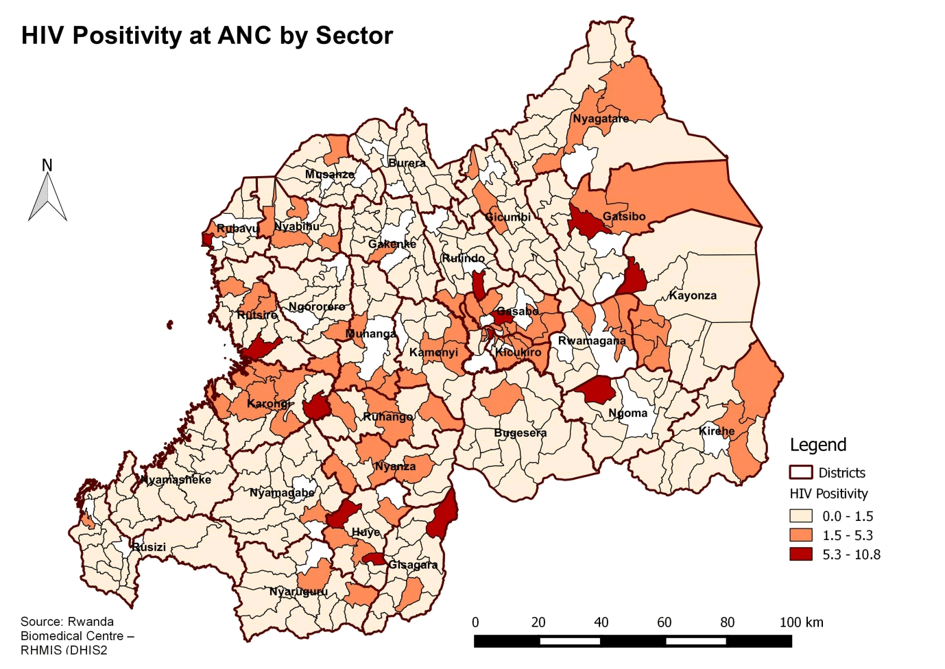
3.1.8 Create a choropleth map of HIV variance at ANC
Mapping the greatest and least values involves mapping features based on quantities. These quantities can relate to discrete data, continuous data, or data summarized by area. In our case, HIV data is aggregated at sector administrative level. It can be mapped using classes to show variations in quantities across the districts. Such maps are commonly referred to as choropleth maps or area maps.
Classes can be created manually or using standard classification schemes. The choice of scheme depends on data value distribution and the purpose of your map. Manual classification can be used to look for specific criteria or thresholds in your data, and when you understand the data well. Commonly used standard classification schemes include
- Natural breaks (Jenks): creates classes based on natural groupings of data
- Quantile: each class contains an equal number of features
- Equal Interval: creates classes of equal intervals
- Standard Deviation: creates classes based on the extent to which values vary from the mean
- Right-click on the .csv file and remove it from the map document. Turn off the sectors layer by clicking on the box next to the layer name.
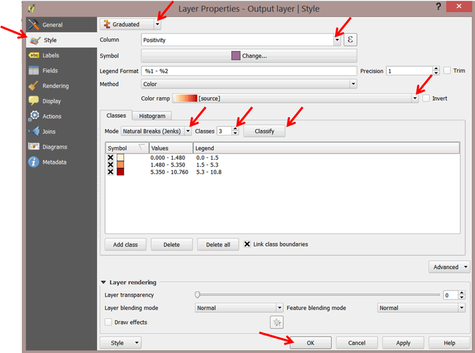
- Double-click on Output layer to open the properties dialog box.
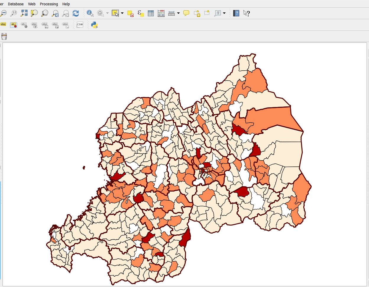
- Click on Style in the left panel. Select Graduated symbol from the pull down menu. For the classification field, select Positivity. Change the Classes from 5 to 3 and select Natural Breaks as the classification Mode.
- Select a Color ramp.
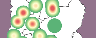
- Click Classify, then click OK. Refer to the graphic below.
- We would like to view data within a higher administrative level.
- There are two administrative layers files in your layer panel, for districts and provinces.
- Turn on the Districts layer and drag it above the Output layer (the Output layer will no longer be visible). To make it visible, we will need to change the properties of the Districts layer.
- Double-click on the Districts layer to open the Layer Properties dialog box.
- Click on Style > Simple fill.
- Click on Fill and select Transparent fill.
- Click on Border to change the color of the border outline.
- Select a brown color, or a color of your choice, and click OK.
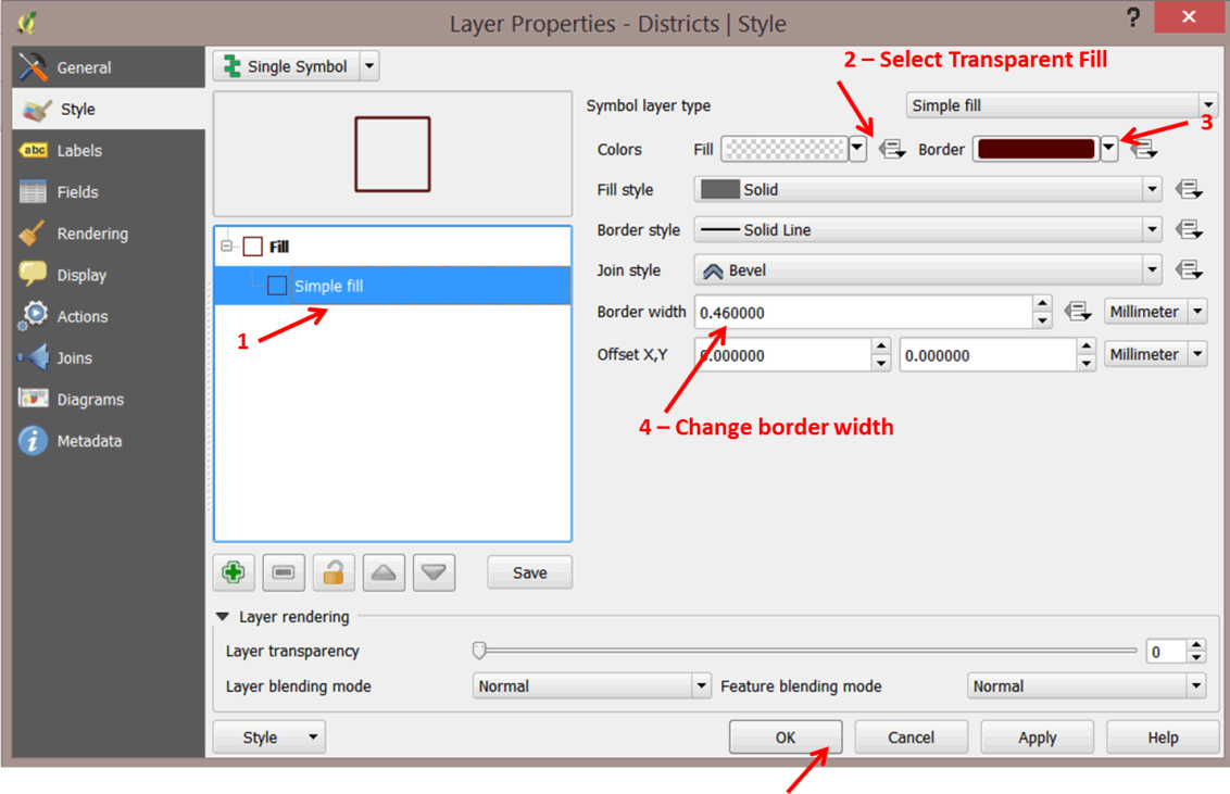
- Change the Border width to 0.50000 by clicking on the up arrow next to the border width box. Click OK. The output layer showing HIV positivity will be visible beneath the districts layer.
- Remember to save your project.
3.1.9 Create a professional map layout
So far, we have worked with different tools in QGIS to process, visualize, and obtain results from data. The results make sense to us because we know what the data portrays. How do we communicate these results to an external audience?
Spatial information is communicated to external audiences either in the form of printed or digital maps; supplementary and explanatory information can be used to make the maps meaningful and easily understood. A good map must have a minimum of five basic elements to be meaningful, although additional information can be added depending on the audience:
- Map title: Informs the user of the topic being visualized
- Map legend: Serves as a decoder of all colors and symbols used in the map
- Map scale: Establishes a relationship between distance on the map and a corresponding distance in the real world for the area depicted in the map
- North Arrow: Establishes directional orientation
- Bibliographic data: Details source(s) of data, when the map was created, who created the map, etc.
The print composer in QGIS provides tools to design your map with these additional elements. We will learn how to do this in the next steps.
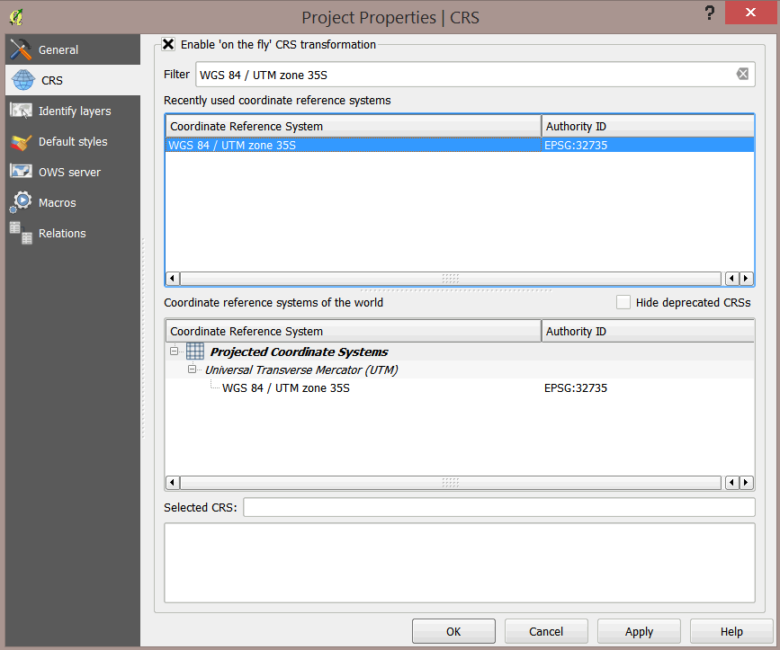
Before you begin, however, first change the project CRS properties. Our map units are currently in degrees (longitude, latitude), but we would like them to display in meters.
- On the main menu, select Project > Project Properties. This opens up the Project Properties dialog box.
- Select CRS and select Enable 'on the fly' CRS transformation.
- Type WGS 84 / UTM zone 35S in the Filter box. The CRS will appear in the list box. Select the CRS and click OK
 .
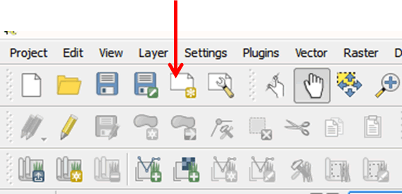
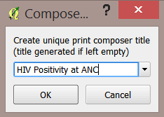
. - To create a map, click on the New Print Composer button on the main menu.
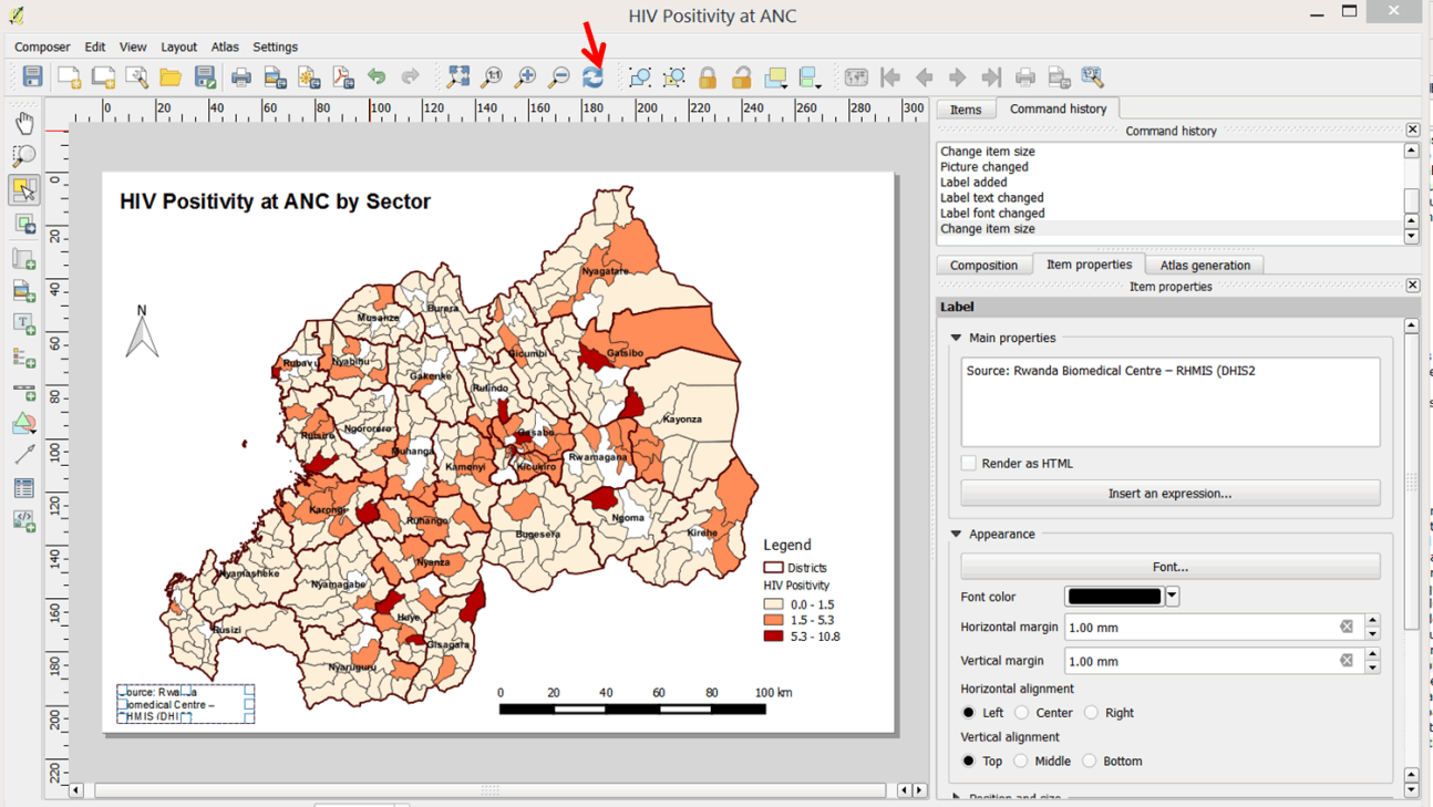
- In the composer title box, type HIV Positivity at ANC and click OK.
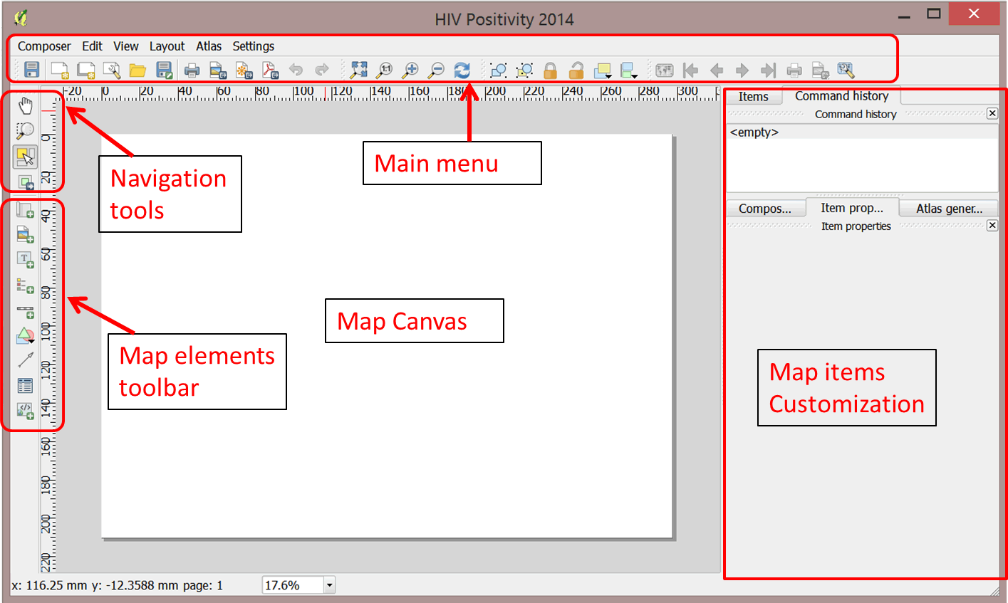
- A map composer window will open.
- The map composer includes
- Map canvas
- Main menu
- Map elements toolbar
- Navigation buttons
- Map item properties (customization tools)
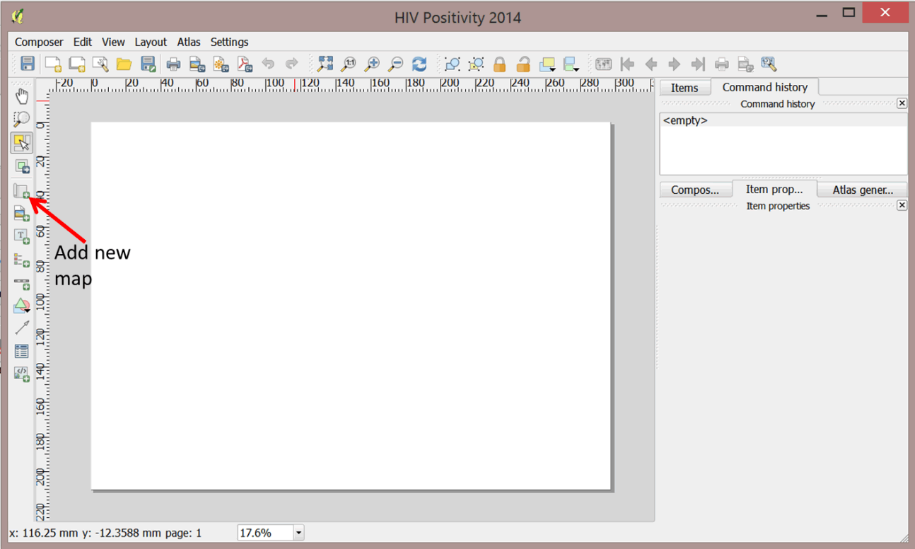
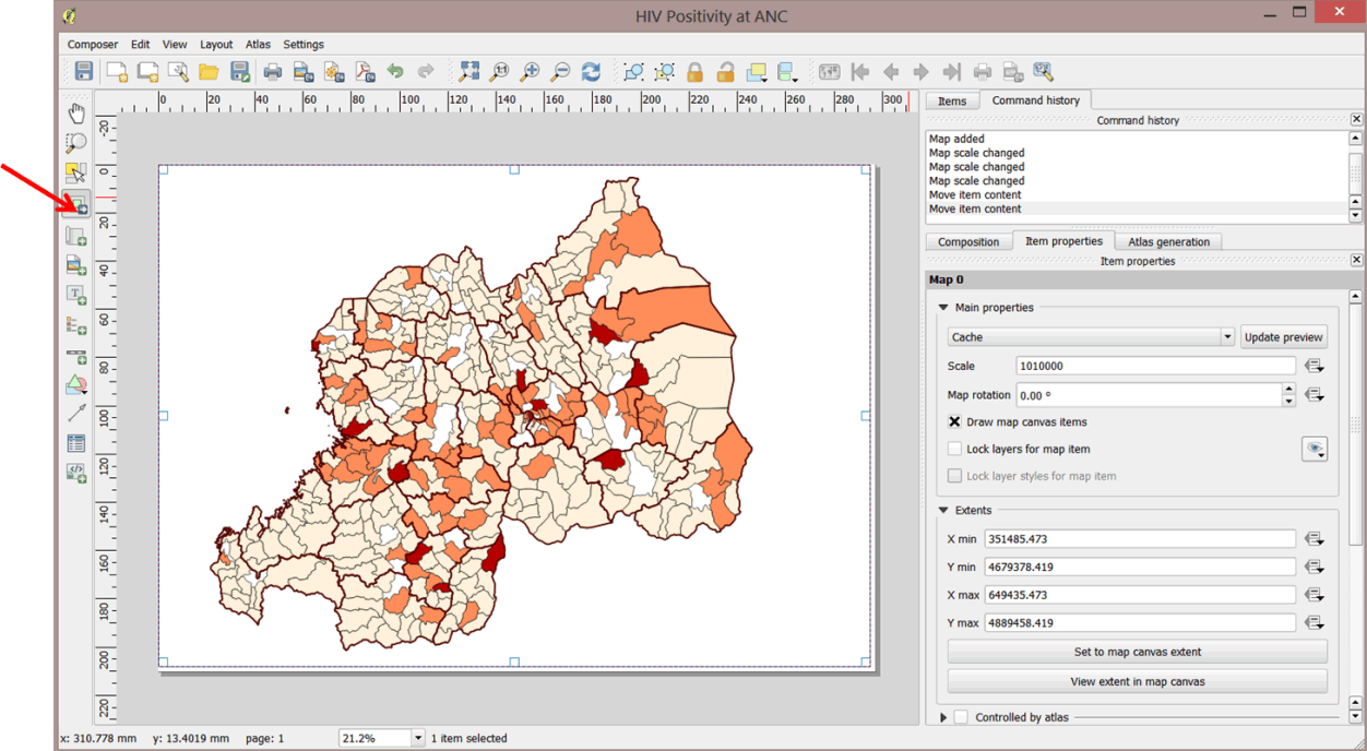
- The first map element we need to add is the map itself. On the side toolbar, click on the Add new map button.
- To indicate the area of the map canvas where you would like to place the map, left-click in the upper-left corner of the canvas. Drag the cursor to the lower-right corner in order to draw a box that occupies the entire map canvas. Release your mouse.
- You map is now displayed in the map composer.
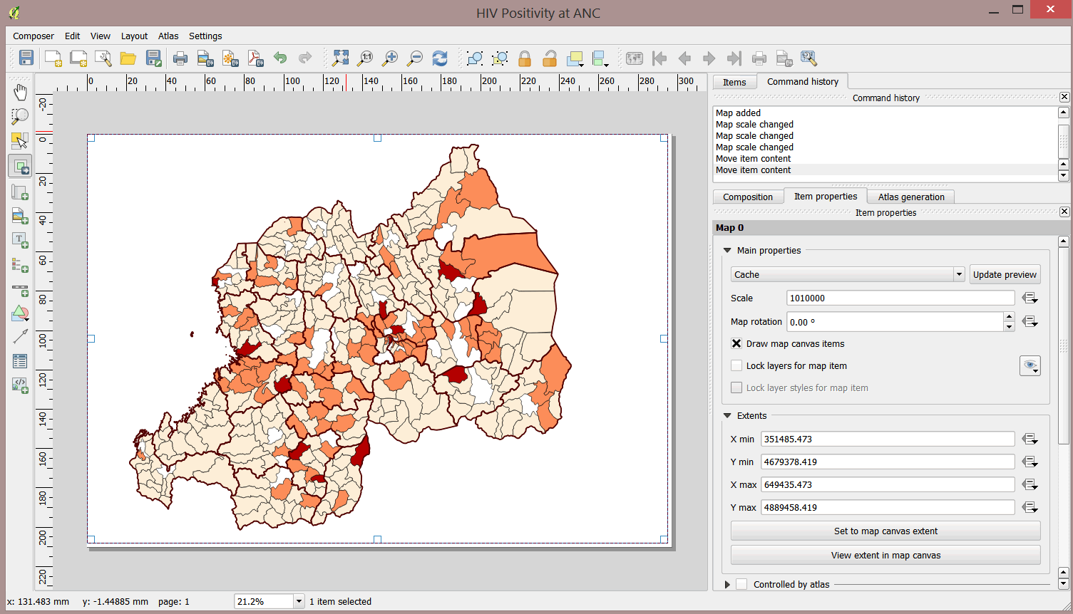
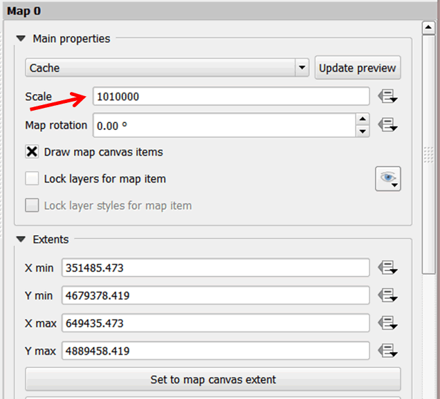
- You can make the map larger or smaller by decreasing or increasing the denominator in the Scale box in the item properties.
- Use the Move item content button on your left panel to move the map in the composer to create space for other cartographic elements like the legend, title, etc.
- To add a title to your map, click on the Add new label button on the left panel. Click and drag to add a text box to an empty space at the top of your map.
- A title will appear on your map, with the default text QGIS.
- Change the title by typing in the item properties panel on the right. Replace QGIS with HIV Positivity at ANC by Sector.
- Change the font size and type to an appropriate size by clicking on the Font button. You should see the changes on your map composer. Drag on the handles of the text box to make it larger.
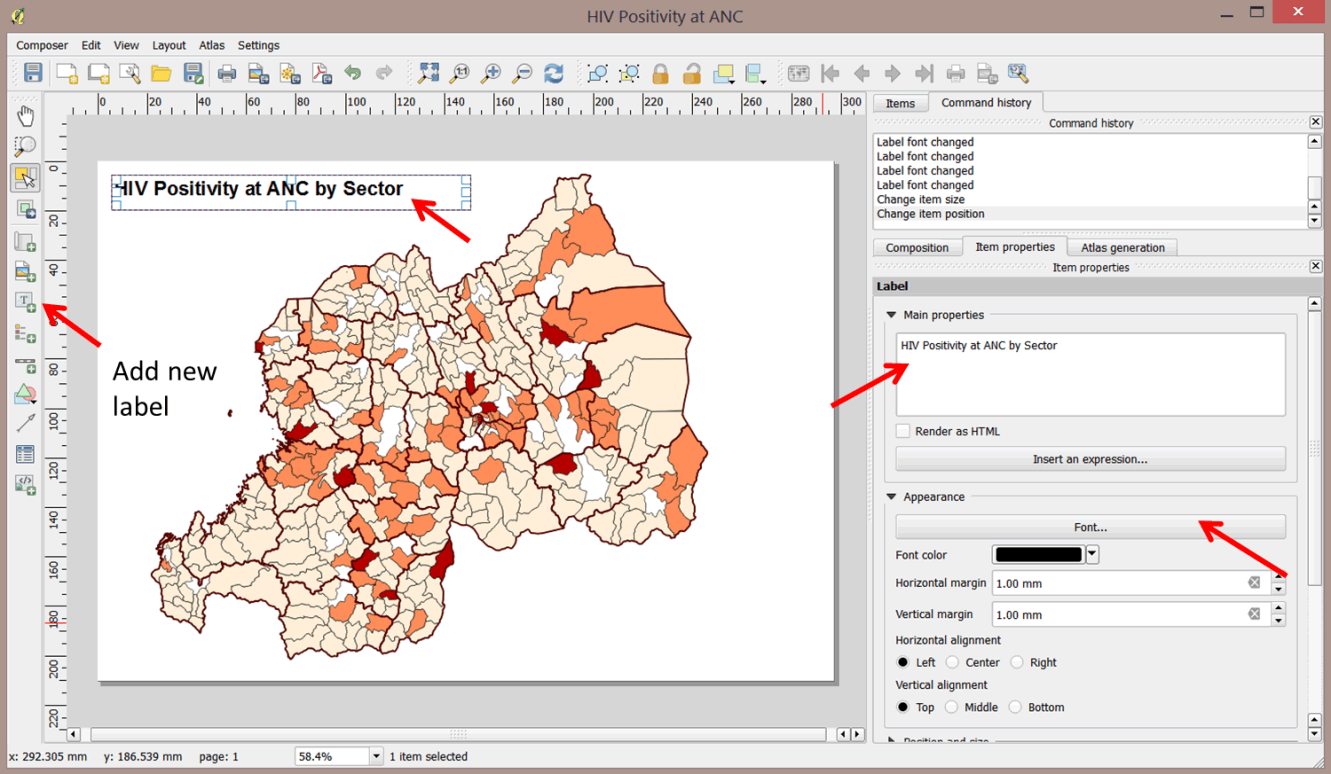
- You can move the title to an appropriate position by dragging it.
- To align the title in the title box, select your preferred Horizontal alignment and Vertical alignment option in the Appearance section.
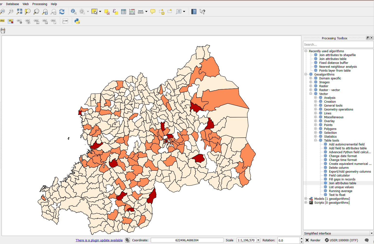
- Next, we will add a legend to the map. Click the Add new legend button on the left panel and click in an empty space in your map composer. Your map should look like the graphic below.
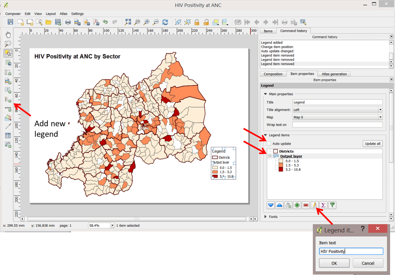
- The legend has been added to your map. You can change the labels on the legend to be more descriptive.
- Uncheck the Auto update button in the legend properties to enable editing of legend items.
- Click on Output layer in the legend items on the right panel. Next, click on the
 edit button as shown above and change the item text to HIV Positivity.
 - To remove any unnecessary layers from your legend, click on the layer and then on the red 'minus' button on the legend tools.
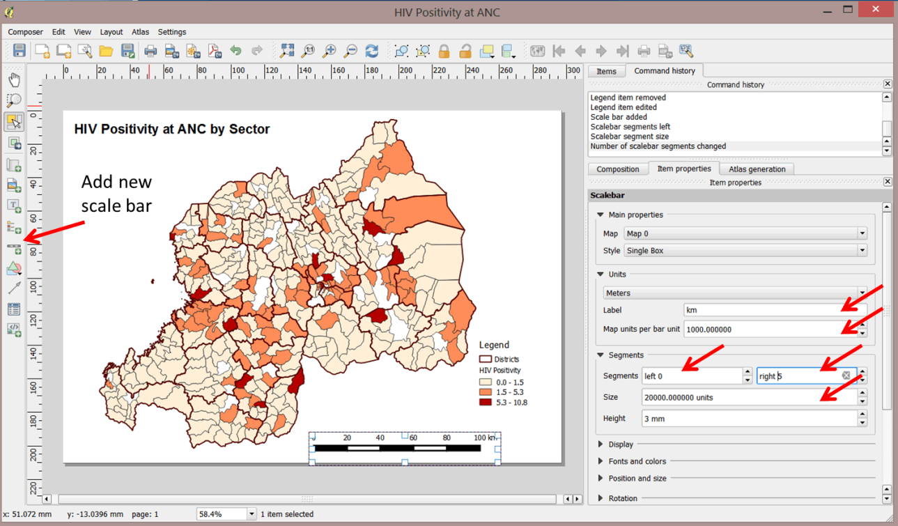
- Next we will add a scale bar. Click on Add new scale bar on your left panel.
- Click on an empty space at the bottom of your map. The scale bar is now added.
- Change the scale item properties so that it is representative of the scale of the map on the ground.
- Under Units select Meters and change the label to km. Type 1000 for map units per bar to represent meters in kilometers.
- Under Segments select 0 for left segments and 4 for right sements.
- Set the segment Size to 20000. Each segment will represent 20km on the ground.
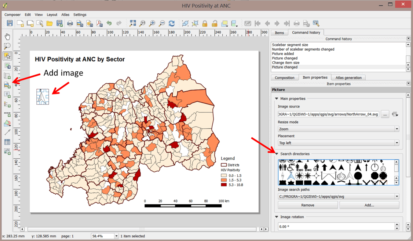
- Next, add the north arrow.
- Click on the Add image button and drag a box to an empty space on your map canvas.
- In the item properties, click on Search directory to display available icons.
- Select a suitable north arrow graphic. The arrow will display in the image box.
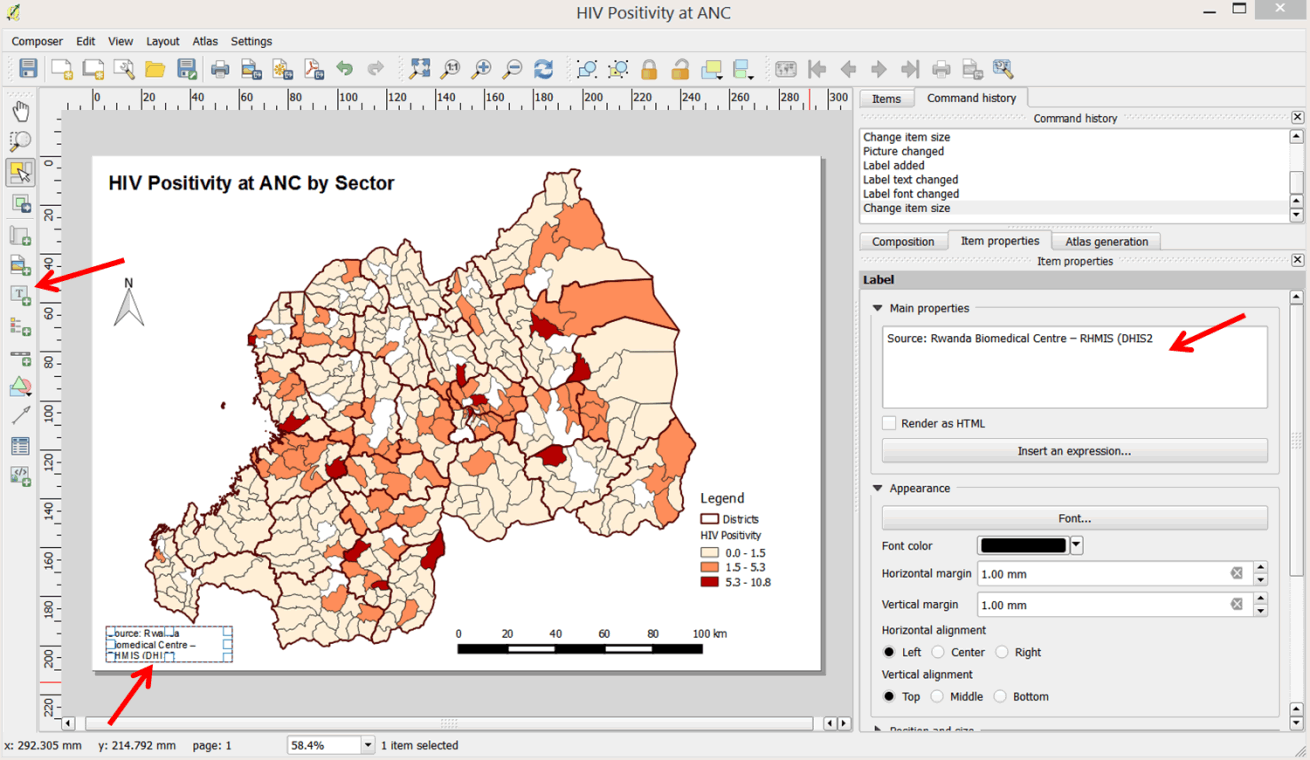
- Finally, add a bibliography to indicate source(s) of data.
- Click the Add new label button; click and drag to an empty space at the bottom of your map.
- In the item properties panel, type Source: Rwanda Biomedical Centre – RHMIS (DHIS2). Drag the handles of the text box to enlarge it so that all text is visible. Save your project.
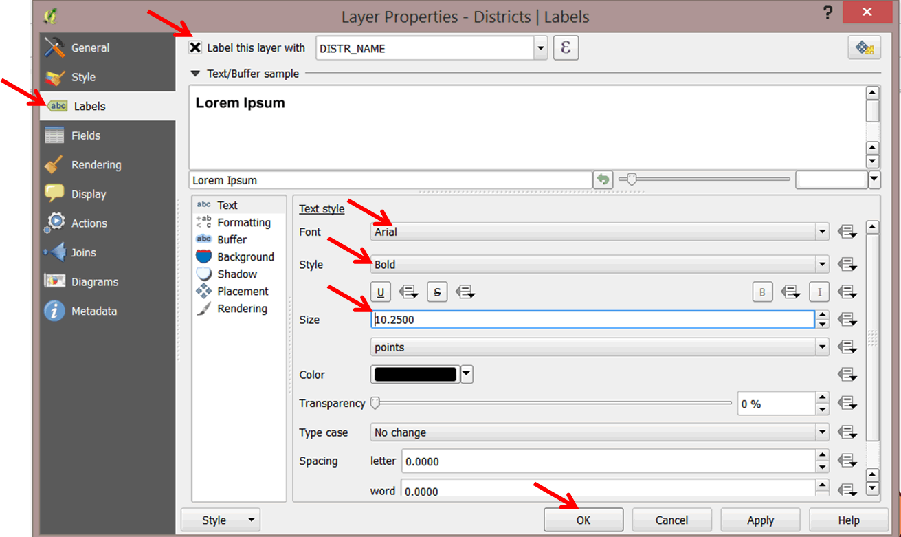
- Our map is still not complete. It would be difficult for someone to tell which districts are displayed on the map, so we will label them with their names.
- In your main map document, double-click on the Districts layer to open up the Layer Properties dialog box.
- Select Labels and select DISTR_NAME as the label field. Change the font as appropriate and click OK.
- Go back to your map canvas and click on the refresh button
 to see the changes.
3.1.10 Export the map for publication
- Your map is ready for dissemination!
- Save your map for publication by exporting it as an image. There are three options to choose from: Export as image, Export as SVG (scalable vector graphics), and Export as PDF (see below).
- Click the Export as image option.
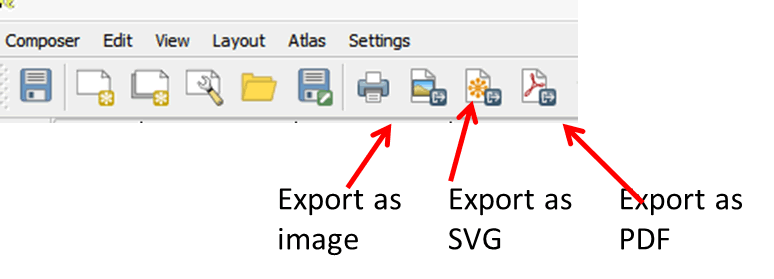
- You have three formats to choose from: .bmp, .jpg, and .png. We will save in each format so you can see the difference. Save your maps in the MyExercise folder as
- RWA_HIV_ANC_Positivitymap.bmp
- RWA_HIV_ANC_Positivitymap.jpg
- RWA_HIV_ANC_Positivitymap.png
- BMP is a high resolution, device-independent bitmap (raster) format.
- JPG is a file format designed to store compressed versions of photographs and other raster images. The compression methods employed can result in some loss of information with respect to the original image.
- PNG is another file format for storing compressed versions of photographs and other raster graphics, but the compression method used does not result in a loss of data with respect to the original images.
- Save your QGIS project.
- Your map is ready for use in a PowerPoint presentation or report.