GeoHealth Mapping GIS Training
for Monitoring and Evaluation or
Strategic Information Officers and Data Analysts for HIV

3.3. Mapping Multiple Indicators
Maps are a powerful data visualization tool that allow us to examine spatial patterns that may not be apparent when viewing the same data in a table or chart. They also allow layering of information, revealing relationships between multiple and otherwise disparate data sources.
3.3.1 Objectives
- Summarize program data using pivot tables
- Create polygon centroids
- Create a map of multiple indicators
- Symbolize data using proportional symbols
You will need the files for Section_3_3 to complete this module.
One indicator used to measure program performance is the number of patients newly enrolled on pre-antiretroviral therapy (pre-ART). In this exercise, we will work with ART data to prepare a map comparing program performance with prevalence.
3.3.2 Summarizing program data
The program data needed for this exercise is in Excel and was collected at health facilities for the period October–November 2014. We will use Excel pivot tables to summarize this data by district for use in QGIS.
- Open Microsoft Excel and open the file HIV_ART_Oct_Nov_2014.xlsx in your exercise data folder.
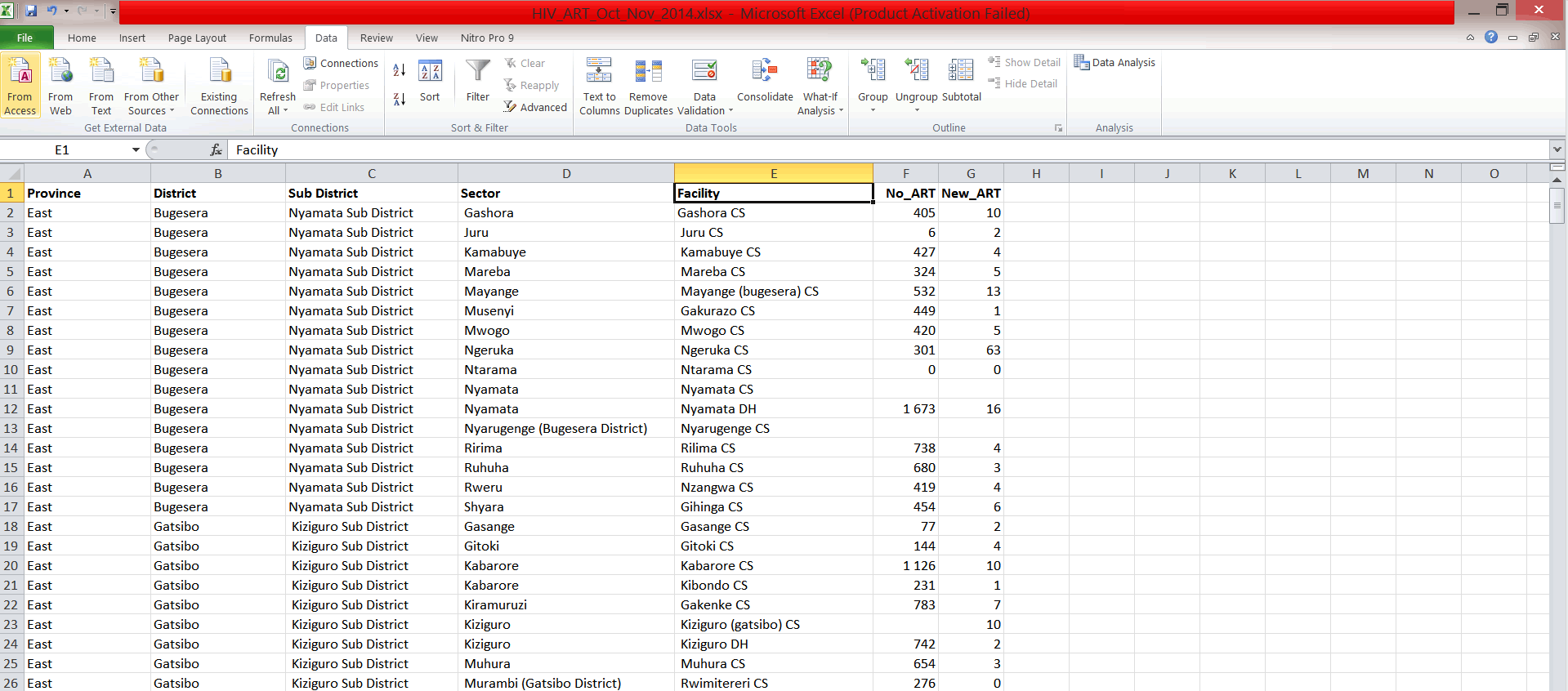
- This file contains data on ART at health facilities.
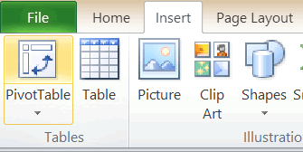
- On the Excel main menu, click on Insert and select Pivot Table; click OK.
- We would like to summarize the data by district, so our row labels would be district names. On the PivotTable Field List select District and drag it to the Row Labels.
- Our column headings will be the Total No of ART cases and New Pre-ART cases. Select No_ART and New_ART and drag them to the Values section.
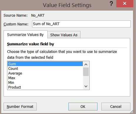
- Your table should resemble the graphic below.
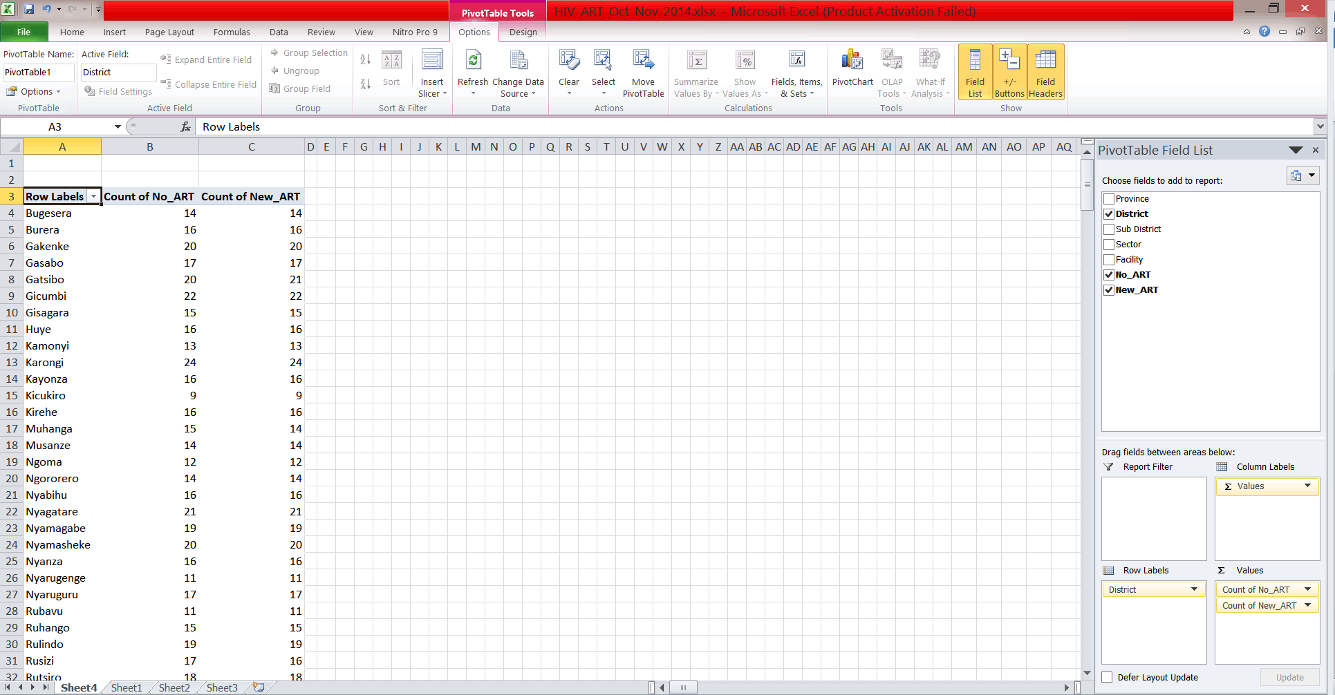
- By default, the pivot table has given us a count of cases. However, we would like to know the sum of cases per district. To do this, click on Count of No_ART in the values box and select Value Field Settings. Change the calculation type to Sum, and do the same for Sum of New_ART.
- When done, save your file under the same name in the MyExercises folder.
3.3.3 Save results of pivot table
- Highlight the pivot table results and copy and paste into a new Excel workbook. Use the paste as values option.
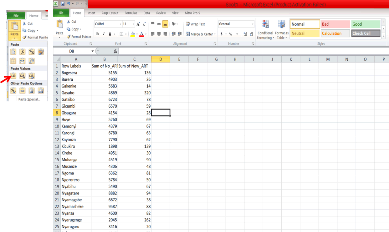
- Next, edit the column headings of the table. Edit the column heading for the first column to District, the second column to No_ART, and the last to New_ART.
- Delete the Grand total row. You should now have a 3 column spreadsheet like the one below.
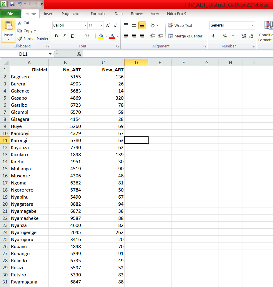
- Save your file as HIV_ART_District_OctNov2014.xlsx in the MyExercises folder.
3.3.4 Convert Excel file to .csv
To import Excel data into QGIS, it must be converted into a comma separated values file (.csv or comma delimited text file).
- Click on File > Save As. Change the Save as type from Excel Workbook to CSV by clicking on the down arrow and selecting CSV.
- Save the file as HIV_ART_District_OctNov2014.csv in the MyExercises folder.
- Click Yes on the next dialog box.
- Close the file and exit Excel.
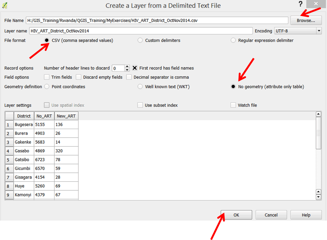
3.3.5 Load CSV file in QGIS
- Launch QGIS and click on the Open button
 on the main menu.
 - Browse to your exercise files folder and open Exercise_3c.
- This project consists of a layer of district-level HIV prevalence.
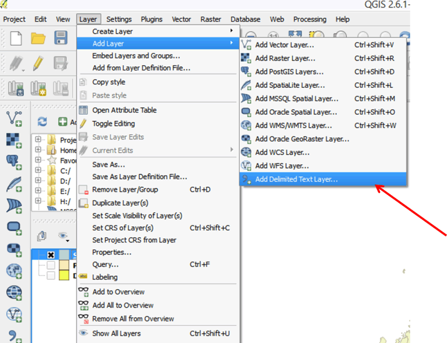
- Click on Layer on the main menu.
- Click on Add Layer, then select Add Delimited Text Layer.
- In the dialog box that opens, Browse to MyExercises and select the CSV file that you just saved: HIV_ART_District_OctNov2014.csv.
- For File format select CSV and for Geometry definition select No geometry (attribute only table).
- Click OK.
- The CSV file has been added to your layer panel.
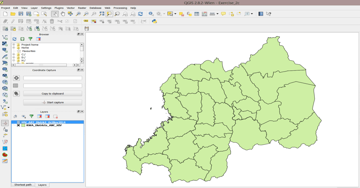
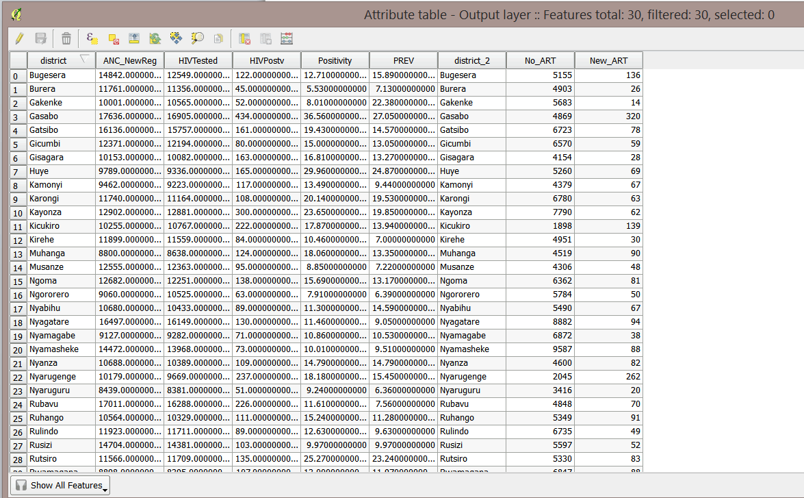
- Right-click HIV_ART_District_OctNov2014 and open the attribute table to familiarize yourself with the data.
- Close the attribute table.
3.3.6 Join .csv file to districts
In order to map the ART data, we have to link it to district boundaries.
- Open the Join attribute table tool in the Processing Toolbox.
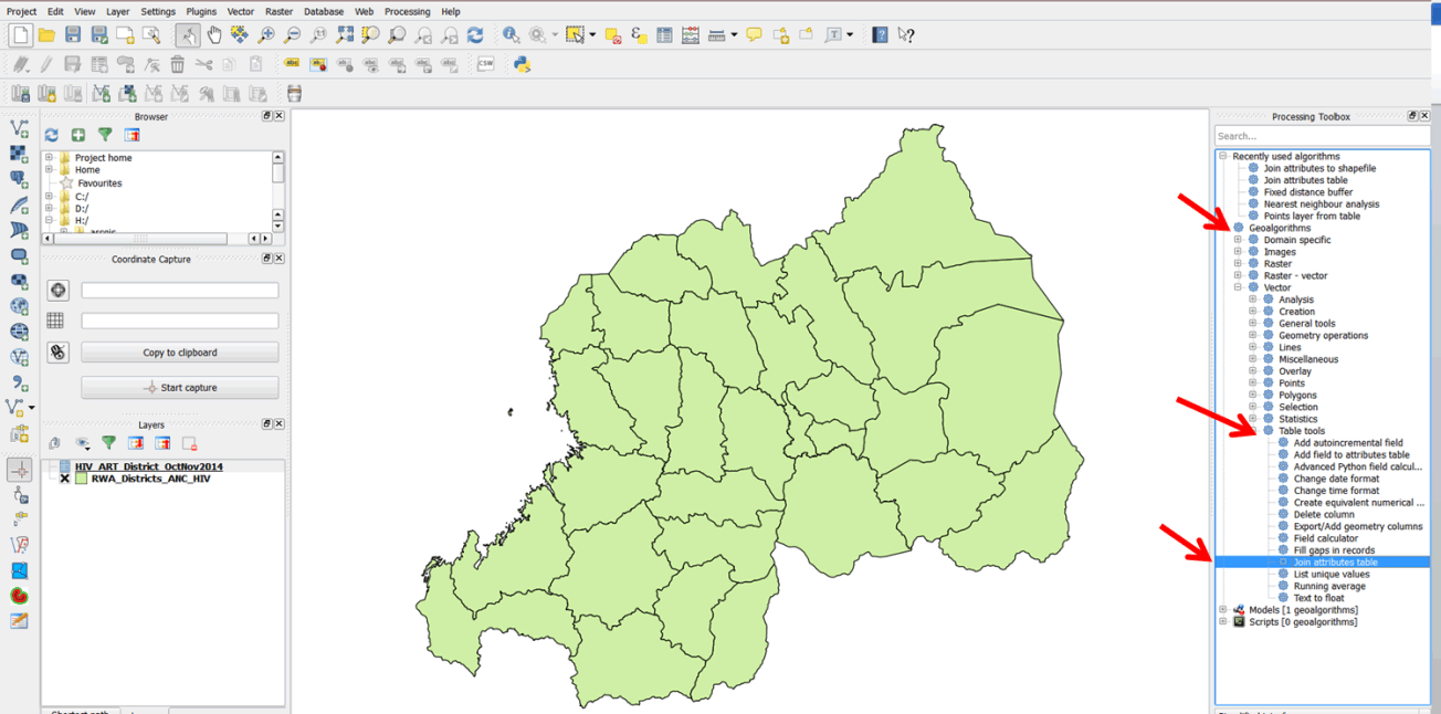
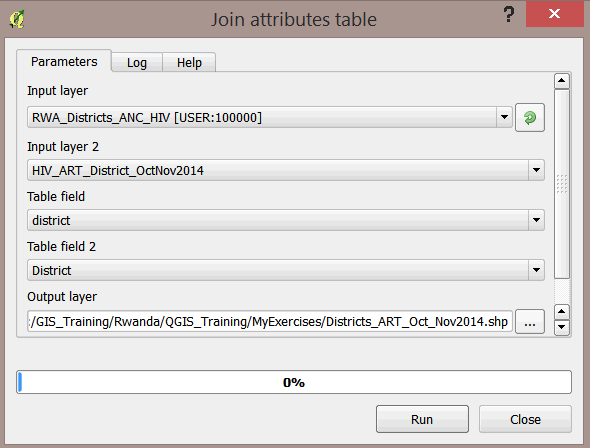
- Make the following selections in the Join attributes table window:
- Input layer: RWA_Districts_ANC_HIV;
- Input layer 2: HIV_ART_District_OctNov2014;
- Table field: district;
- Table field 2: District.
- For your Output layer, save the file in the MyExercises folder as Districts_ART_Oct_Nov2014.shp.
- Click on Run to run the tool.
- Your layer has been added to your map document as Output layer.
- Open the Output layer attribute table, scroll right, and scroll through the data. The Output layer now consists of both HIV prevalence data and ART data.
- Close the attribute table.
- Save your map as Exercise_3c.qgs in the MyExercises folder.
3.3.7 Create a map of multiple indicators
As mentioned in the introduction, this exercise is intended to map program performance by mapping the number of patients newly enrolled on pre-ART and comparing that to prevalence. This will require preparing a map of multiple indicators. One way of accomplishing this is to display one variable as a choropleth map and the second variable as a chart or diagram. In this exercise, we will display pre-ART cases using proportional symbols.
Proportional symbols portray point data to show the relative magnitude of a particular variable. The norm is to display the symbols at the center of the area they depict—in this case, the district. To do this, we must create polygon centroids from the Output layer. A centroid is a geometric center of a polygon.
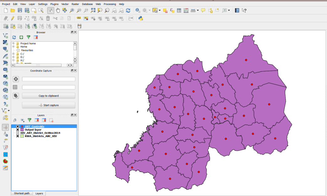
3.3.8 Create polygon centroids
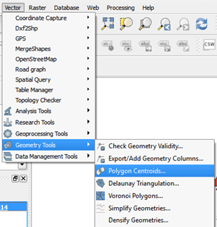
- On the main menu, go to Vector > Geometry Tools > Polygon Centroids.
- In the dialog box, browse to the MyExercises/Data folder and save the file as ART_Centroids.shp.
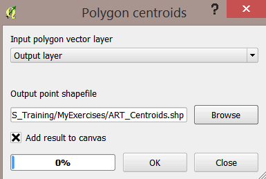
- Click OK in the next dialog box and then close the box.
- Your layer is added to your map.
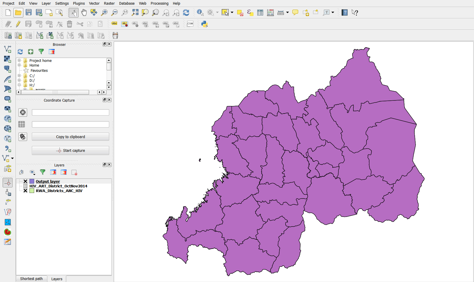
- Right-click on the Districts layer and click Remove. We do not need it for our exercise.
- Your map should resemble the graphic below.
3.3.9 Create a choropleth map showing HIV prevalence by district
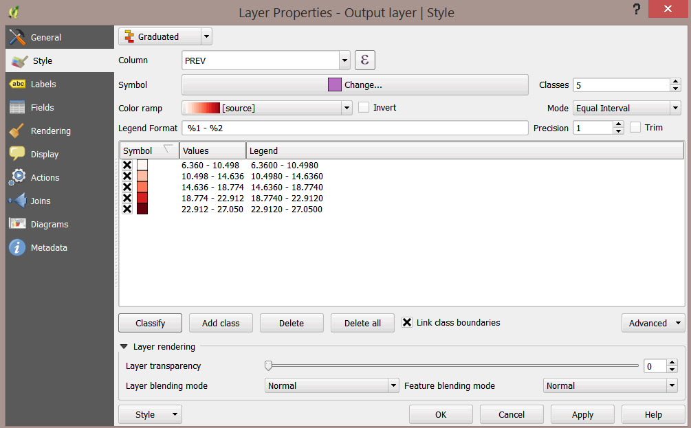
- Double-click on the Output layer to open the Layer Properties dialog box.
- Under Style, change from Single Symbol to Graduated.
- Select PREV as your Column field.
- Select Reds as your Color ramp and click Classify.
Note how your map looks now.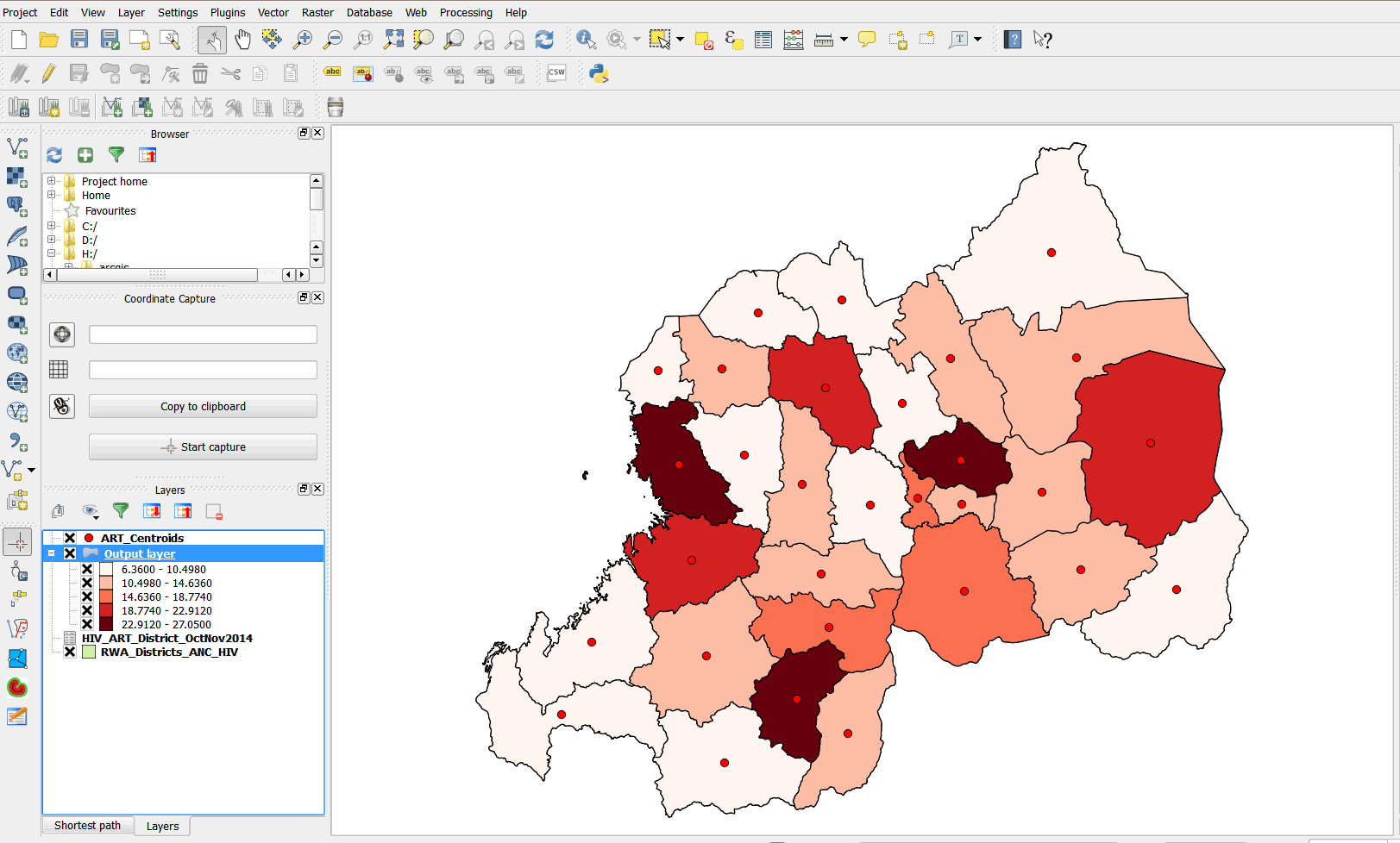
3.3.10 Symbolize data using proportional symbols
- Symbolize the ART centroids using proportional symbols.
- Double-click the ART_Centroids layer to open the Layer Properties dialog box.
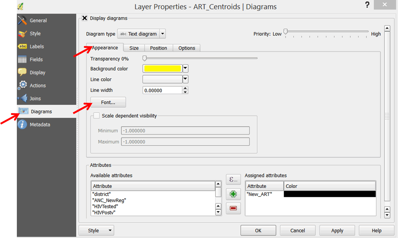
- In the left panel, select Diagrams.
- Select the Display diagrams button.
- In the Diagram type box, use the pull-down menu to select Text diagram.
- Click on the Background color pull-down menu and select a yellow color.
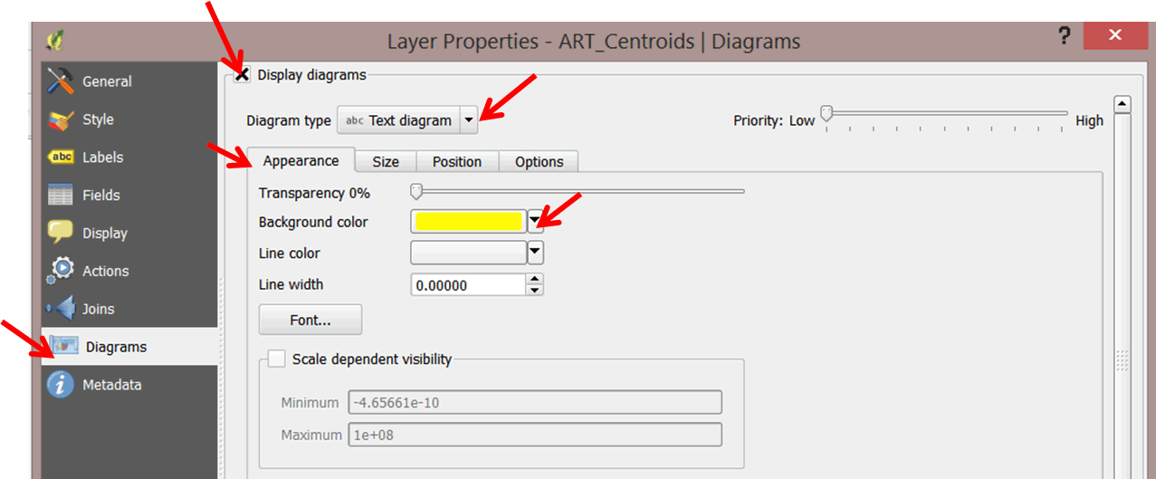
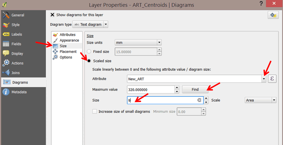
- Click on the Size tab and check the Scaled size option (previos versions: un-check the Fixed size option).
- Select your scale attribute. In the Attribute pull-down menu, select New_ART as the attribute to map using proportional symbols.
- Click on the Find maximum value button and change the size to 9.
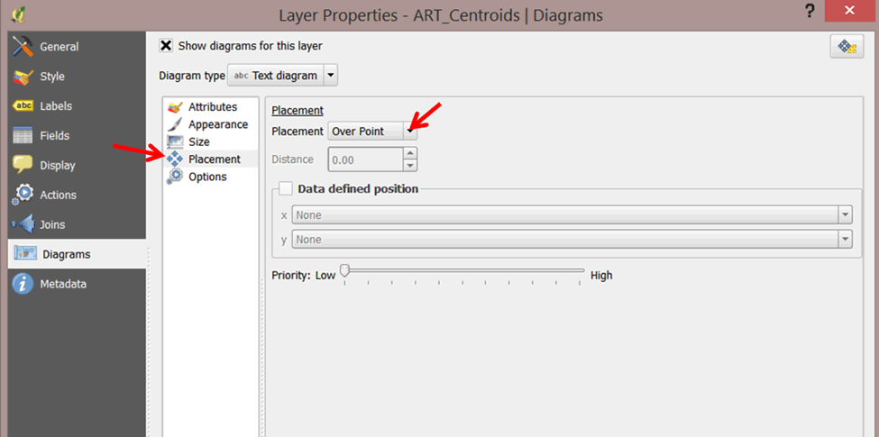
- Click on the Position tab and select Over Point from the Placement pull-down menu.
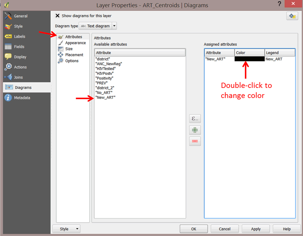
- Click on the Attributes option, select New_ARTin the attributes list and click the green plus sign to add it to the assigned attributes. Change the color to a dark color like black. This will label the proportional symbols with the value from the data.
- Click OK when done.
- The ART centroids layer you used for the proportional symbols is a set of points. These points are separate from and independent of the diagrams you are superimposing on them as proportional symbols. As a consequence, you might sometimes see two sets of symbols on your map when you only want one.
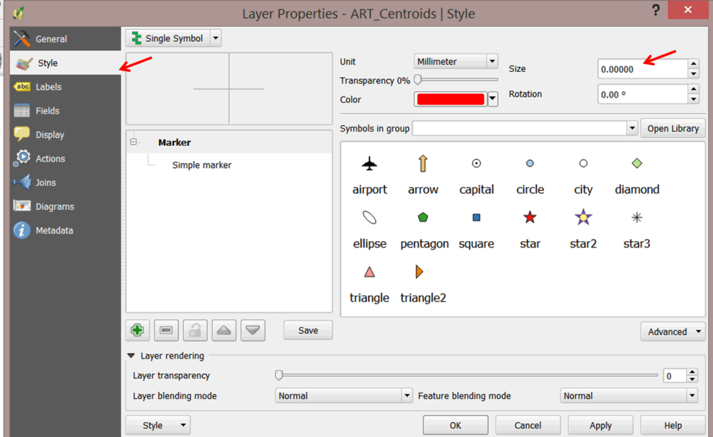
- To avoid this problem, double-click on the ART_centroids layer again and select Style on the left panel.
- Set the Size of the symbol to zero and click OK.
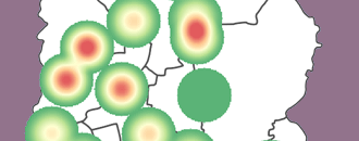
- Your map should look like the graphic below.

- To change the font properties of the proportional symbols labels, double-click on the ART_Centroids to open the properties.
- Click on Diagrams, then on the Appearance tab. Next, click on the Font button to change the font style.
- Study your map—it should be very interesting. In some districts where prevalence is high, there are fewer new patients on pre-ART than in districts where prevalence is low. This could be attributed to various factors. By visualizing our data on a map, we can see emerging trends and seek necessary interventions.
- Save your project in your exercises folder (Save As).