GeoHealth Mapping GIS Training
for Monitoring and Evaluation or
Strategic Information Officers and Data Analysts for HIV

3.6. Interpolation
Health data are often collected at unique sample points such as health clinics or surveillance sites. Using data from these known points, it is possible to estimate values in the space between these points using a technique called interpolation. Interpolation can be defined as the estimation of attribute values at unsampled points from measurements made at surrounding, sampled points.1 2 When presented on a map, interpolation allows us to generate a smooth, continuous surface on which patterns can be easily recognized.
Why is this useful? Imagine that a district health officer is interested in estimating HIV prevalence in district X, but that the district does not have a health clinic within its boundaries. However, two health facilities are located to the north and south of the district at distances of 75km and 100 km, respectively. In the absence of clinic-level data for district X, the district health officer can (1) estimate HIV prevalence at facilities located to the north and south, and (2) use these data to estimate HIV in the area in-between these facilities: district X.
Using interpolation as an analysis and visualization tool allows users to
- Estimate values in the absence of data
- Examine patterns in HIV variation at a finer level
- Analyze trends by space and time
There are various methods of interpolation, including global and local methods. Global methods utilize all known points contained in a dataset to estimate the values at unsampled points. Local methods utilize either a fixed number of points or points within a certain distance or radius relative to the sampled point.
Interpolation methods vary in complexity and in their accuracy for prediction. It is important to undertake appropriate validations prior to selecting a method, as there are key differences between interpolation methods that can result in variations in the predicted surface. Users should select a method that minimizes prediction error and provides an estimated error of prediction. Finally, remember that not all GIS software has the ability to interpolate data; among those that do, some (such as QGIS) have limited interpolation functionality.
This section offers users an opportunity to practice a local method of interpolation known as inverse distance weighting (IDW) within QGIS. IDW is a useful method for health-related analyses, as it accounts for distance between data points: the farther away a sampled point from the area of interest, the less weight it holds in the calculation.3 For example, the HIV prevalence at the health facility 100km away from district x would be weighted differently than that seen at a facility 75km away.
Users seeking an in-depth overview of interpolation would benefit from reading Spatial Interpolation with Demographic and Health Survey Data: Key Considerations, available at http://www.dhsprogram.com/pubs/pdf/SAR9/SAR9.pdf.
3.6.1 Objectives
- Apply inverse distance weighting to interpolate HIV prevalence among the general population ages 15–49 at the district level in Rwanda.
You will need the files for Section_3_6 to complete this module.
3.6.2 Launch QGIS and open an existing project
- Launch QGIS and open Exercise_3f.qgs from your exercise folder.
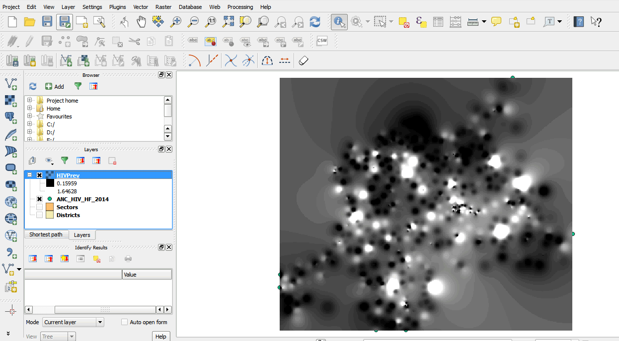
- This opens a project with point data of HIV prevalence from health facilities data.
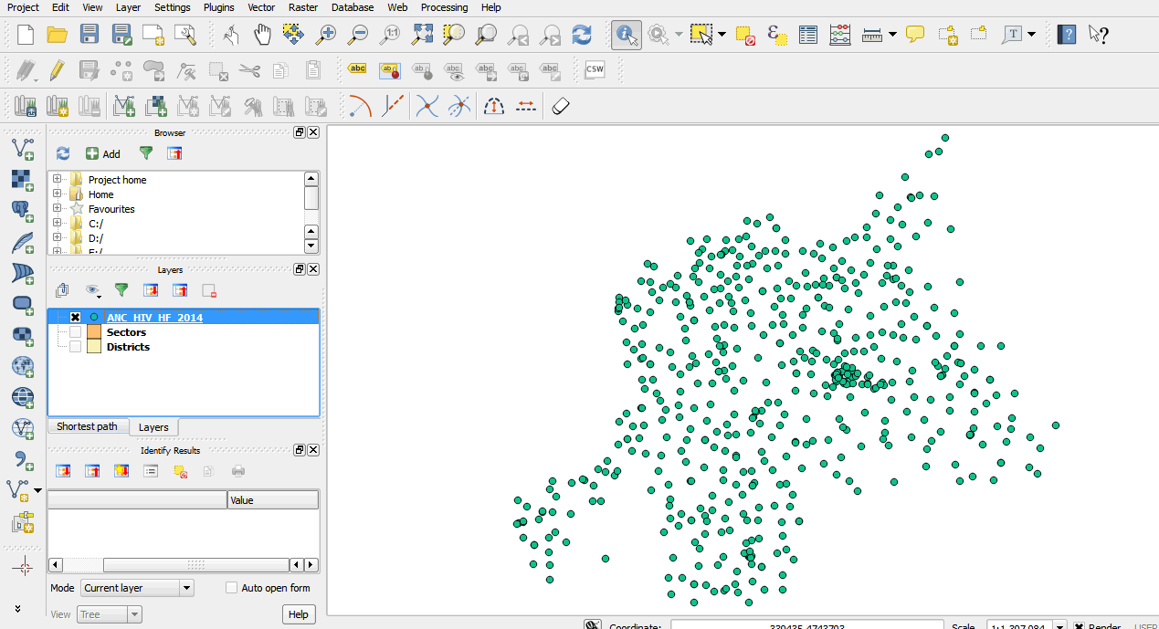
- Open the attribute table for ANC_HIV_HF_2014 and look at the data. We will create an interpolation surface to see which areas have high prevalence.
3.6.3 Install the interpolation plugin
- Before we begin, we must confirm that the interpolation plugin is installed.
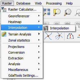
- On the main menu, click on Raster. If the interpolation plugin is installed, it will be listed under the Raster tools. If not, you will install it using the Plugin Manager.
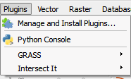
- To install the interpolation plugin, click on Plugins > Manage and Install Plugins.
- On the list of plugins, scroll down until you find the Interpolation plugin.
- Click the Install plugin button on the dialog box of the plugin manager.
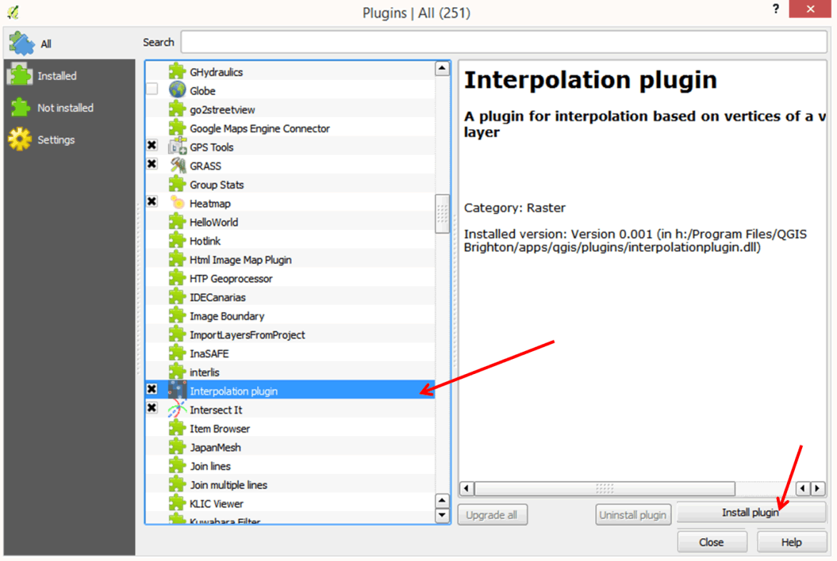
- Close the dialog box when done.
3.6.4 Create an interpolation surface
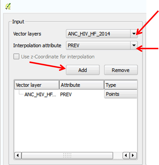
- Click on the ANC_HIV_HF_2014 layer in your table of contents.
- On the main menu, click on Raster > Interpolation to open the interpolation tool.
- In the Input section, select ANC_HIV_HF_2014 as your Vector layers. It may have already been automatically selected.
- Next, select PREV as your Interpolation attribute. Remember that we want to create a surface of prevalence values.
- Click Add to add to the list of attributes.
- In the Output area of the dialog box, select Inverse Weighting Distance (IDW) as the Interpolation method.
- In the Cellsize X and Cellsize Y boxes, type in the value 500. This means that the surface will have a cell size of 500 meters by 500 meters. Our dataset is in meters.
- In the Output file box, browse to your Data folder and save the file as HIVPrev.
- Enable the Add result to project option.
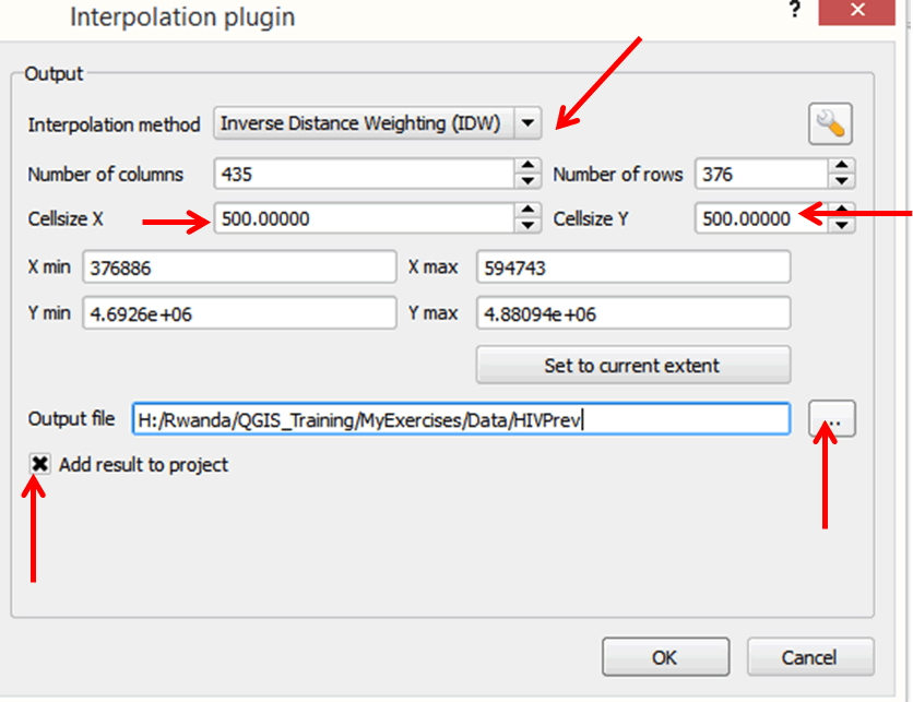
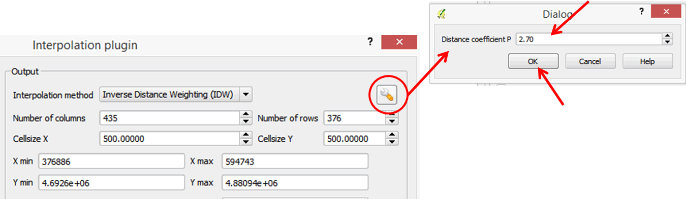
- On the upper right portion of the output area of the dialog box, click on the Distance coefficient P button (looks like a wrench). Enter the value 2.70 and click OK to close this dialog box and go back to the previous dialog box.
- Click OK to run the tool.
- The interpolated surface has been added to your map.
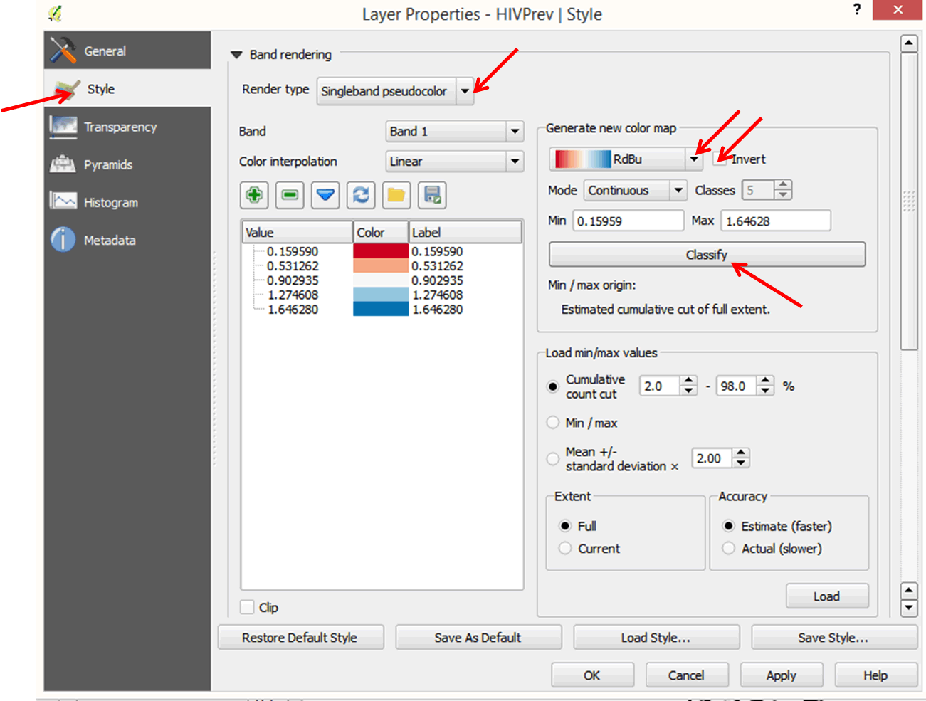
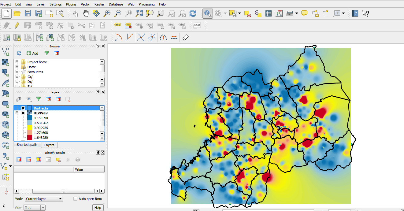
- We must change the color of the surface to see where the high and low values are located.
- Double-click on the HIVPrev layer to open the Layer properties dialog box.
- Click on Style on the left panel.
- In the Band rendering section, change the Render type to Singleband pseudocolor.
- In the Generate new color map section, select the red to blue color ramp (RdBu).
- Select Invert color so that high values will be displayed in red and low values in blue.
- Click Classify.
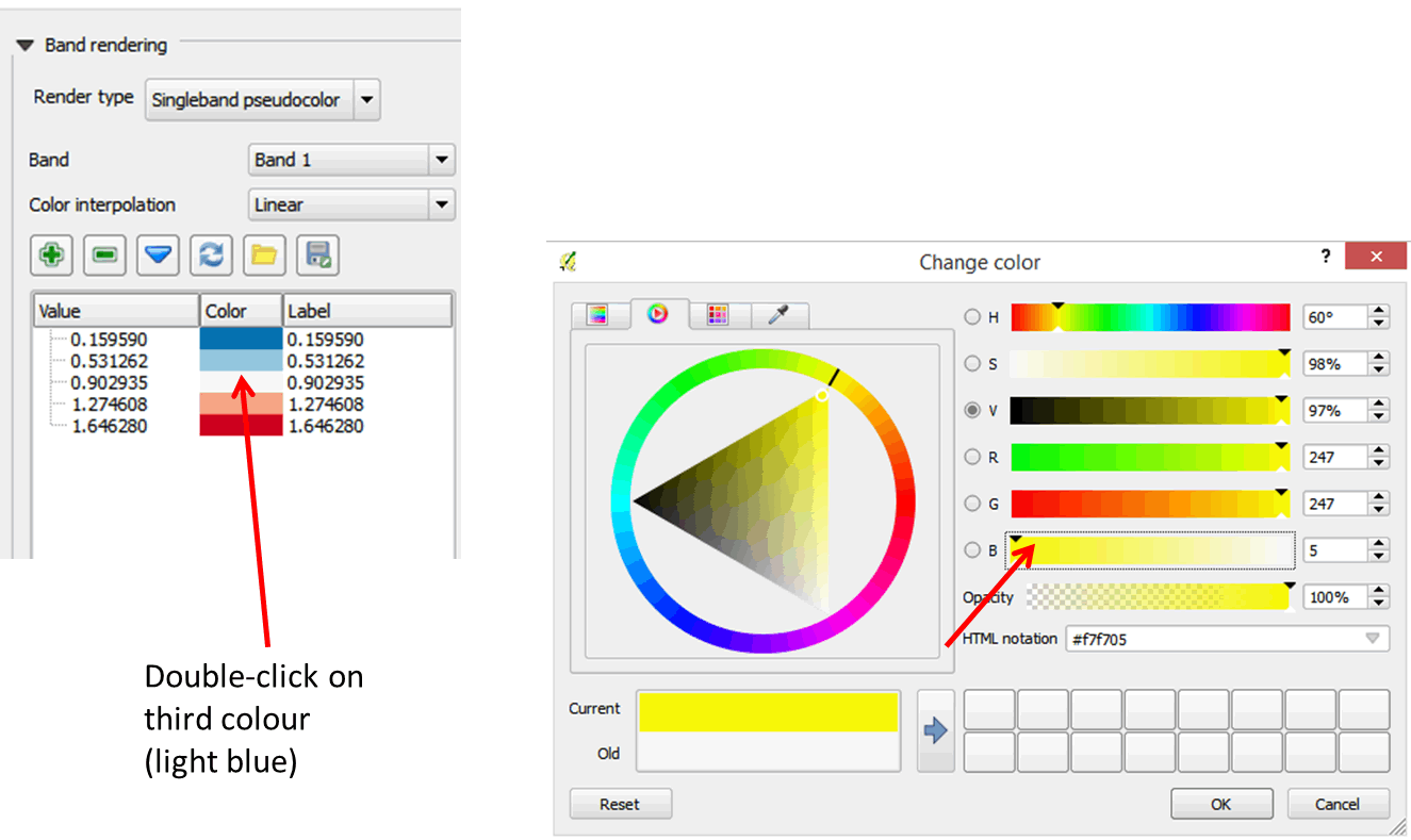
- Next, we will modify the colors a bit for a better visual effect.
- In the Value table, double-click on the light blue color corresponding to 0.902935.
- In the color dialog box, change the color to yellow and click OK.
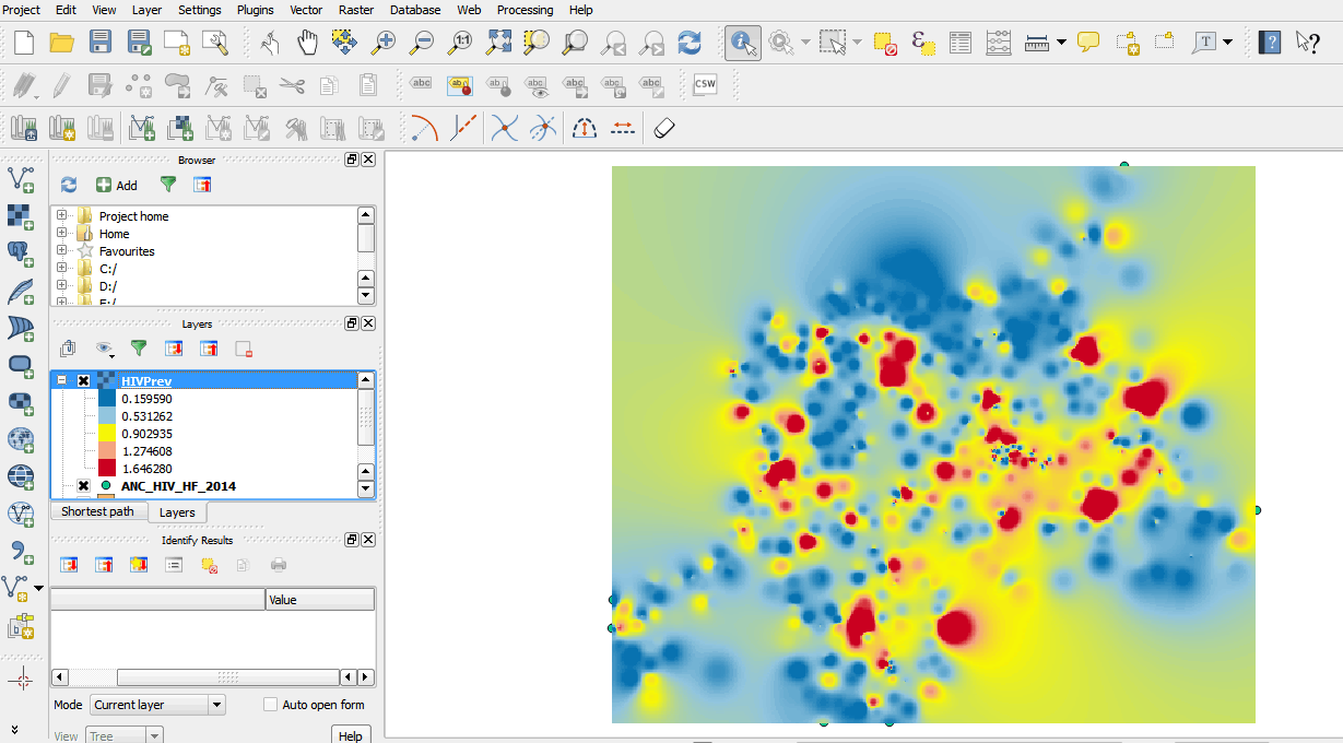
- In the Layer Properties dialog, click OK.
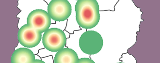
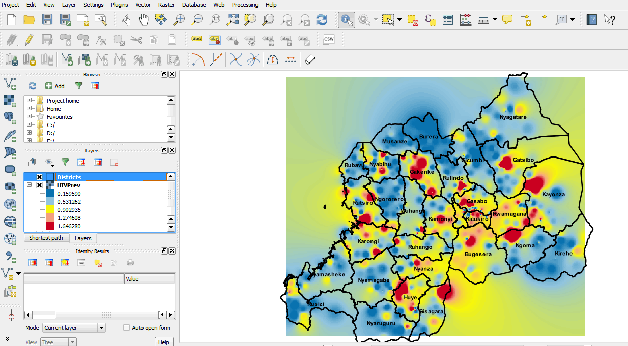
- Your map should resemble the graphic below.
- Next, drag the Districts layer above the new interpolated surface. Use the Style options under Layer Properties to change the fill properties of the Districts layer to a transparent fill with a border width of 0.6.
- We can now tell which districts have high or low prevalence values.
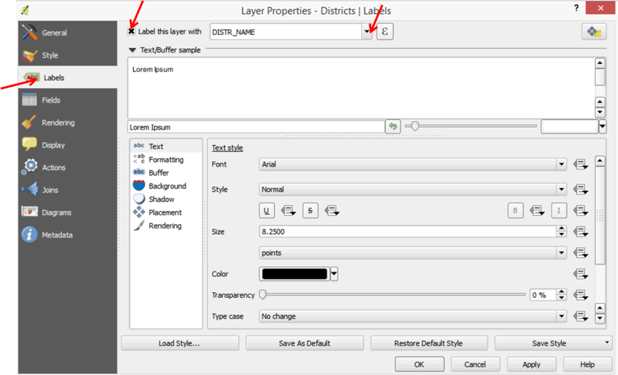
- To add labels to your districts right-click on the Districts layer to open the Layer Properties dialog box.
- Click on Labels and enable the Label this layer with option then select DISTR_NAME from the pull-down menu.
- Your map should resemble the one below.
/knowledgebase/GISDictionary/term/interpolation.