GeoHealth Mapping GIS Training
for Monitoring and Evaluation or
Strategic Information Officers and Data Analysts for HIV

3.4. Mapping Program Coverage
3.4.1 Background
Program managers require tools and analytic skills to conduct routine monitoring and management of programs to measure progress toward performance targets. Mapping program coverage allows them to determine the number of services delivered in relation to program targets at a particular point in time. For example, the program manager of a polio vaccine campaign might map the number of polio vaccines actually delivered to a community as compared to the expected target during a given month. Likewise, HIV treatment program managers will need to map treatment coverage and compare those still in need of anti-retroviral therapy (ART) with those on ART. In both examples, mapping program coverage allows for an examination of gaps in service delivery. When used to compare service providers, facilities, or partners, coverage maps may also indicate areas of high and low performance.
3.4.2 Objectives
- Map program data using proportional symbols
You will need the files for Section_3_4 to complete this module.
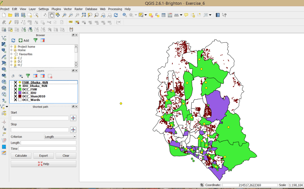
An estimated 40 percent of the population in Dhaka, Bangladesh lives in the slums. This exercise looks at service coverage of drop-in centers for female sex workers (FSWs) and people who inject drugs (PWIDs) in relation to slum dwellings in Dhaka. We will map program coverage through drop-in centers that offer services to FSWs and PWIDs, and compare the distribution to the locations of slum dwellings.
3.4.3 Launch QGIS and open an existing project
- Launch QGIS and click on the Open button
 on the main menu.
 - Browse to your exercise files folder and open Exercise_3d.
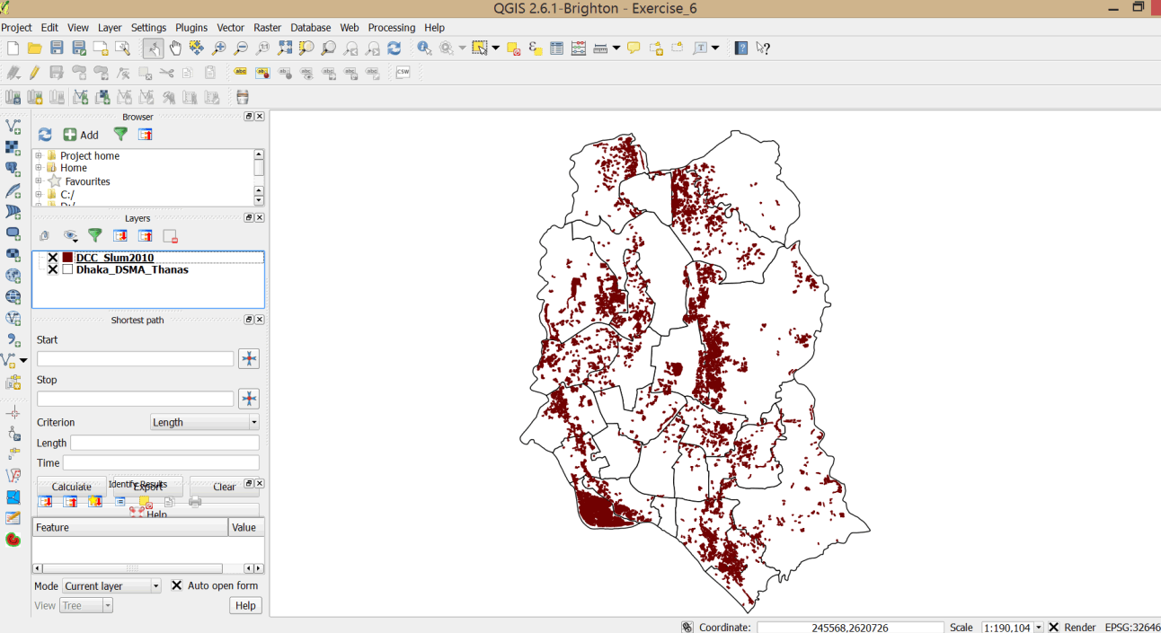
- This is a map of the Dhaka Statistical Metropolitan Area (DSMA) and slum dwellings.
3.4.4 Use statistics to spatially join Dhaka FSWs with Dhaka City Corporation Wards
- The DSMA Thanas layer does not have data on FSWs in Dhaka. We will add this data by doing a spatial join with data from the Dhaka FSW layer.
- Click on the Add vector layer button on your side bar:
 .
. - Browse to your exercise data folder, hold down the Ctrl key, and add the FSW_Dhaka_46N and IDW_Dhaka_46N files. Change the colors as appropriate.
- Click on the FSW_Dhaka_46N layer to highlight it.
- On the main menu bar, select Vector > Data management > Join attributes by location.
- In the dialog box that opens, select FSW_Dhaka_46N as your join layer.
- Select the Take summary of intersecting features option.
- Deselect Mean and select Sum. Click OK (see graphic below).
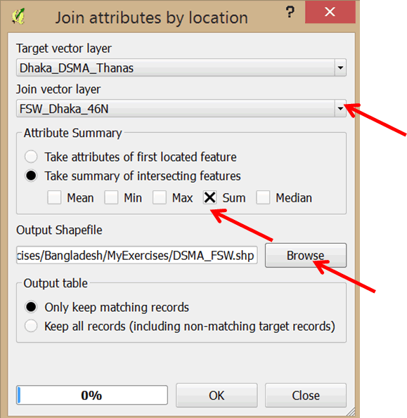
- Browse to the MyExercises folder and save the output shapefile as DSMA_FSW.shp.
- Click Yes in the next dialog box to add the layer to your project.
- Close the dialog box.
- Do the same for the IDU_Dhaka_46N layer. Save the output shapefile in the MyExercises folder as DSMA_IDU.shp.
- Drag the new layers below the IDU_Dhaka_46N layer so that the point layers are visible on the map.
- Open the attribute table of the DSMA_FSW layer. Data on FSWs has been aggregated by thanas.
- Close the attribute table.
3.4.5 Create polygon centroids
In this exercise, we will map the numbers and distribution of FSWs and PWIDs using proportional symbols, which are a way of symbolizing point data to show the relative magnitude of a particular variable. We want to map the relative magnitude of FSW and PWID numbers. To use proportional symbols, we must create centroids.
- Click on the DSMA_FSW layer to select it.
- On the main menu, go to Vector > Geometry Tools > Polygon Centroids.
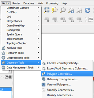
- In the dialog box, browse to the MyExercises folder and save the file as FSW_DSMA_Centroids.shp.
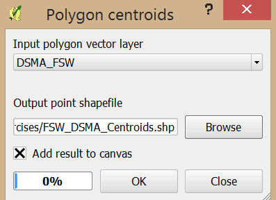
- Click OK in the next dialog box and close.
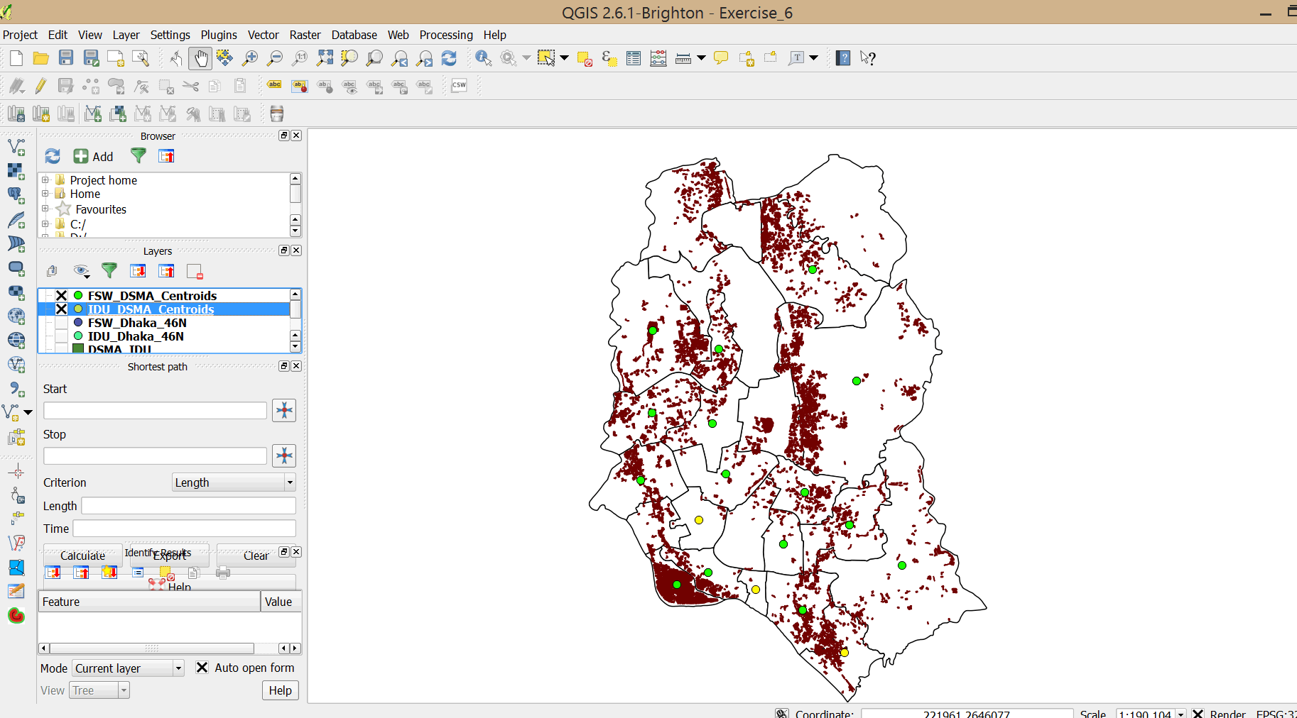
- Repeat steps 19–22 to create centroids for the DSMA_IDU layer. Save the file as IDU_DSMA_Centroids.shp in the MyExercises folder.
- Your layers have been added to your map.
- Turn off (click on the box next to the layer to uncheck it) FSW_Dhaka_46N, IDU_Dhaka_46N, DSMA_FSW, and DSMA_IDU, as we do not need to use them for the next steps.
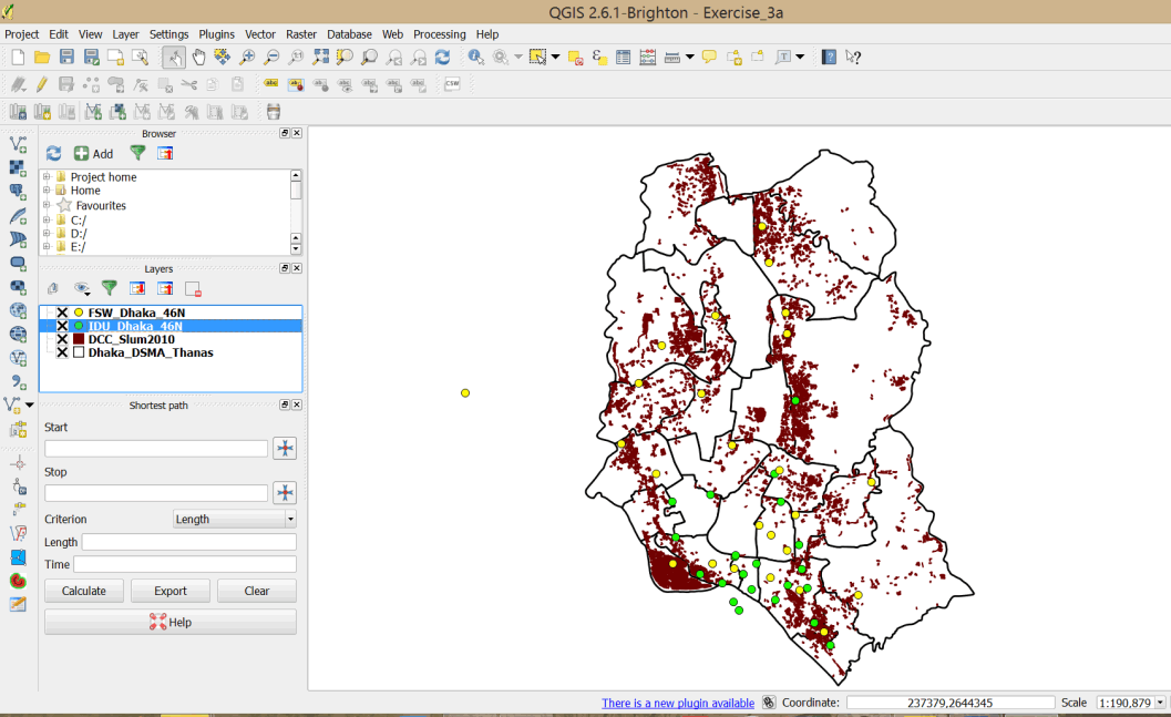
- Your map should resemble the graphic below.
- Save your project in the MyExercises folder as Exercise_3d (Save As).
3.4.6 Symbolize data using proportional symbols
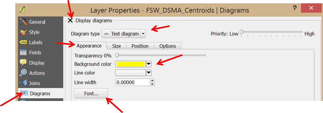
- Double-click the FSW_DSMA_Centroids layer to open the Layer Properties dialog box.
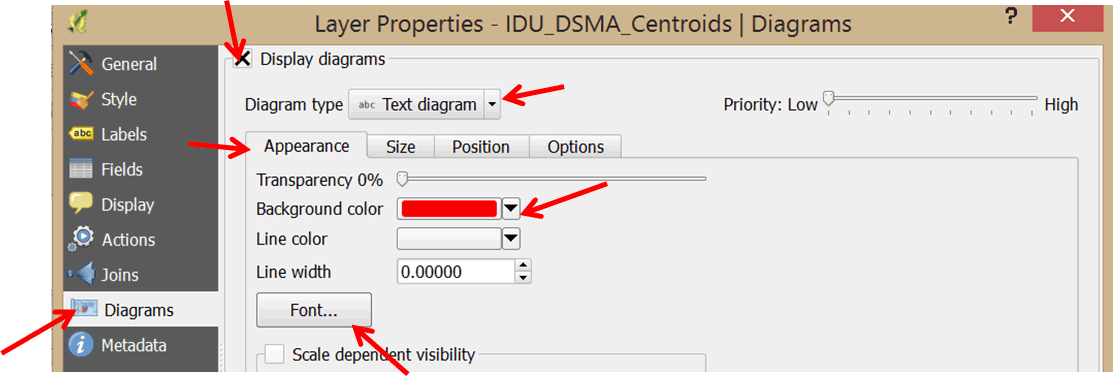
- In the left panel, select Diagrams.
- Check the Display diagrams option.
- In the Diagram type box, use the pull-down menu to select Text diagram.
- Click on the Background color pull-down menu and select a yellow color.
- Click on the Font button and set the style to Arial, 7, Bold.
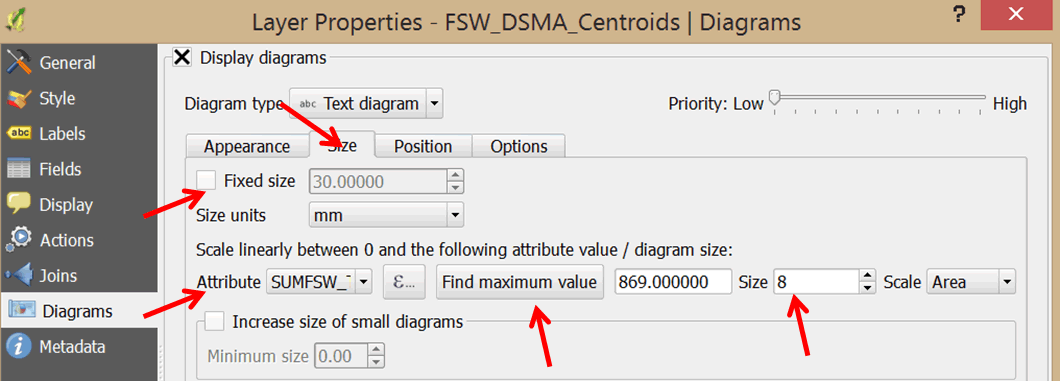
- Click on the Size tab and un-check the Fixed size option.
- Select your scale attribute. In the Attribute pull-down menu, select SUMFSW_Tot as the attribute to map using proportional symbols.
- Click on the Find maximum value button.
- In the Size box, change the size to 8.
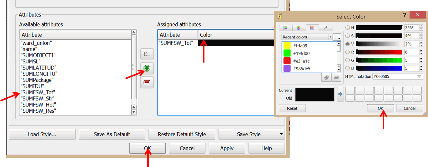
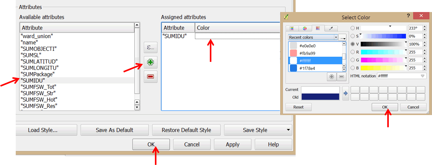
- In the Available attributes section at the bottom of the dialog box, click on SUMFSW_Tot and click the green plus sign to add it to the Assigned attributes section. In the assigned attributes double-click on the color block of the attribute SUMSW_Tot to open up the color selection dialog box. Select a color of your choice (e.g. black).
- Click OK to apply your changes and exit the dialog box. Please refer to graphic below.
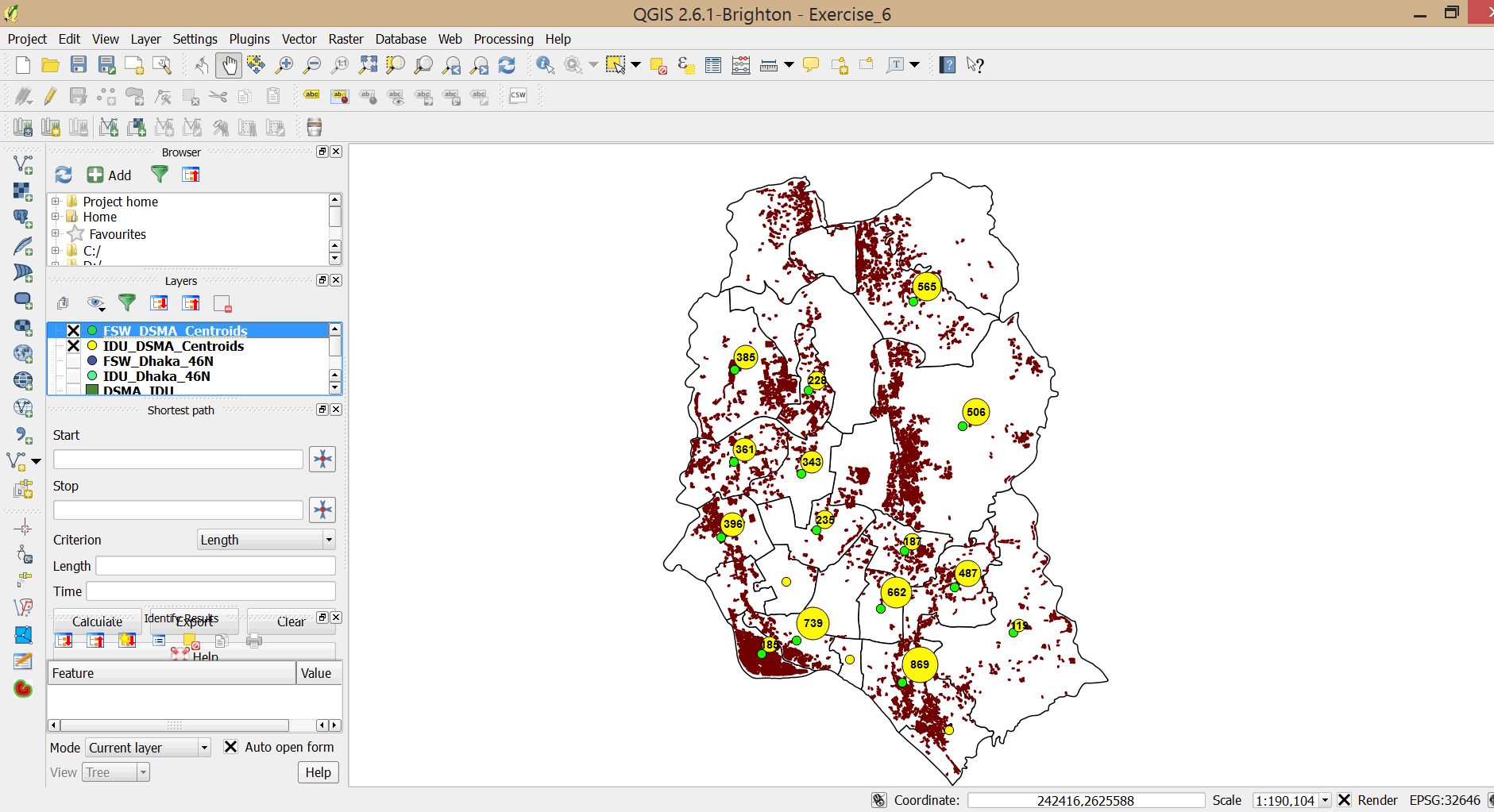
- Your map should resemble the graphic below.
- The layer you use as the foundation for generating proportional symbols is displayed as a set of points. These points are separate from and independent of the diagrams you are superimposing on them as proportional symbols. As a result, you might see two sets of symbols on your map when you only want one.
- To avoid this problem, double-click on your layer again and select Style on the left panel.
- Set the Size of the symbol to zero. Click OK.
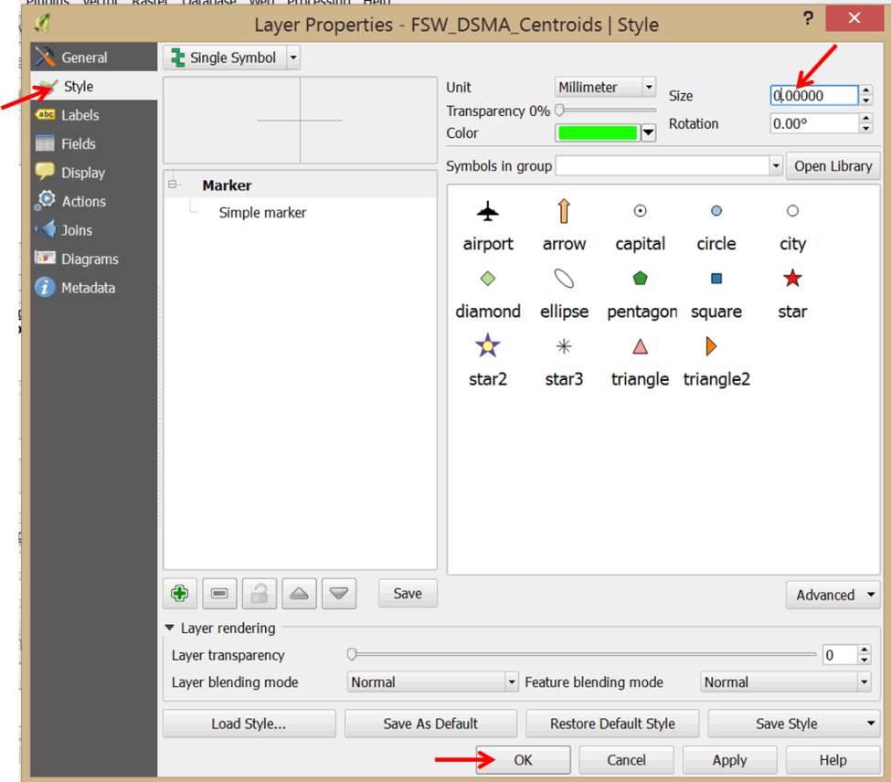
- Your map now displays one set of symbols.
- Double-click the IDU_DCC_Centroids layer to open the Layer Properties dialog box.
- In the left panel, select Diagrams.
- Check the Display diagrams options.
- In the Diagram type box, use the pull-down menu to select Text diagram.
- Click on the Background color pull-down menu and select a red color.
- Click on the Font button and select Bold for the font style.
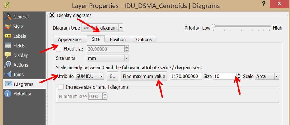
- Click on the Size tab and un-check the Fixed size option.
- In the Attribute pull-down menu, select SUMIDU as the attribute to map using proportional symbols.
- Click on the Find maximum value button.
- In the Size box, change the size to 10.
- In the Attributes section at the bottom of the dialog box, click on SUMIDU and click the green plus sign to add it to the Assigned attributes. Double-click on it and change the color to white.
- Click OK to apply your changes and exit the dialog box.
- You will notice the symbols for the FSW layer have disappeared.
- Click the pan button on the main menu
 , and click and drag the map a little bit.
 - Symbols from both layers are now displayed.
- Double-click on IDU_DCC_Centroids and select Style in the Layer Properties dialog box.
- Set the Size of the symbol to zero and click OK. Drag the map a little so that all symbols are displayed.
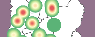
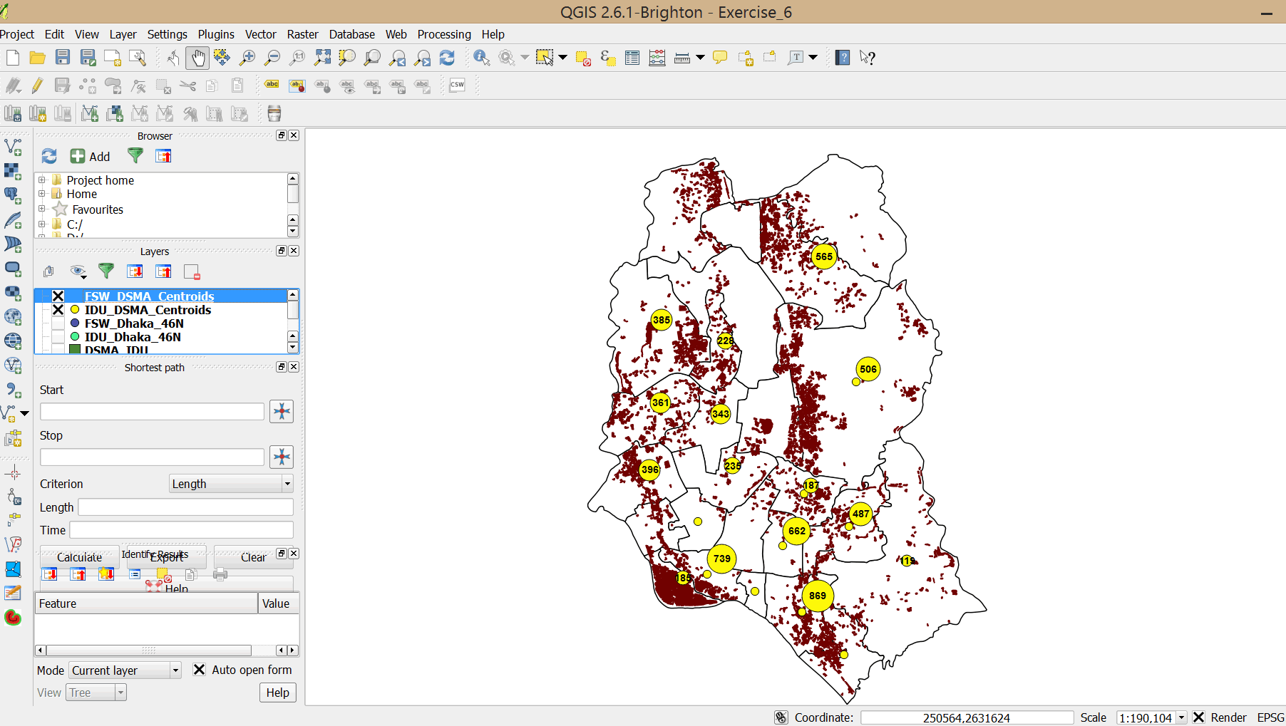
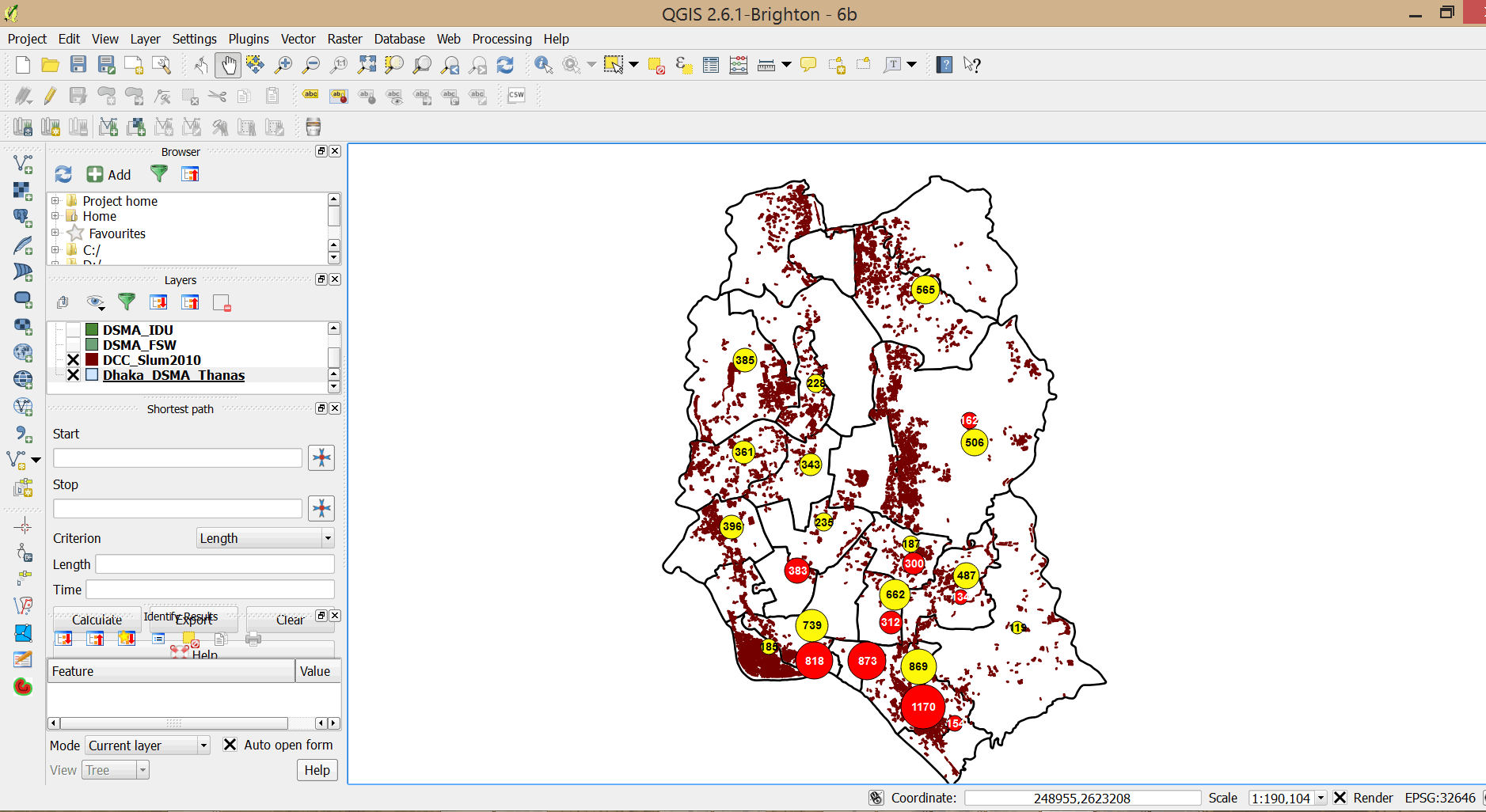
- We now have a very interesting map showing program coverage for PWIDs and FSWs in relation to slum dwellings. Study the map and write down your observations. Do you think there is adequate coverage?
- Save your project in your exercises folder (Save As).