GeoHealth Mapping GIS Training
for Monitoring and Evaluation or
Strategic Information Officers and Data Analysts for HIV

3.8. Examining Change Over Time
A visual examination of an indicator over time may help decisionmakers better understand where some of their interventions have had any impact. Note, however, that the observed change over time must be looked at in conjunction with a test for statistical significance (such as a confidence interval). The observed change may or may not be attributable to interventions, but these would need to be modeled along with potential confounders.
In this section, we will look at changes in HIV positivity from 2013–2014 within Eastern Cape province in South Africa.
3.8.1 Objectives
- Learn how to calculate and map change
- Learn how to create time series maps
You will need the files for Section_3_8 to complete this module.
3.8.2 Calculate HIV Positivity
- Launch QGIS and save a new project as Exercise_3h in the MyExercises folder.
- Add the vector layer ECWB_LocalMunicipalities.
- Open the attribute table and open the Field calculator from the main menu of the Attribute table.
- We shall calculate HIV positivity for 2013 and 2014 and save the results in new fields.
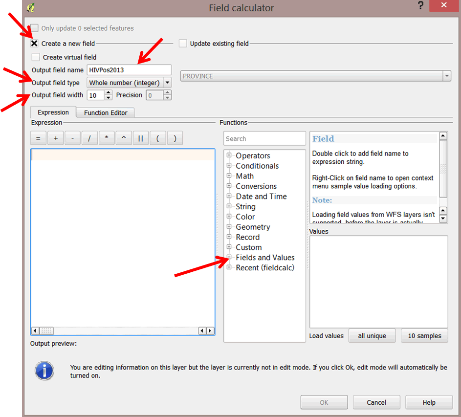
- In the field calculator dialog box, select Create a new field.
- For output field name, type in HIVPos2013.
- For the Output field type, select Whole number (integer). Next, change the Output field width to 10.
- In the expression editor, click on the plus sign "+" next to Fields and Values to display the attributes list.
- Double-click on SUMPos13 in the field list to add it to the Expression editor on the left. Next, select the division function / from the functions menu to add it to the expression.
- Double-click SUMTest13 in the field list to add it to the expression. Next, select the multiplications function * to add it to the expression, and then type in 100. Your expression should resemble the following: "SUMPos13" / "SUMTest13" * 100.
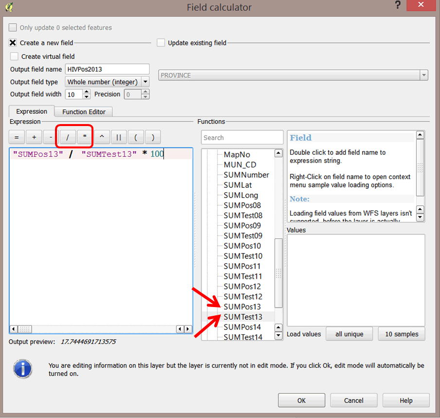
- Click OK when done. The new field, HIVPos2013, with the calculated values for HIV Positivity has been added to the attributes table.
- Repeat steps 5–11 to calculate HIV Positivity for 2014.
3.8.3 Calculate change
We shall now calculate percentage increase/decrease in HIV positivity between 2013 and 2014.
- Open the Field calculator
 from the main menu of the Attribute table.
 - Select Create a new field and enter Change into Output field name. The Output field type should be a decimal number with a precision of 2. Your expression should be "HIVPos2014" - "HIVPos2013".
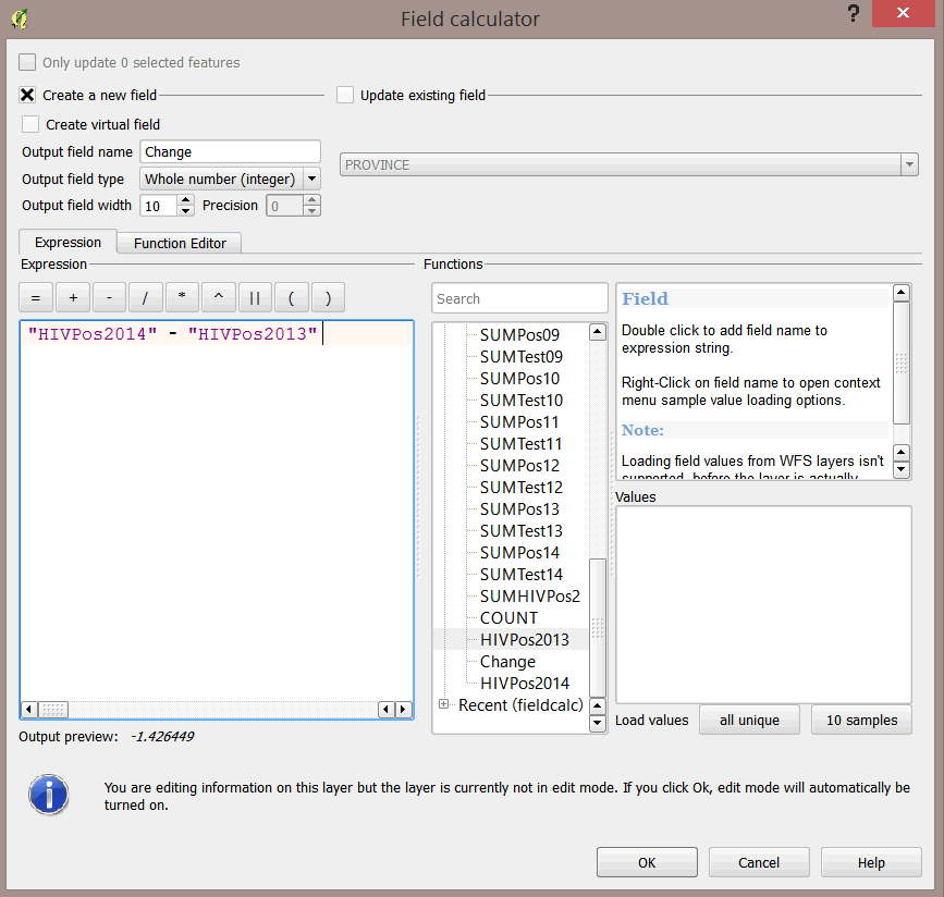
- Click OK when done.
- Open the Attribute table and look at the results.
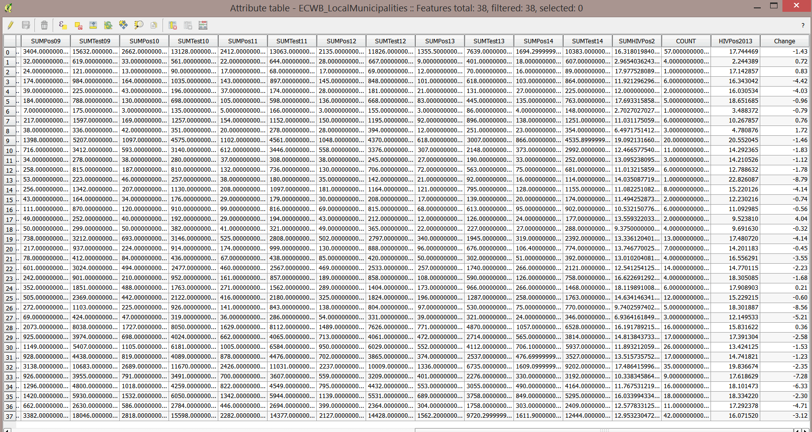
- From these results, we can now tell which municipalities had a decrease in HIV positivity and which had an increase. Negative values indicate a decrease while positive values indicate an increase.
3.8.4 Create a choropleth map of change
- Open the Layer Properties panel for ECWB_LocalMunicipalities and click Style.
- Select the blues Color ramp and check the Invert box.
- Click on the Symbol for the positive values and change the color for the positive values to a red.
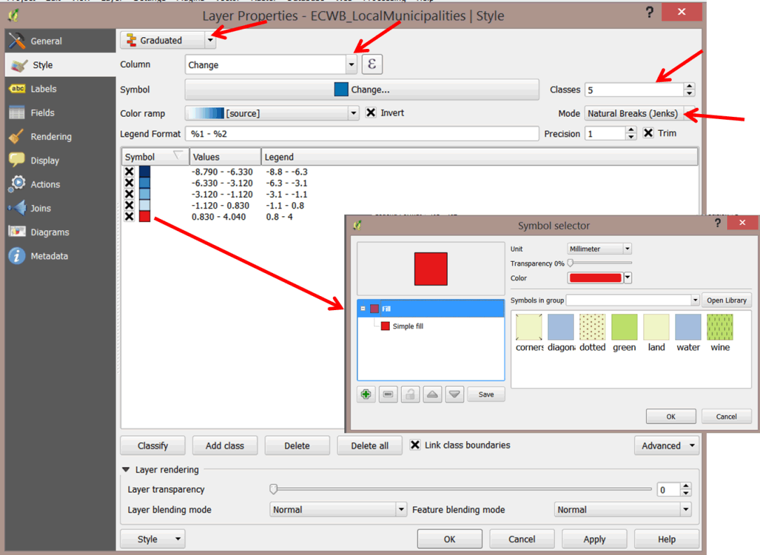
- Click OK when done.
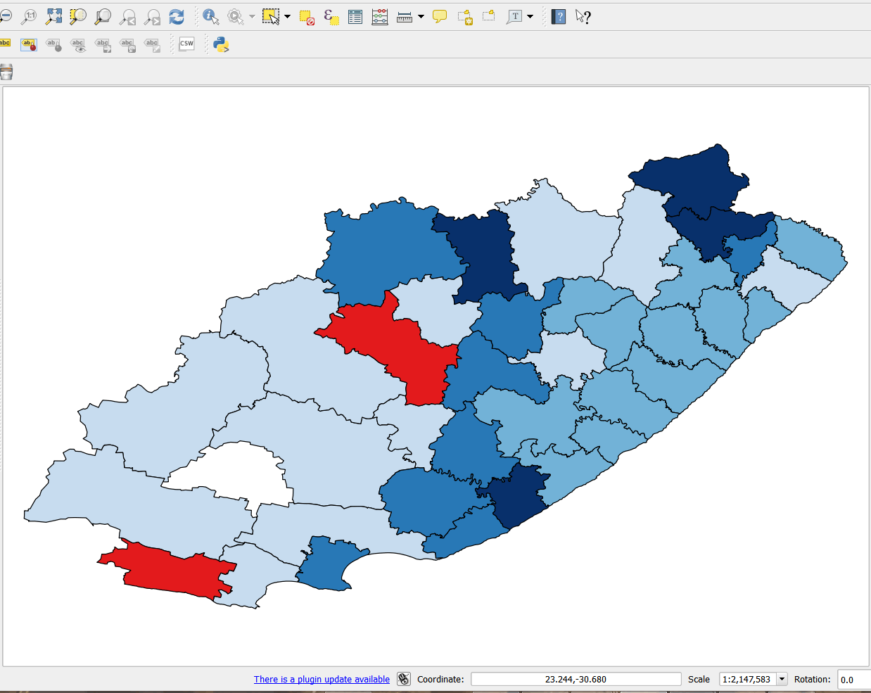
- The choropleth shows districts that have seen a decrease or an increase. Areas that have had a decrease are depicted in blue, while areas with an increase are shown in red. This makes the map easier to understand.
- To show the relative increase or decrease between 2013 and 2014, we will map the data using charts.
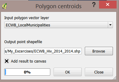
- First, create a centroids file by selecting from the main menu Vector > Geometry Tools > Polygon Centroids.
- In the Polygon centroid dialog box, select ECWB_LocalMunicipalities as the Input polygon vector layer and save the Output point shapefile as ECWB_HIV_2014_2013.
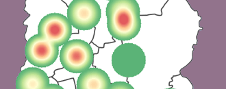
3.8.5 Map change using bar charts
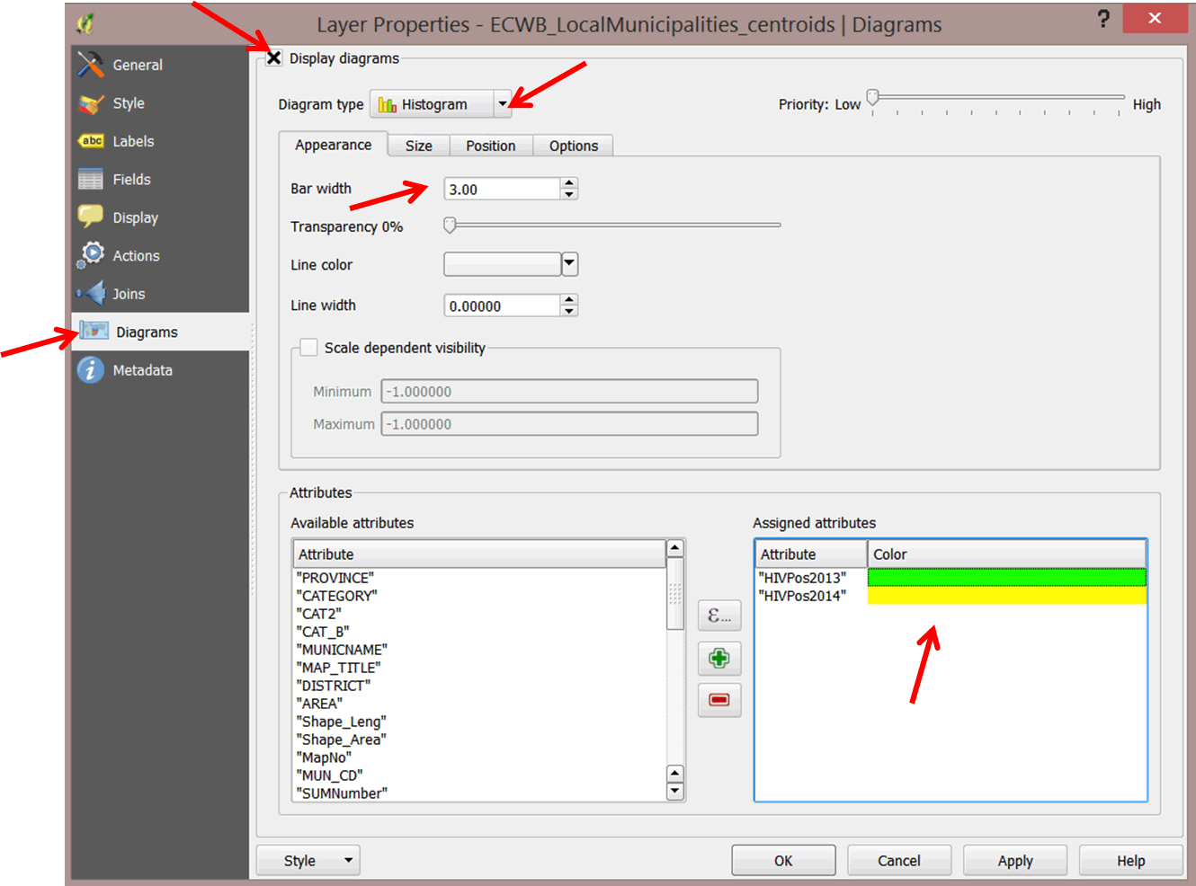
- Open the Layer properties for ECWB_HIV_2014_2013.
- In the left panel, select Diagrams.
- Check the Display diagrams options.
- In the Diagram type box, use the pull-down menu to select Historgram.
- On the Appearance tab, set Bar width to 3.
- In the Assigned attributes section under Attributes, you want "HIVPos2014" to be yellow and "HIVPos2013" to be green.
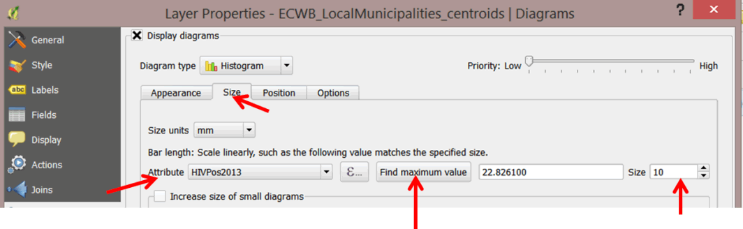
- Click on the Size tab and make changes to control the Bar length.
- In the Attribute pull-down menu, select HIVPos2013.
- Click on the Find maximum value button.
- In the Size box, change the size to 10.
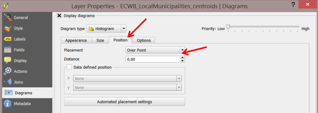
- Click on the Position tab and from the Placement pull-down menu select Over Point.
- Your map should resemble the graphic below.
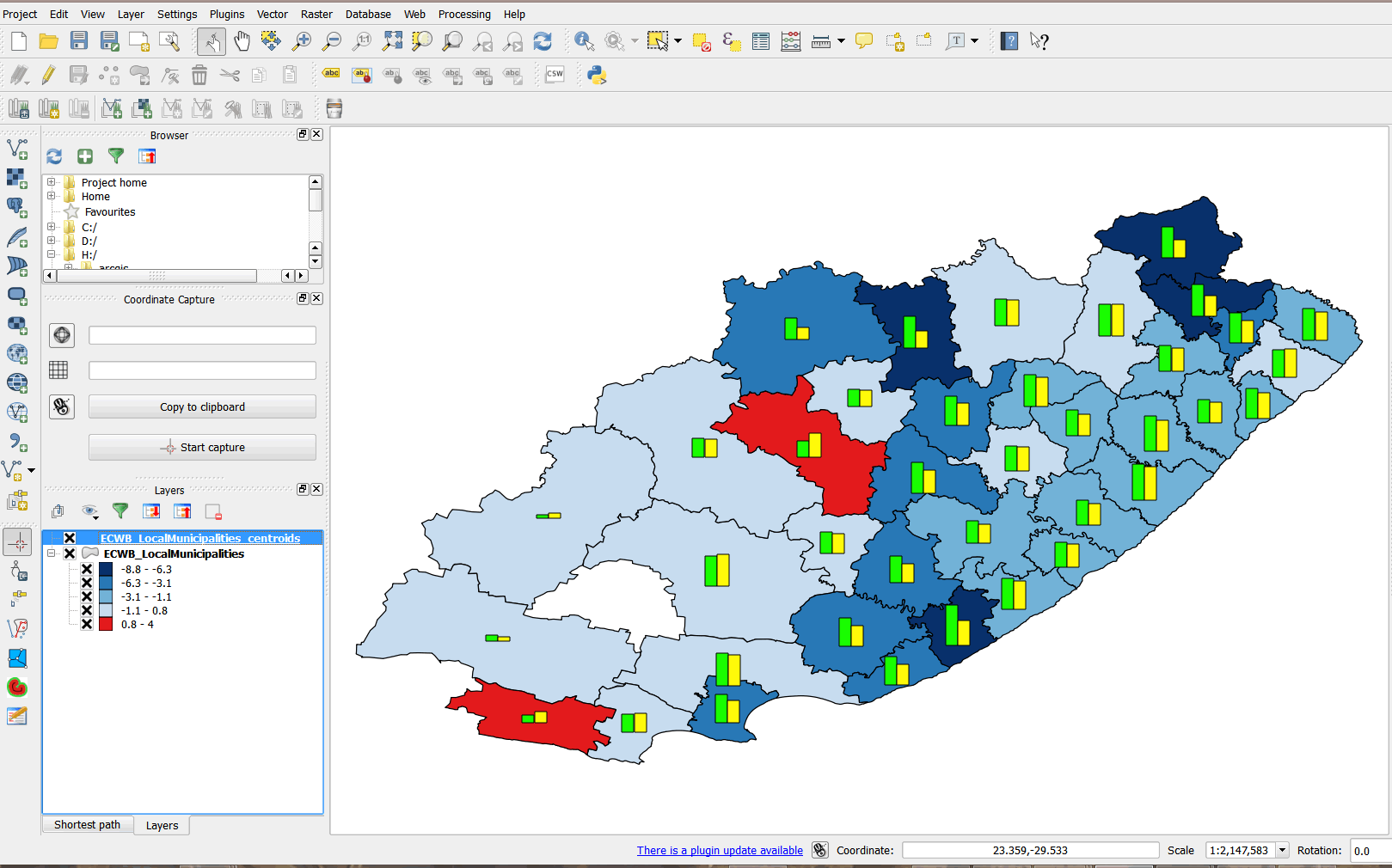
- This type of map can be used to assess program impact and plan for interventions.
3.8.6 Practice exercises
Objectives
In this assignment, we will practice mapping program impact.
- Create a time series map of HIV positivity from 2011–2014.
- Calculate HIV positivity for 2011 and 2012 (you have already calculated 2013 and 2014).
- Create four choropleth maps of HIV positivity for
- 2011
- 2012
- 2013
- 2014
- Use the same classification interval.
- Create publication-quality maps for each year and export as images.
- Present your maps on one PowerPoint slide arranged side by side.